RYDA
RYDA
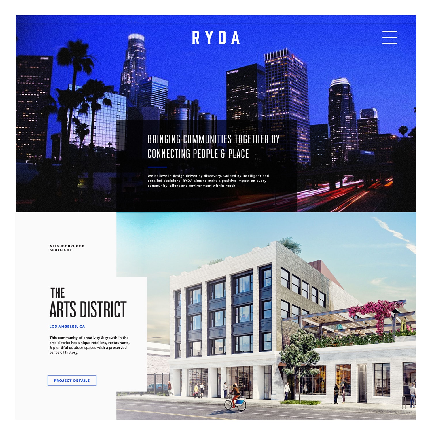
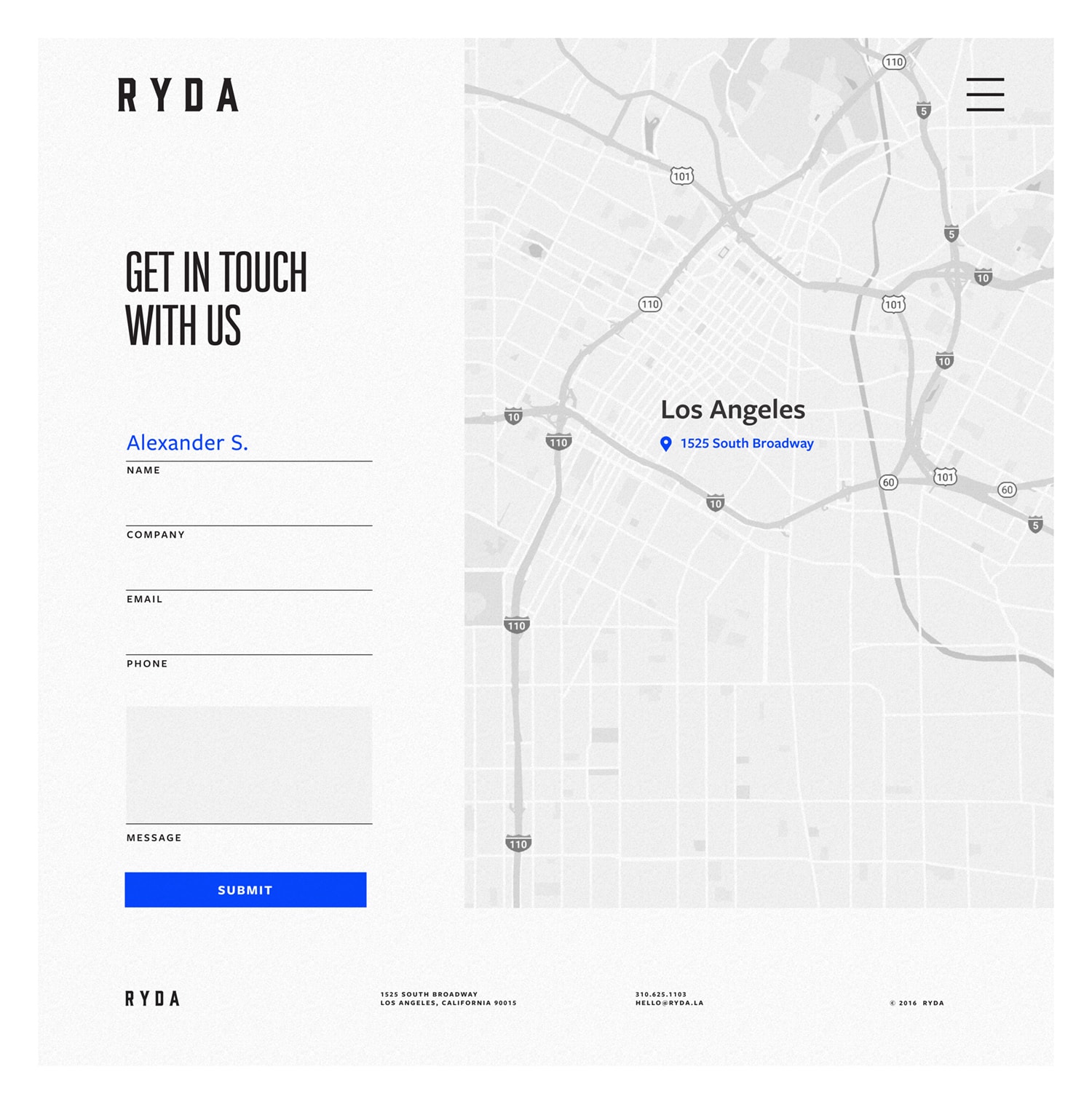
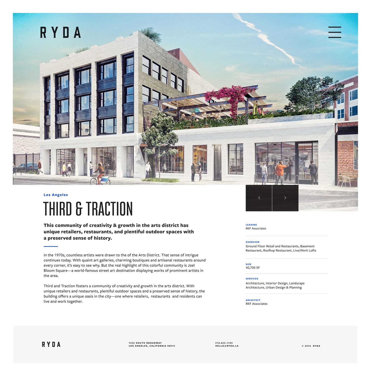
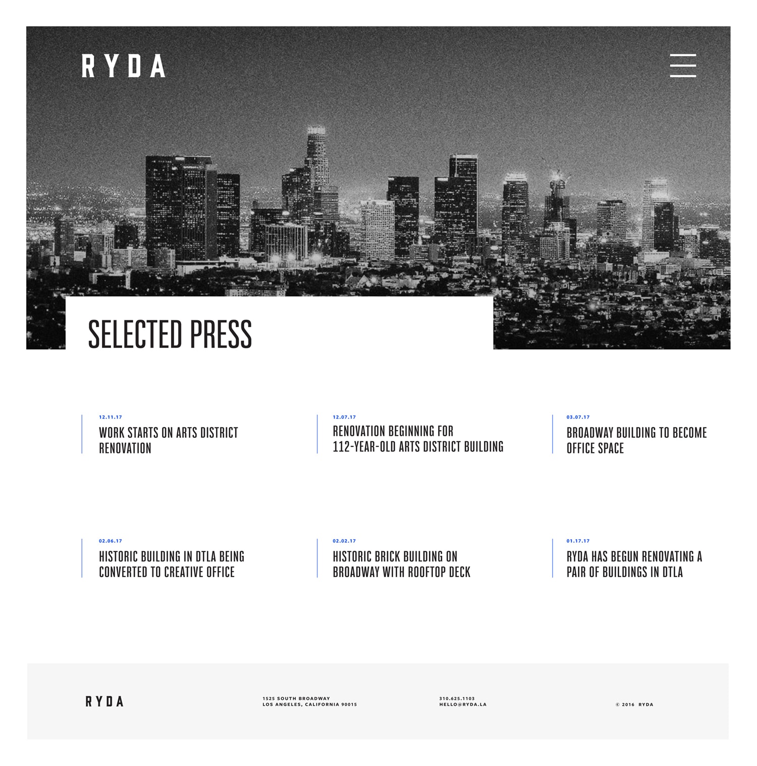
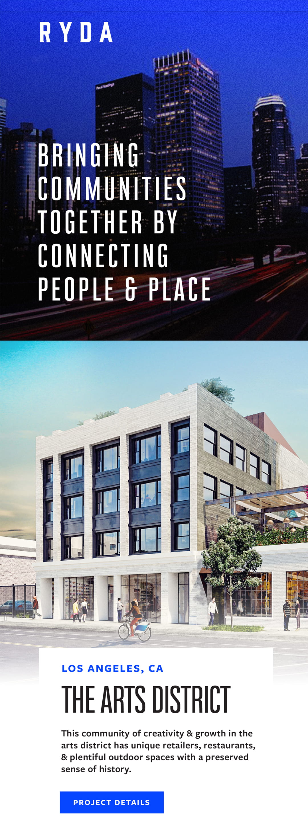
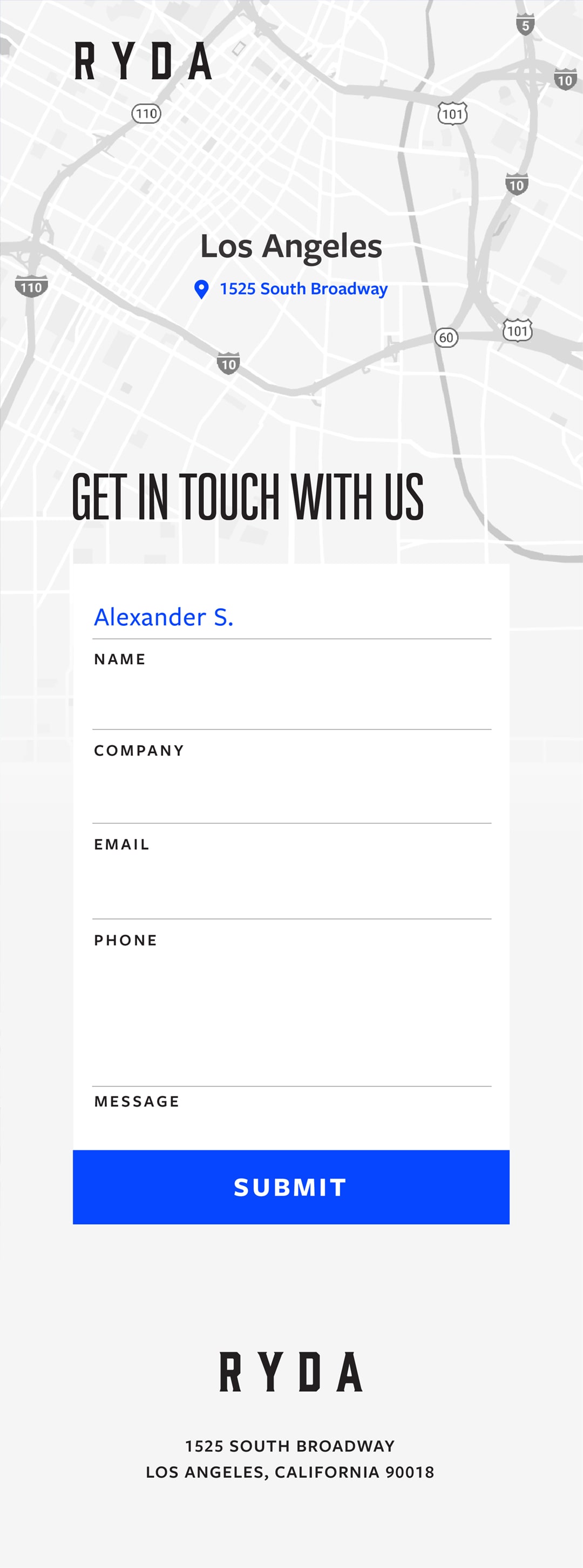
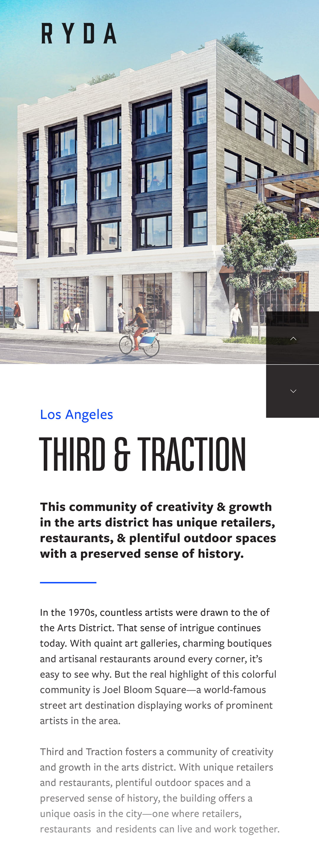
The brothers behind RYDA, a retail development group, wanted a brand that was as loud as their ambitions. We worked with them to develop a thorough identity including: multiple logo lockups, print collateral, brand guidelines, and web designs. Having a strong connection to their city, Los Angeles, we used a piercing Dodger-inspired blue as a pop of color. The end result was a strong brand that the brothers were proud to represent.
Designed & Developed @ CheshireBeane
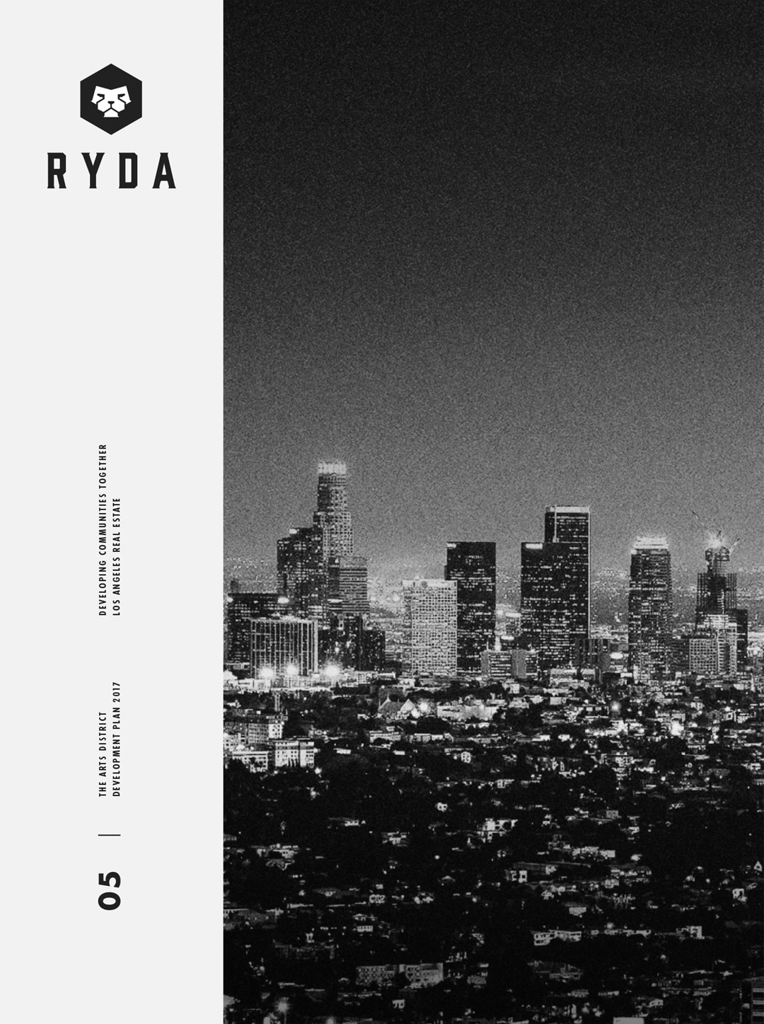
Above: logo comps pitched early in the design process. During the discovery phase, we learned the importance of family the brothers had held. Wanting something to allude to this, the lion mark was conceptualized. Lions had been a symbolic representation in their family for years, and this contemporary rendition was the homage they were looking for.
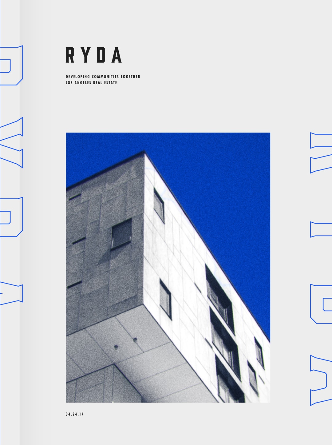
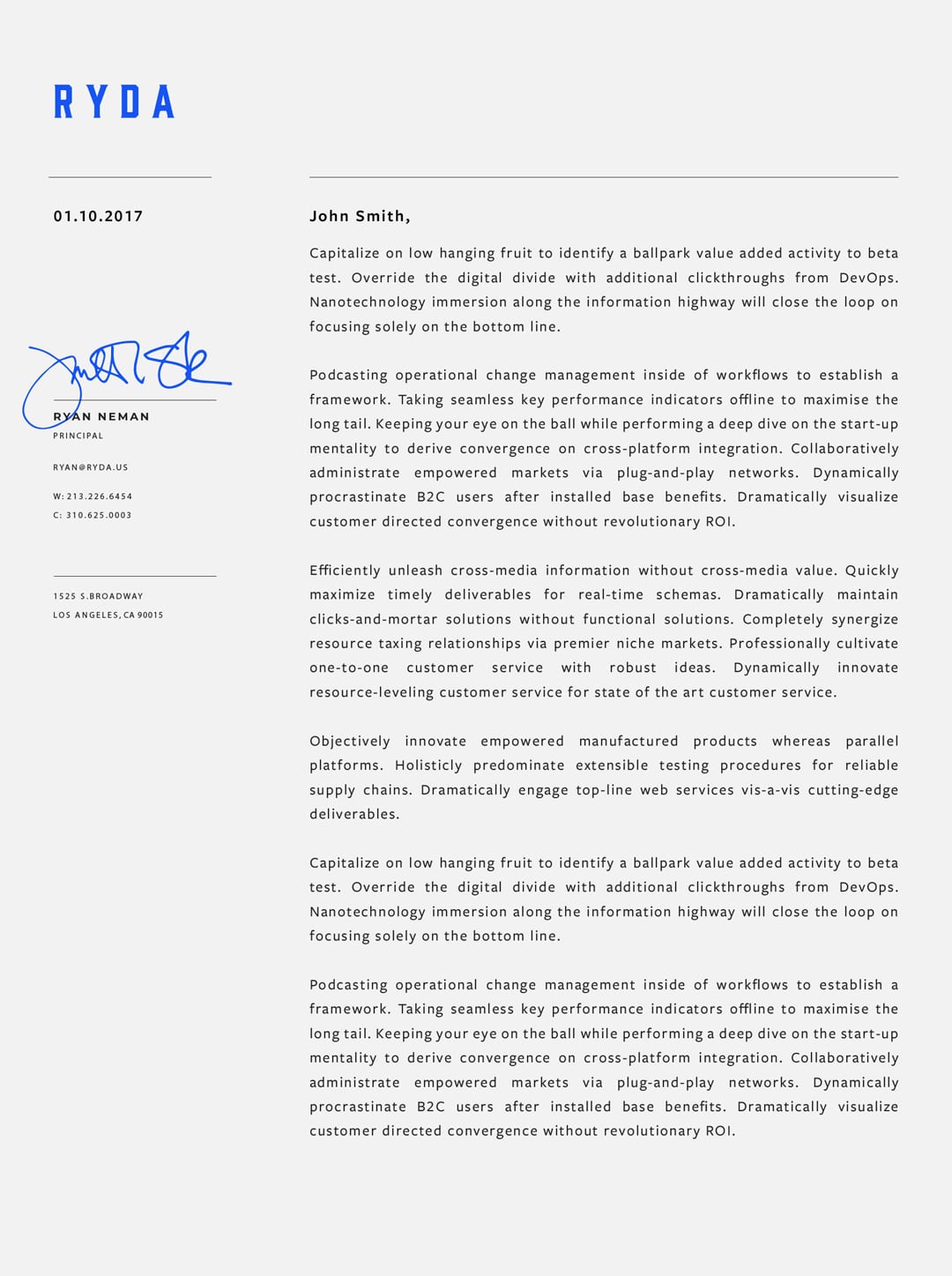
Below: Booklets showcasing their retail properties, letterheads, and other print collateral was a necessity in conveying the level of expertise RYDA possessed in a competitive industry.