Keith Rodri
Hello Instrument!
Thanks for visiting my portfolio! I’ve gathered some projects below for your convenience, however, feel free to poke around at some of my other work by clicking the R in the top left corner.
I enjoy working in a range of disciplines to further my growth and keep things interesting. I’d love to work in an environment where I can learn from my team and contribute to the creative process. I think that I would be a great addition to your team at Instrument! :D
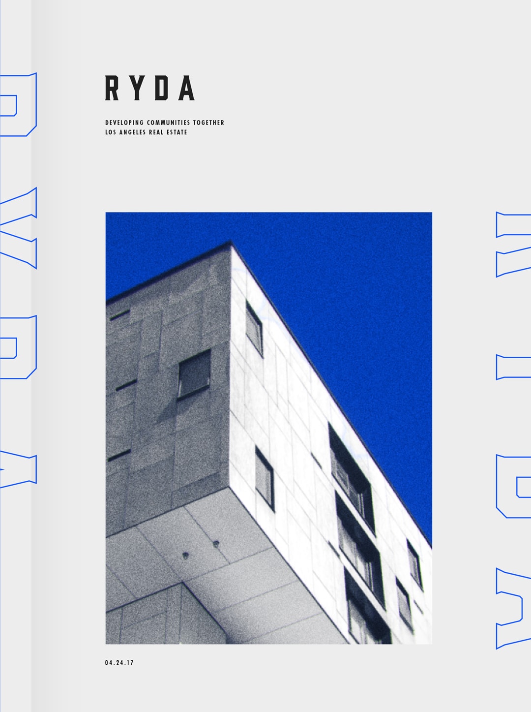
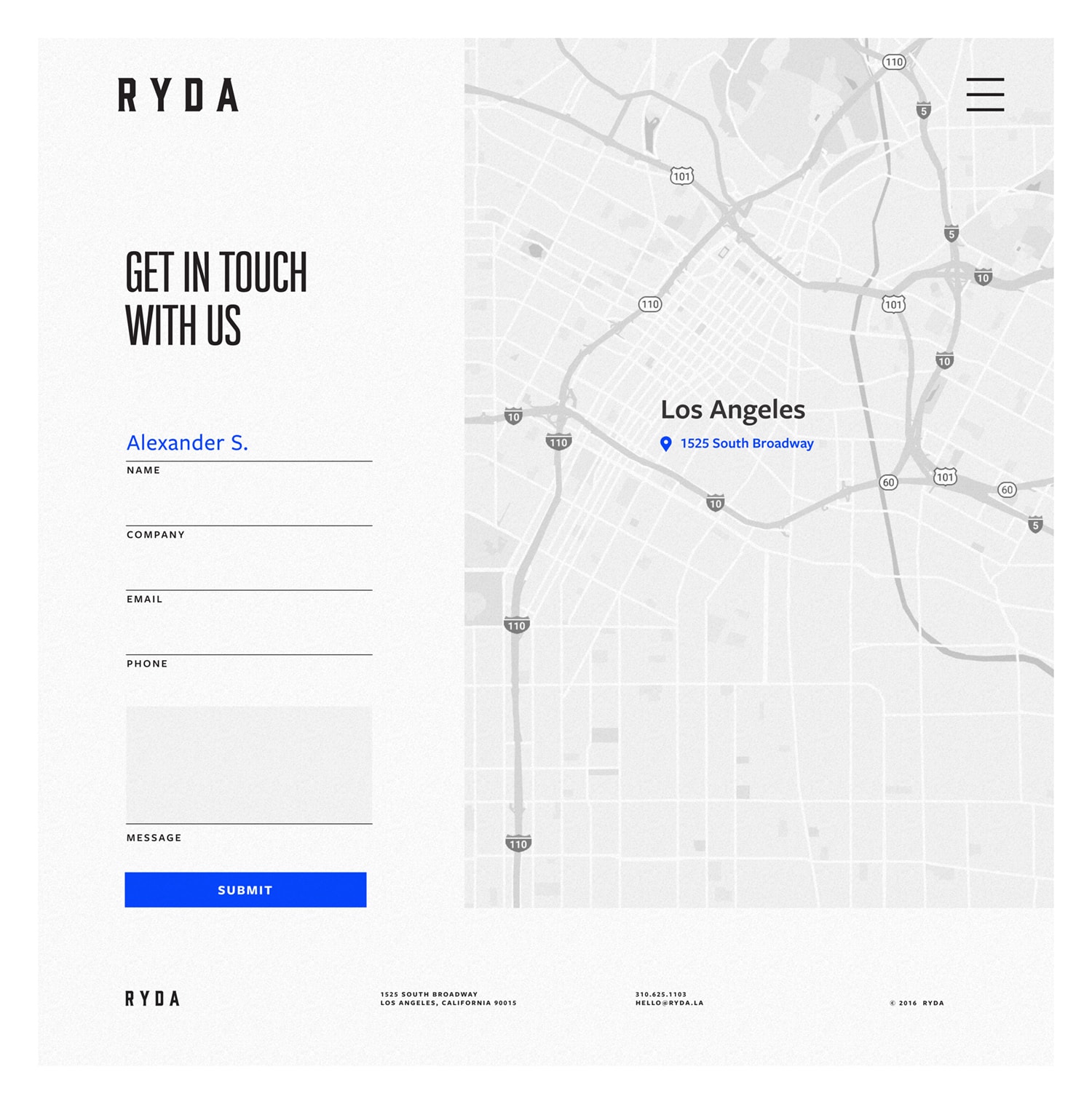
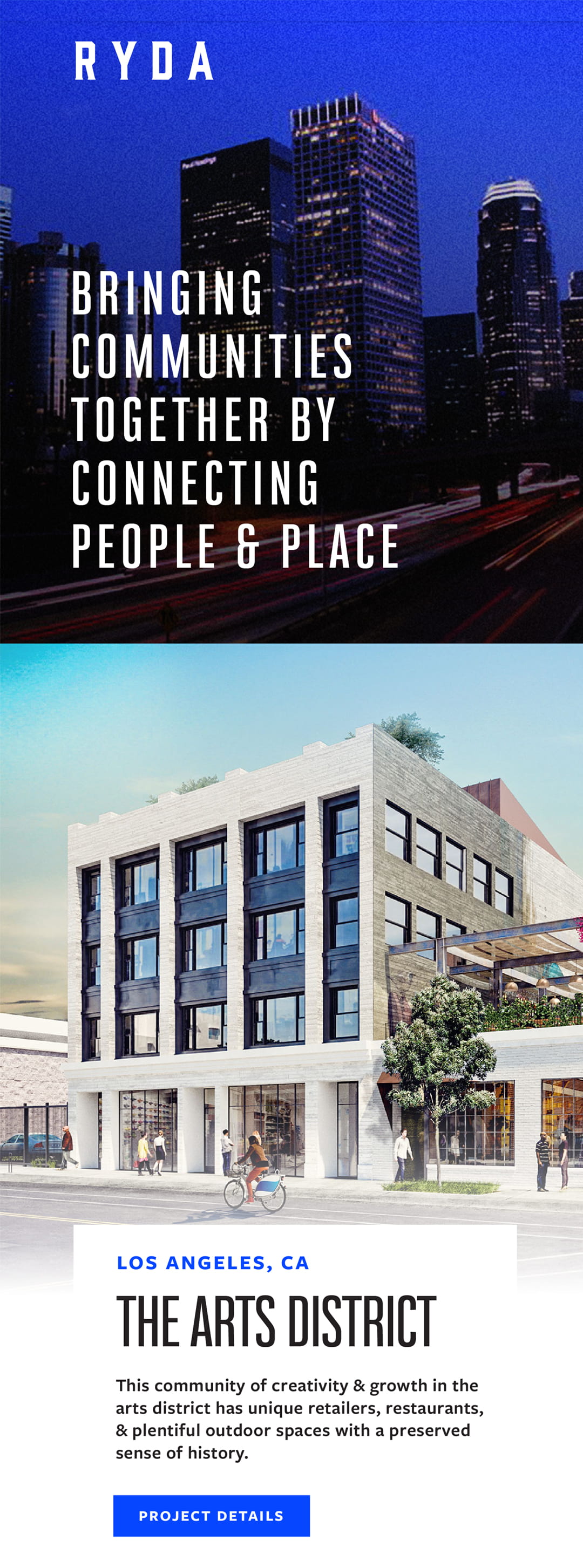
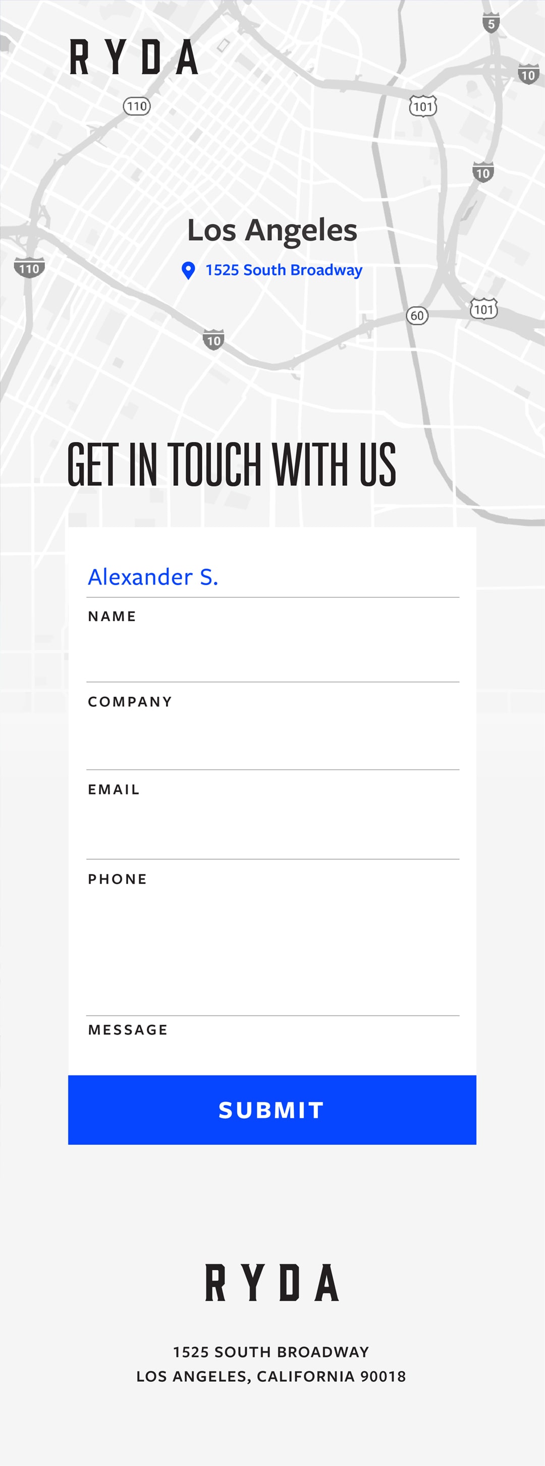
RYDA
RYDA
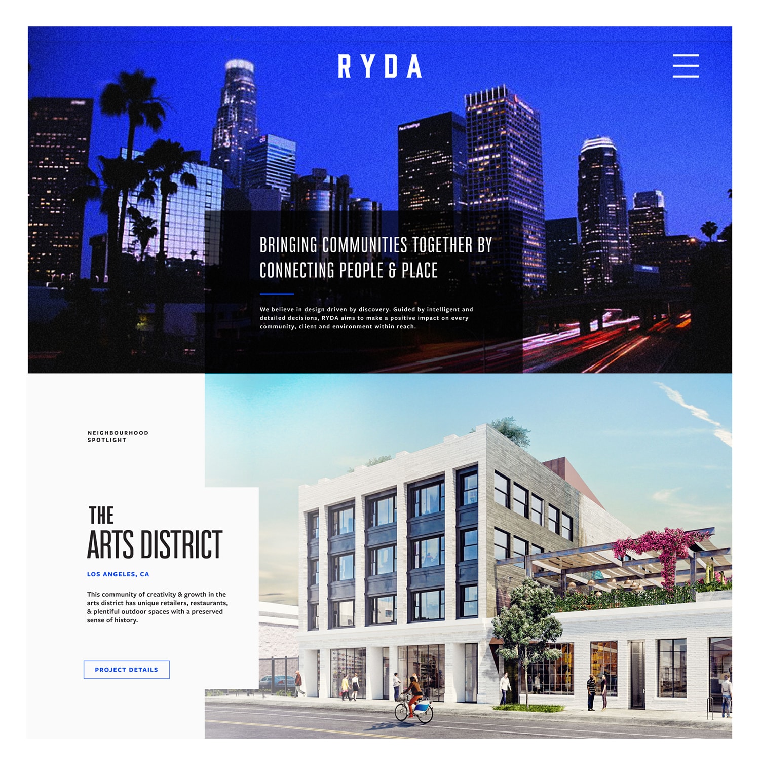
The brothers behind RYDA, a retail development group, wanted a brand that was as loud as their ambitions. We worked with them to develop a thorough identity including: multiple logo lockups, print collateral, brand guidelines, and web designs. Having a strong connection to their city, Los Angeles, we used a piercing Dodger-inspired blue as a pop of color. The end result was a strong brand that the brothers were proud to represent.
Designed & Developed @ CheshireBeane
Above: logo comps pitched early in the design process. During the discovery phase, we learned the importance of family the brothers had held. Wanting something to allude to this, the lion mark was conceptualized. Lions had been a symbolic representation in their family for years, and this contemporary rendition was the homage they were looking for.
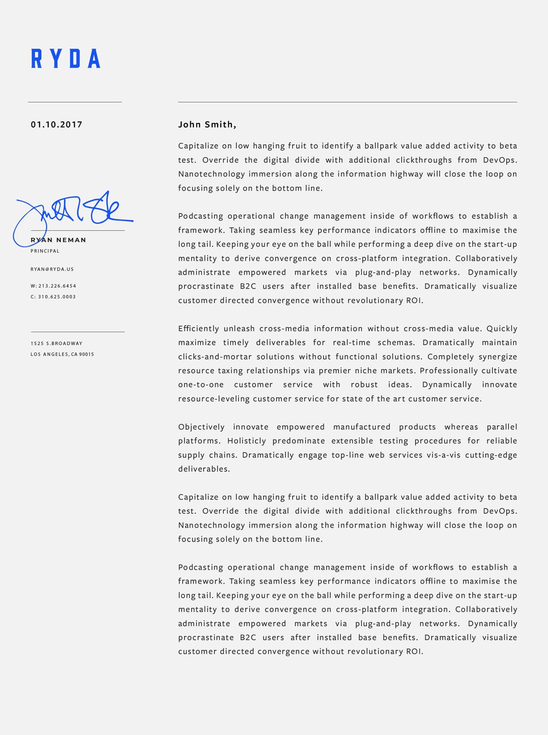
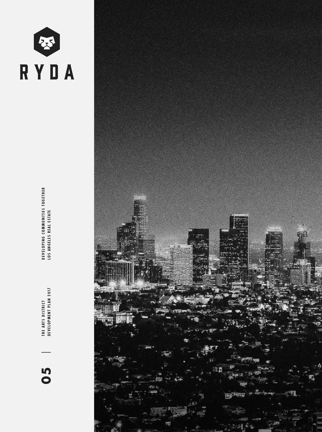
Below: Booklets showcasing their retail properties, letterheads, and other print collateral was a necessity in conveying the level of expertise RYDA possessed in a competitive industry.
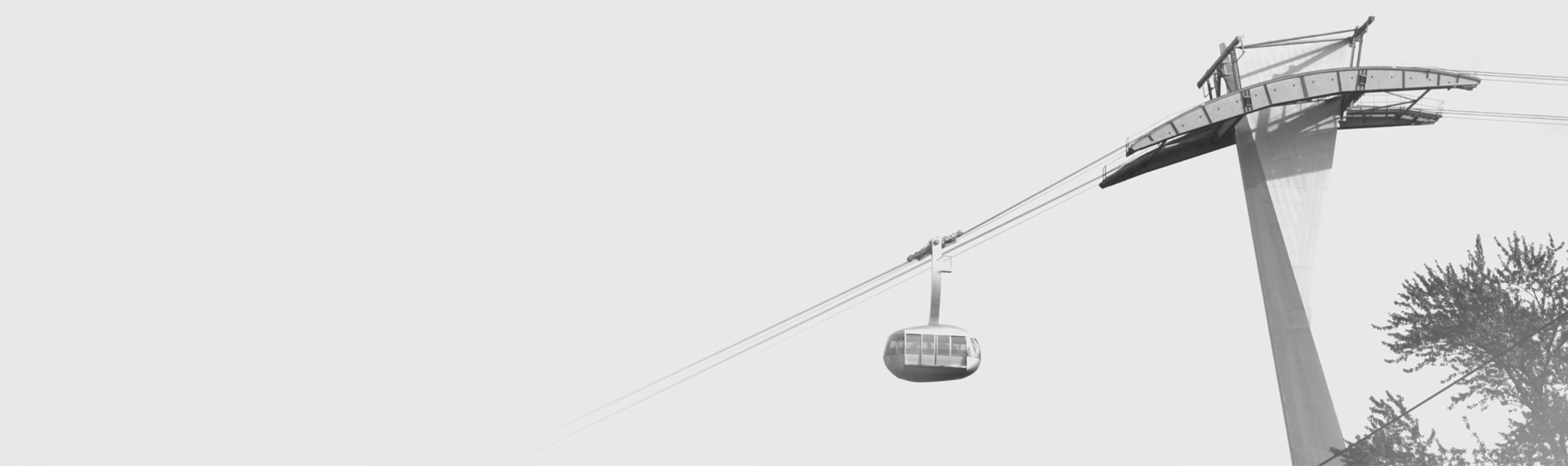
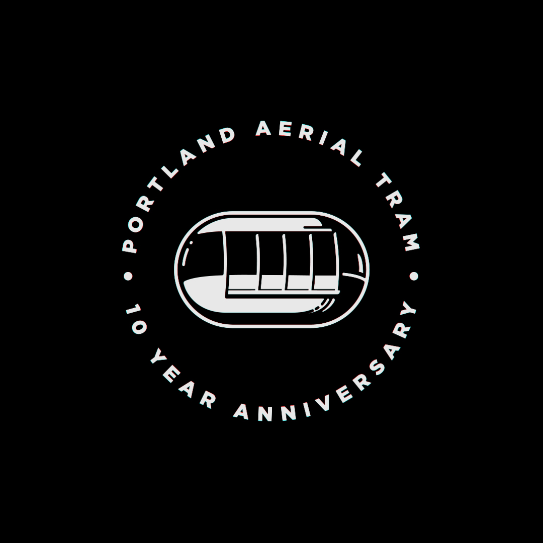
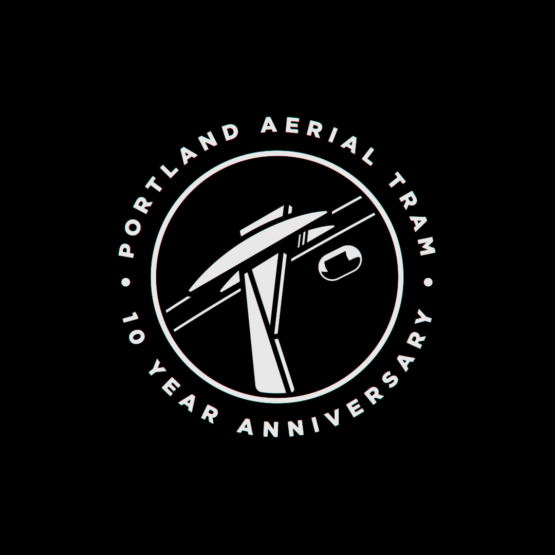
Portland Aerial Tram
PDX Aerial Tram
10th Anniversary Refresh
We were eager to work on a brand refresh for the 10th anniversary of the Portland Aerial Tram. These are some of the designs we pitched.
The tram consists of two cabins that take commuters on a 4 minute trip from OHSU to the SW Moody & Gibbs intersection, a 500 foot difference in elevation. One of the many cool landmarks Portland has to offer.
Designed @ CheshireBeane
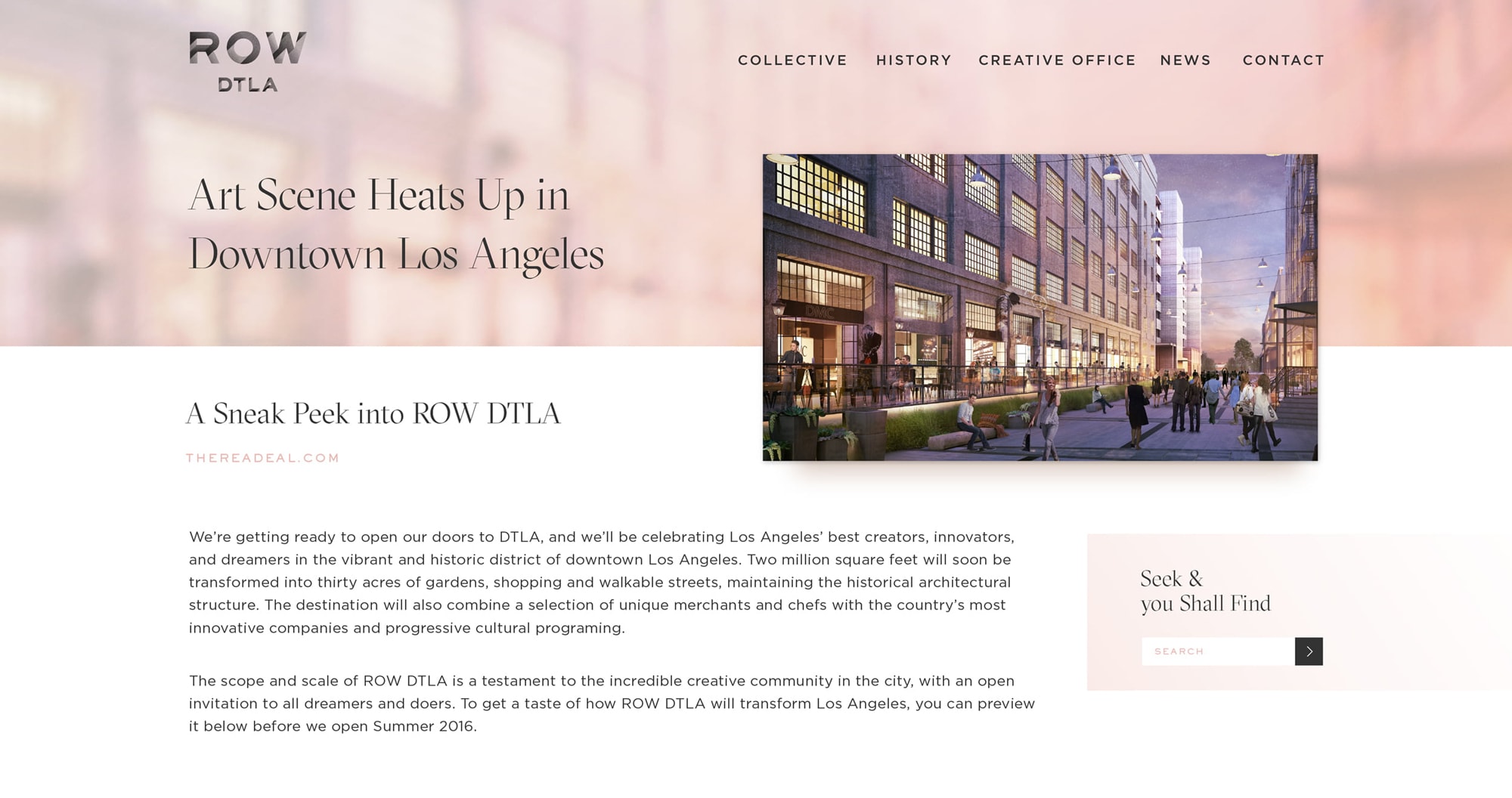
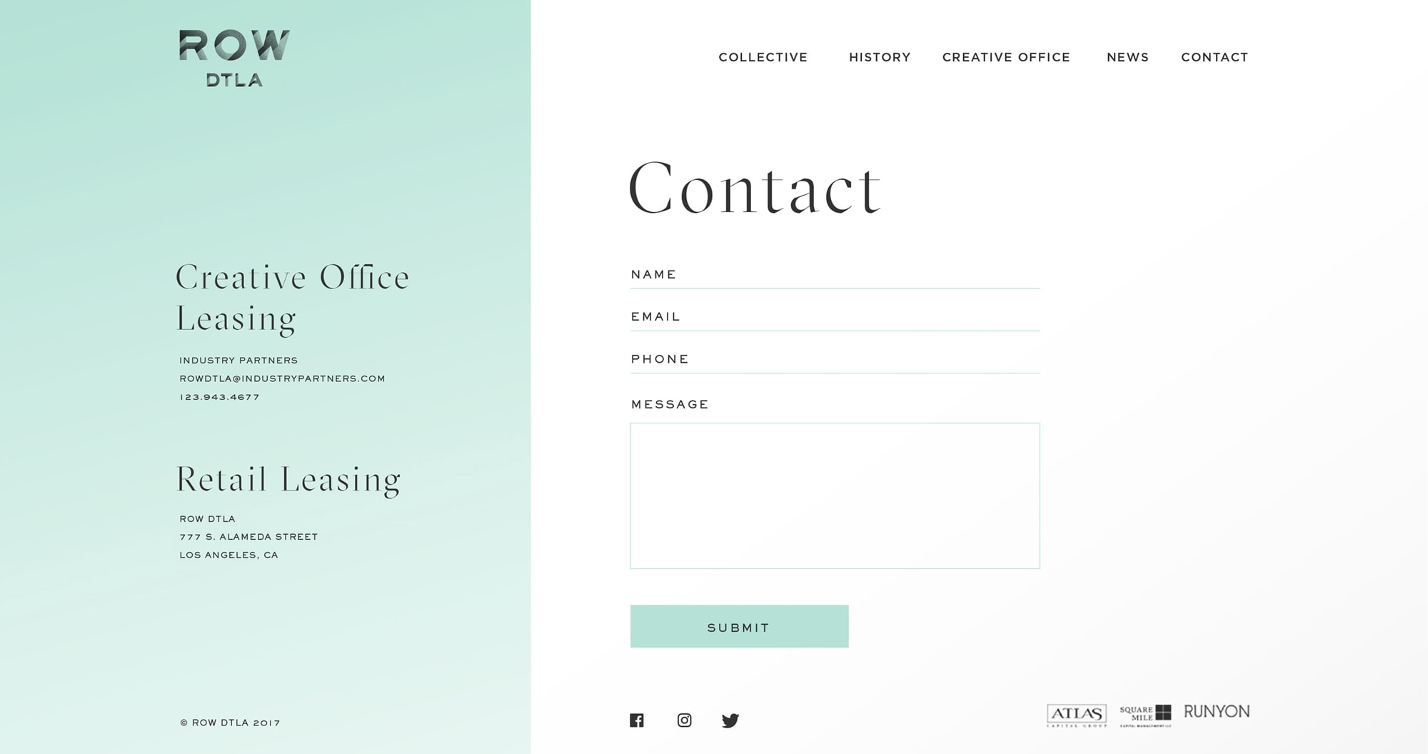
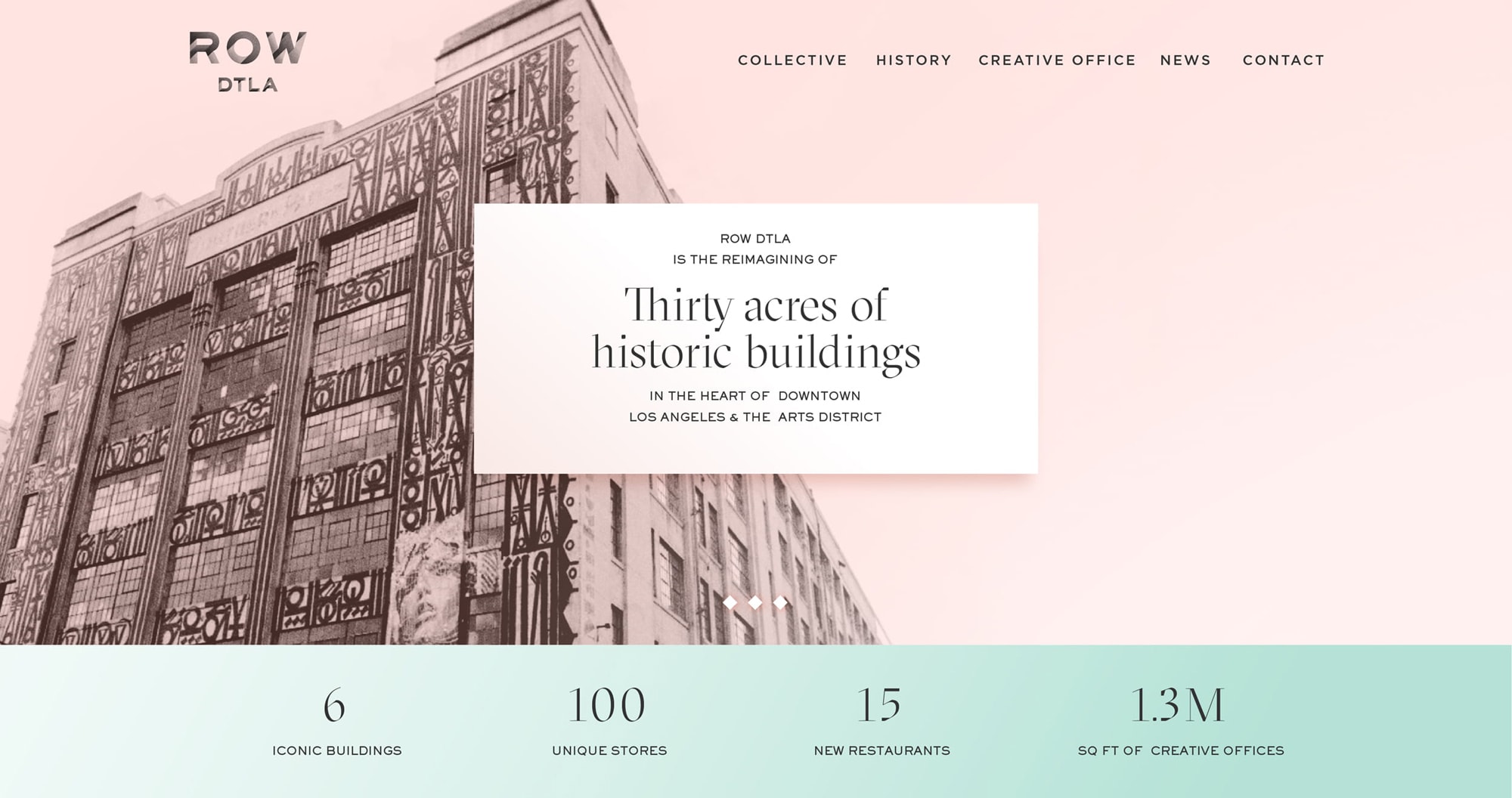
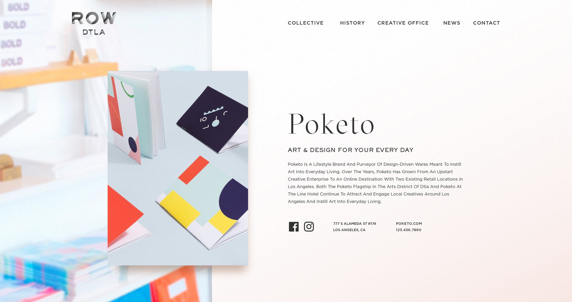
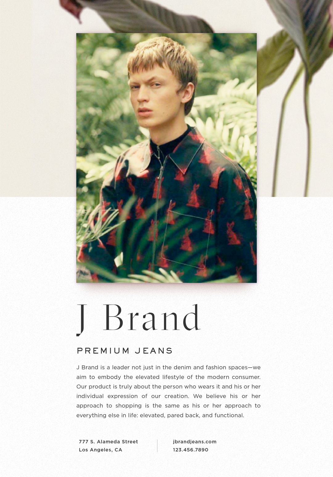
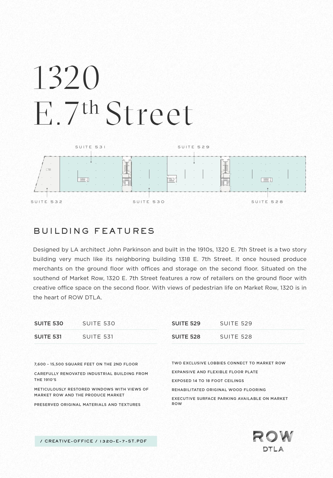
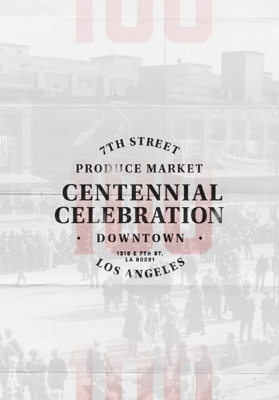
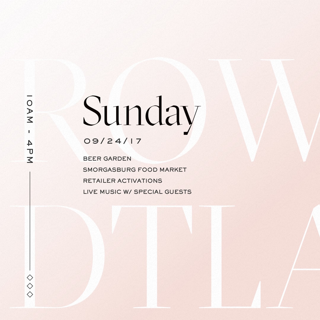
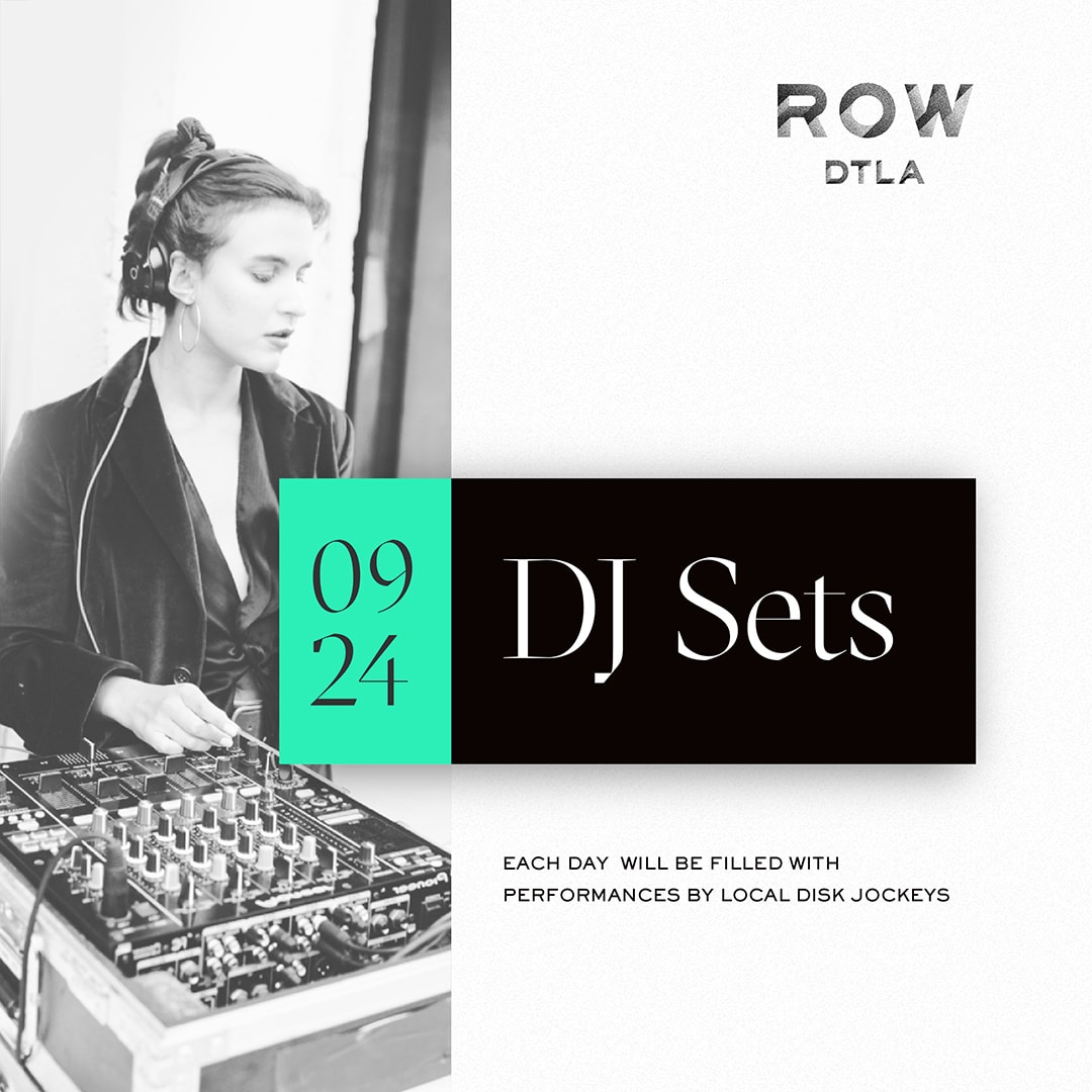
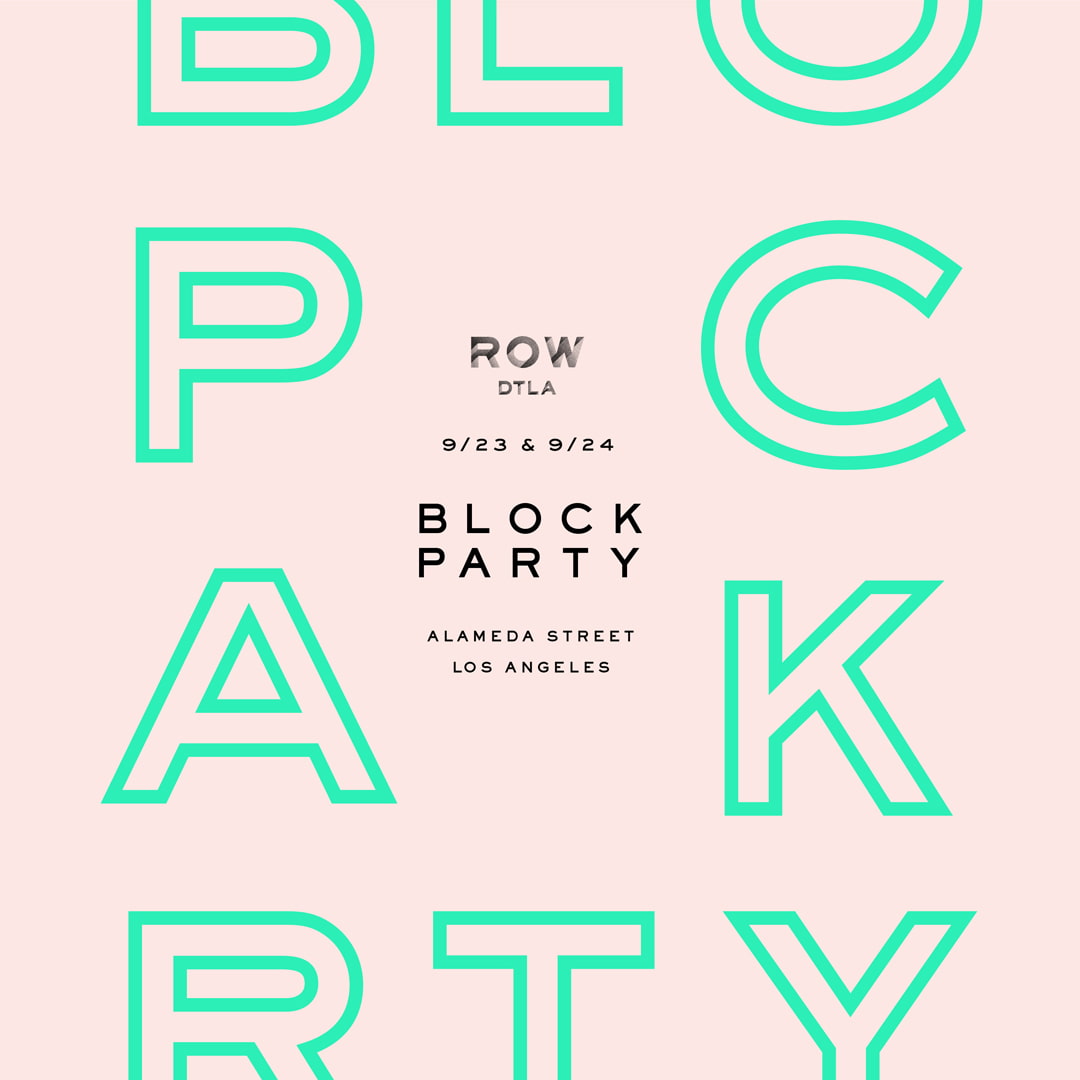
ROW
ROW DTLA
ROW is an impressive shopping destination in the center of the Los Angeles Arts District. When designing their print and web assets, we wanted to build on the artsy aesthetic the property had established. A strong use of color, tenant photography, dynamic layouts, and its display typeface embellish ROW’s fresh and bold personality.
Some of the work in these projects include: highly custom website design & development with backend WYSIWYG content editors, printed collateral such as lookbooks for investors & prospective tenants, and social media content design & strategy.
Designed & Developed @ CheshireBeane

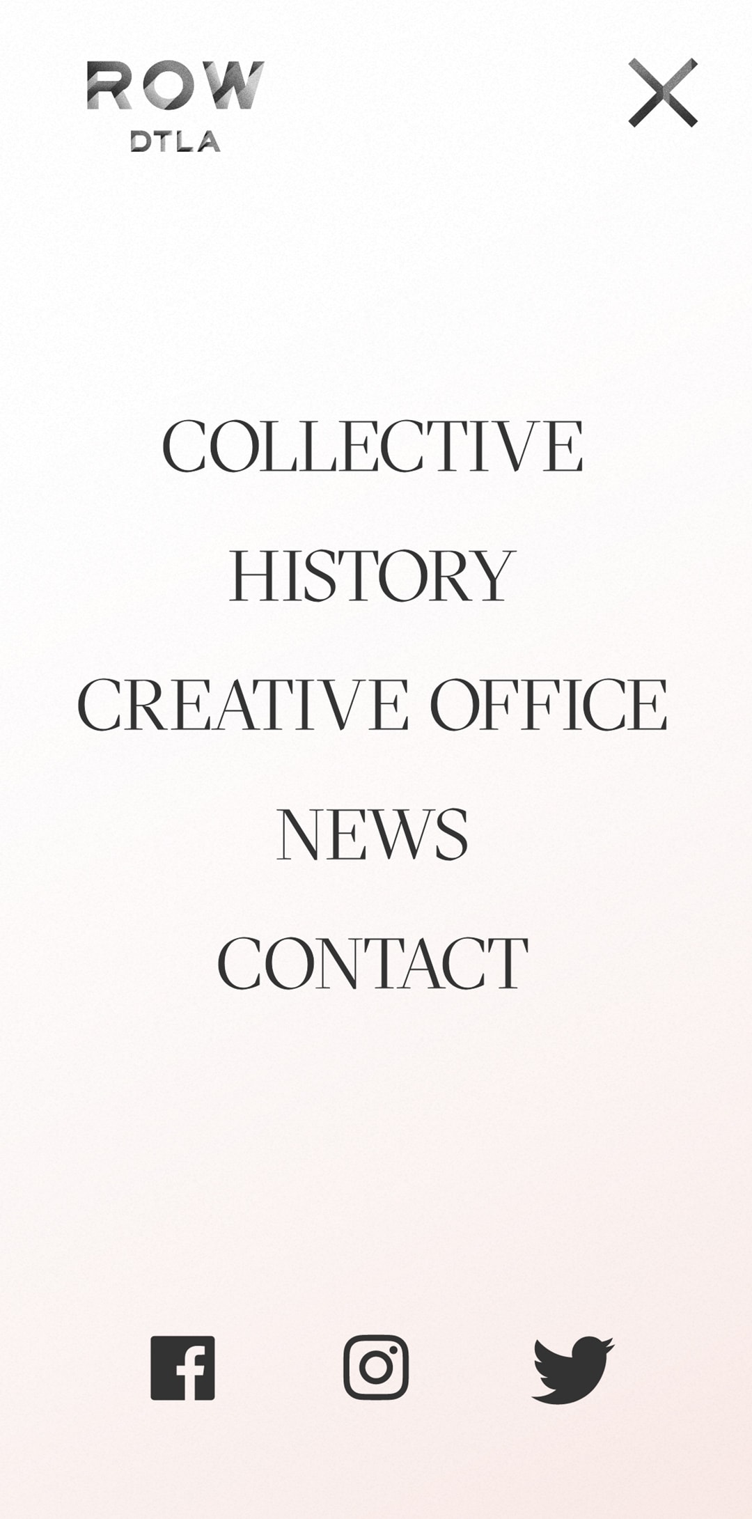
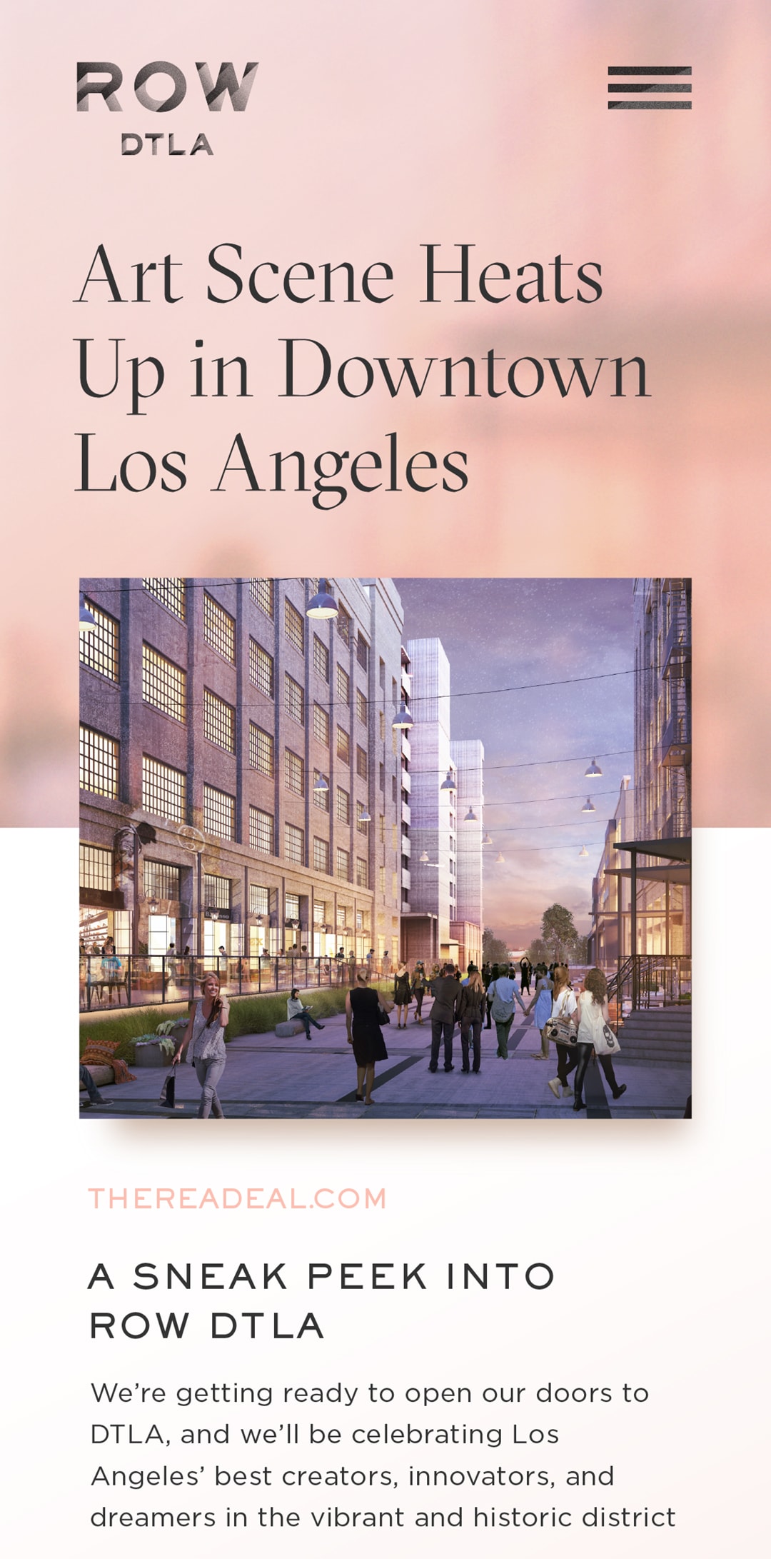
Mobile views of the tenant single page, navigation, and blog post.
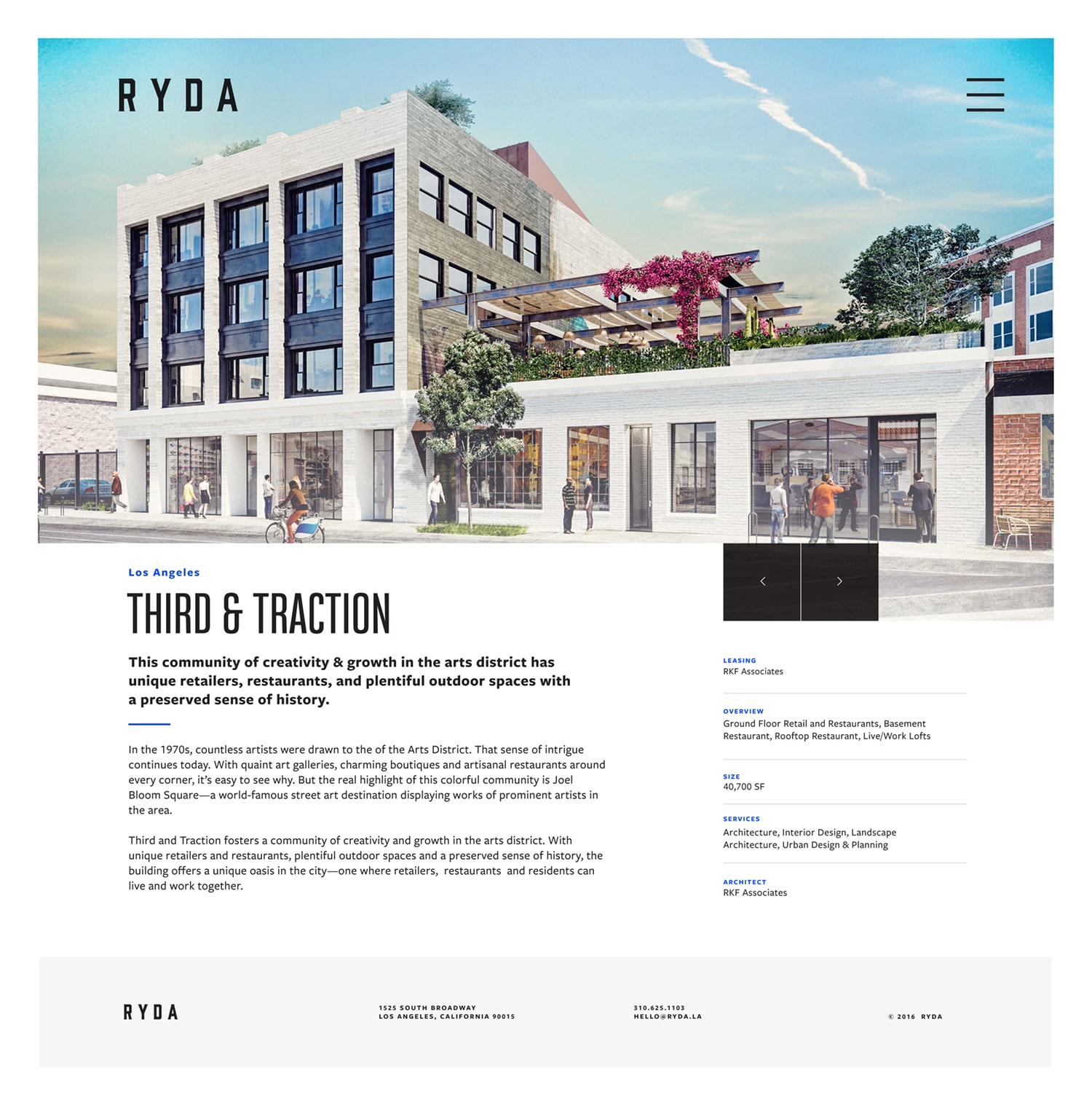
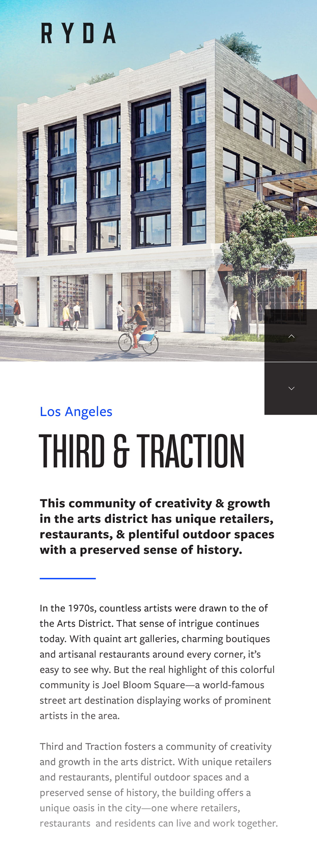
Third & Traction
3TLA Logos
Some of my favorite concepts from Third & Traction's initial identity brainstorm, an attempt to get a range of ideas out quickly. Different ways to visually represent the unique initials of the property was a focus in trying to create something memorable and recognizable. The design process continued to evolve the brand from here, but Roman numerals and geo-ampersands were so fun to explore I wanted to share.
Designed @ CheshireBeane
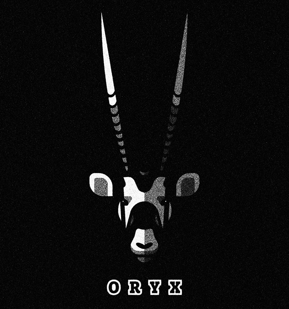
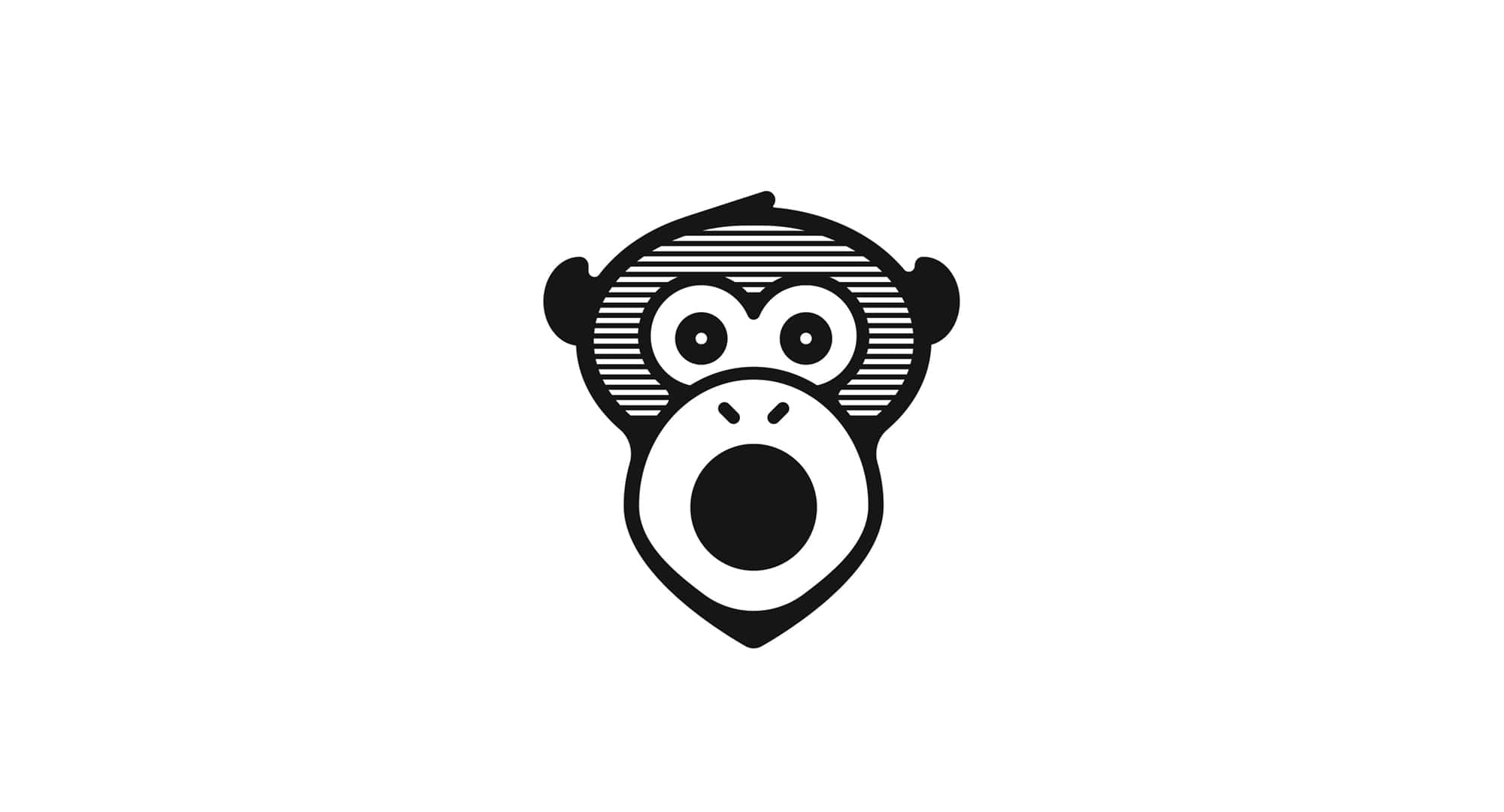
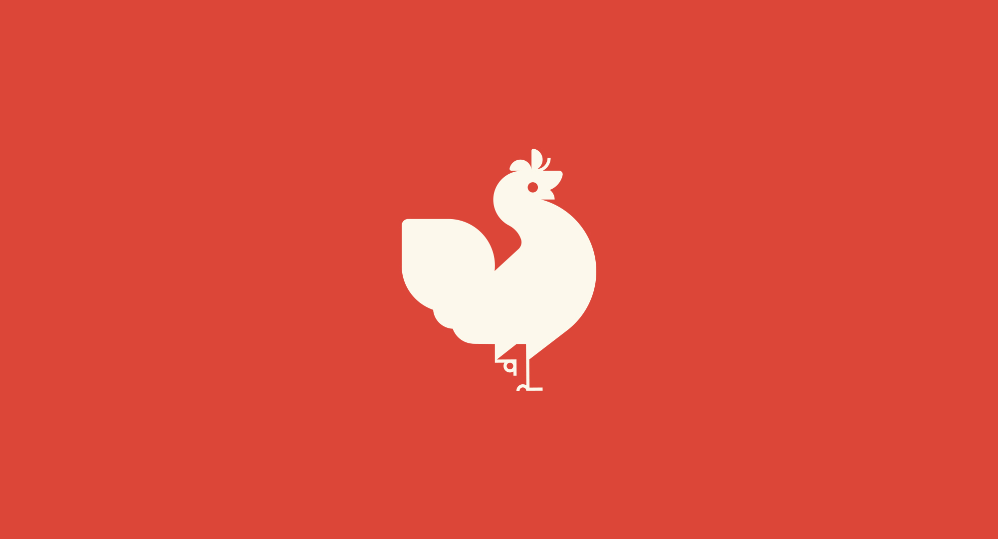
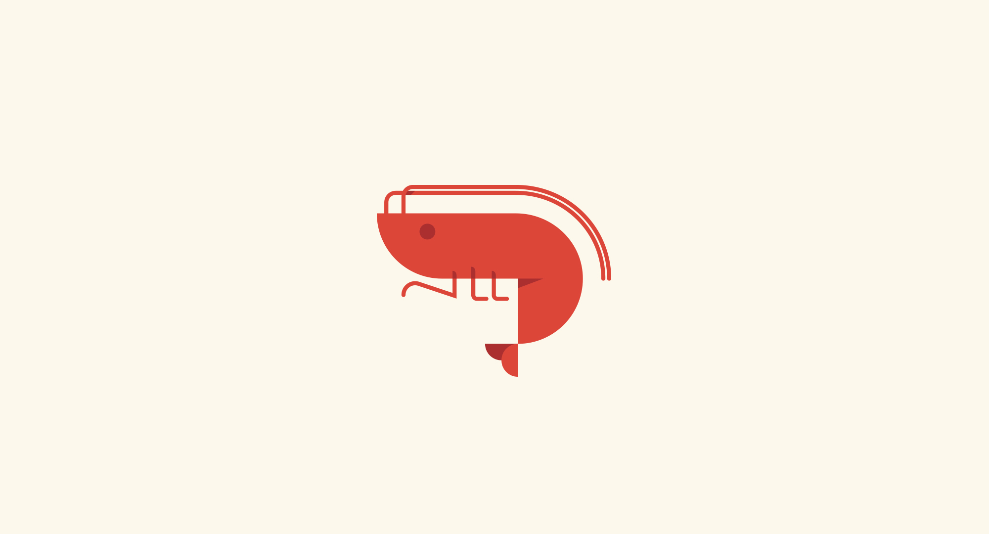
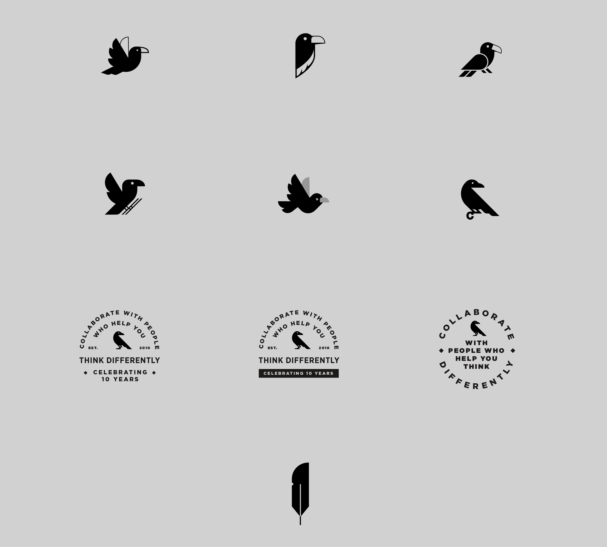
Animal Marks
Animal Marks
A collection of animal marks and illustrations I’ve worked on over the years for various stuffs. Whether for passion projects or practice, it’s always a blast to add some graphic illustration into the workflow. I’ll add more examples in the near future.
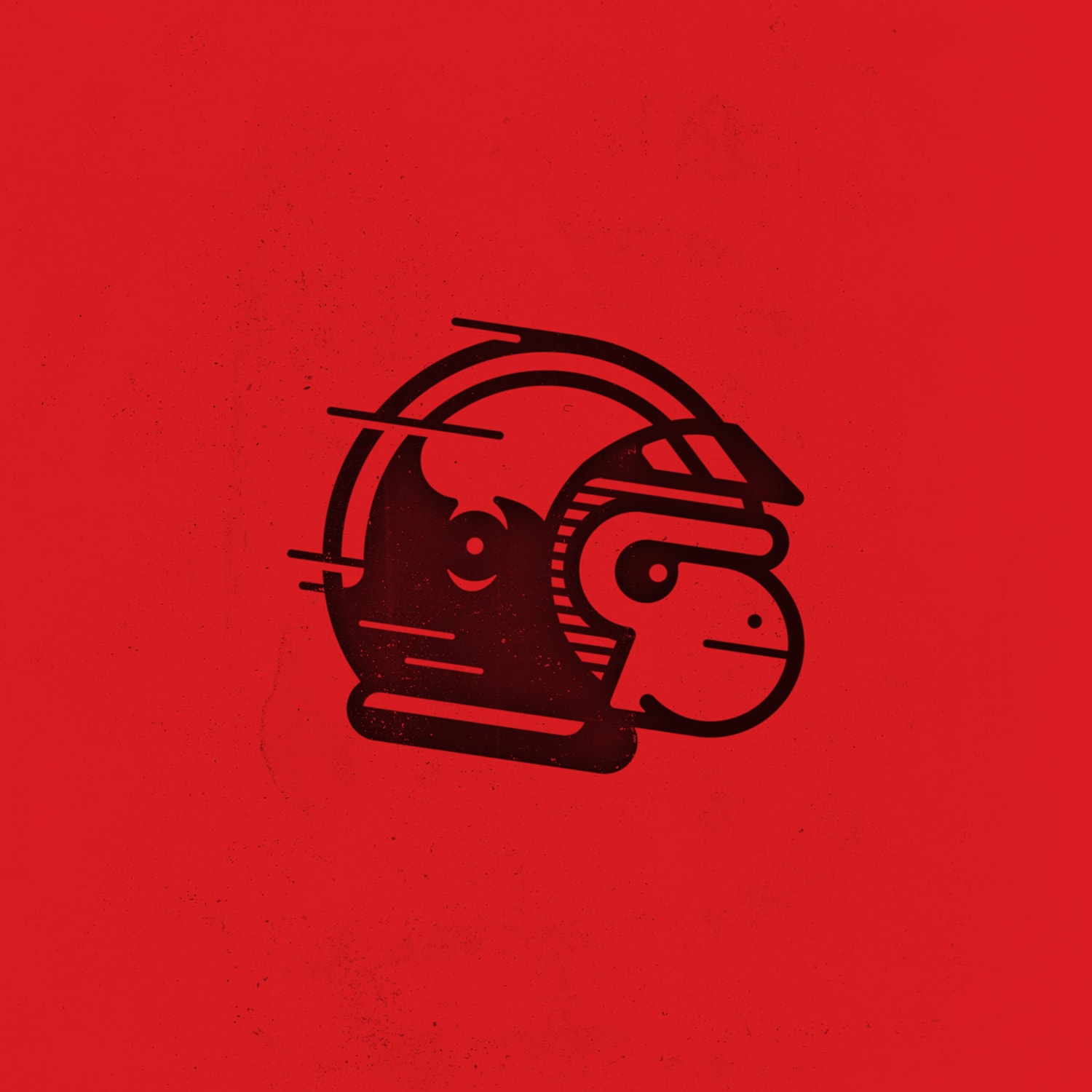
Drift Monkey
Creative Challenge! You and a friend come up with a random word each. Don’t over think it, just choose something. Write them down on pieces of paper and reveal. Now make something that represents both words. I like to do this with my creative friends when we aren’t exhausted from arting all week. This racing monkey mark is the outcome of the words “drift” & “monkey”.
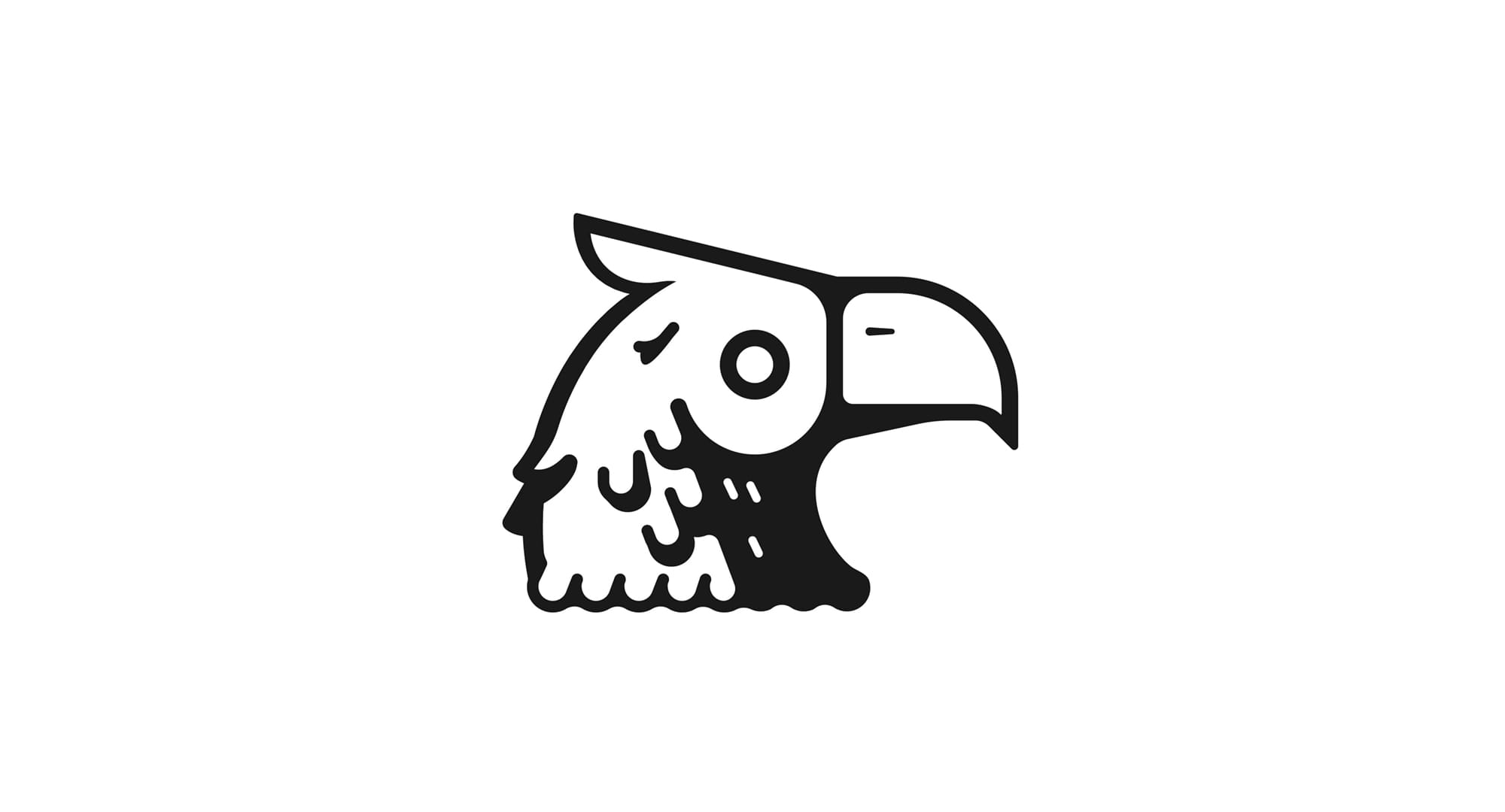
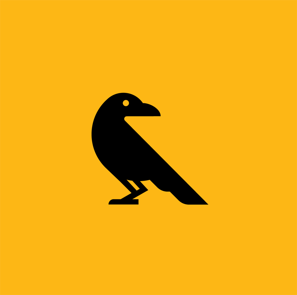
Cheshire Crow
BRIEF
Design a clean crow mark for hello cheshire's brand and incorporate it into a seal.
INSIGHTS
The beak is the clearest indication of a bird's species in this minimal form. Early exploration played with different positions and beak shapes. Many look more parrot-like due to a larger beak and its relationship to the head.
BA Monogram
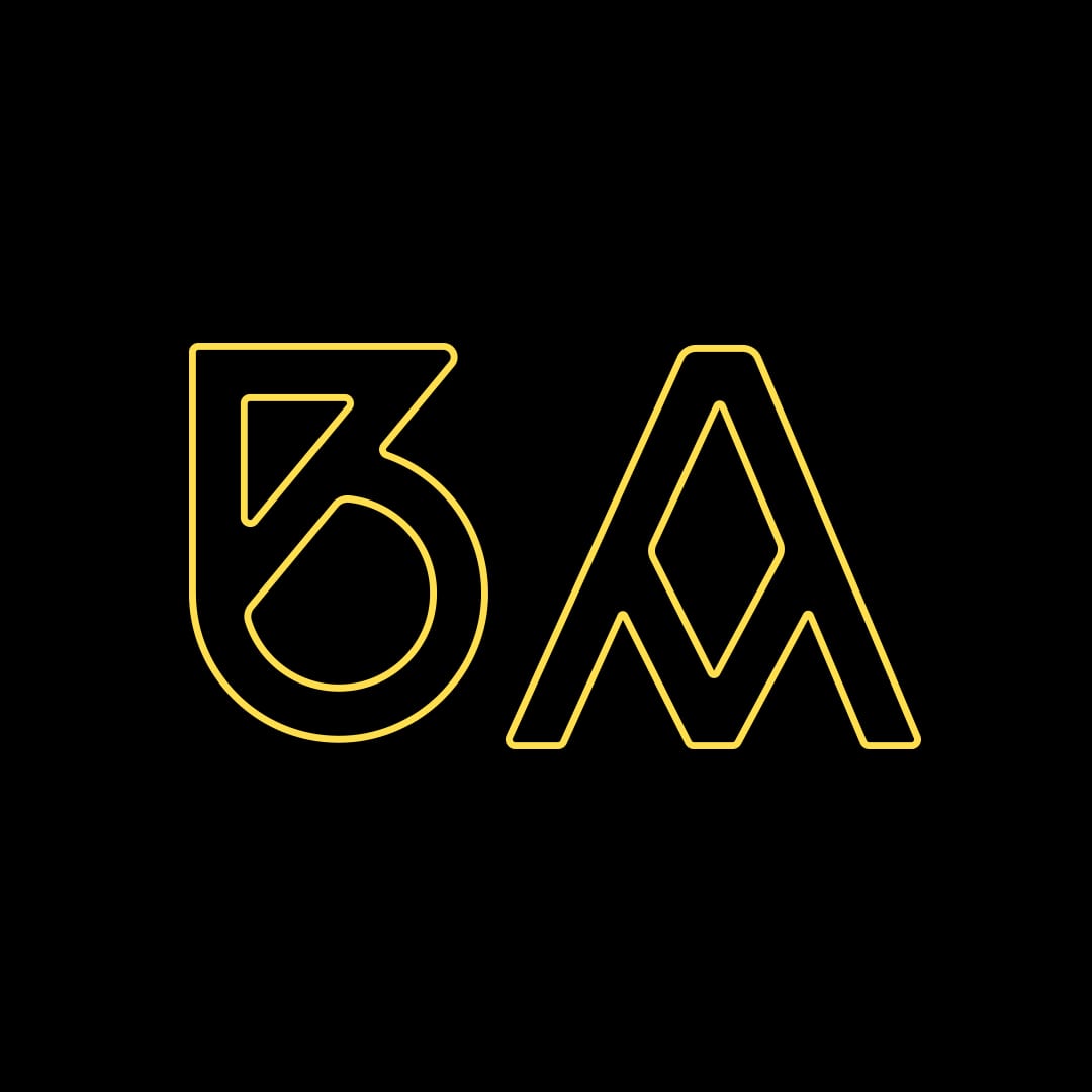
Two monogram designs for musician Brad Alden.
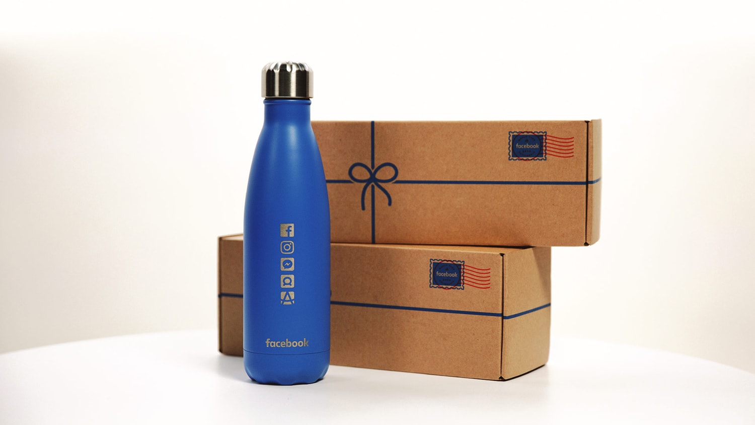
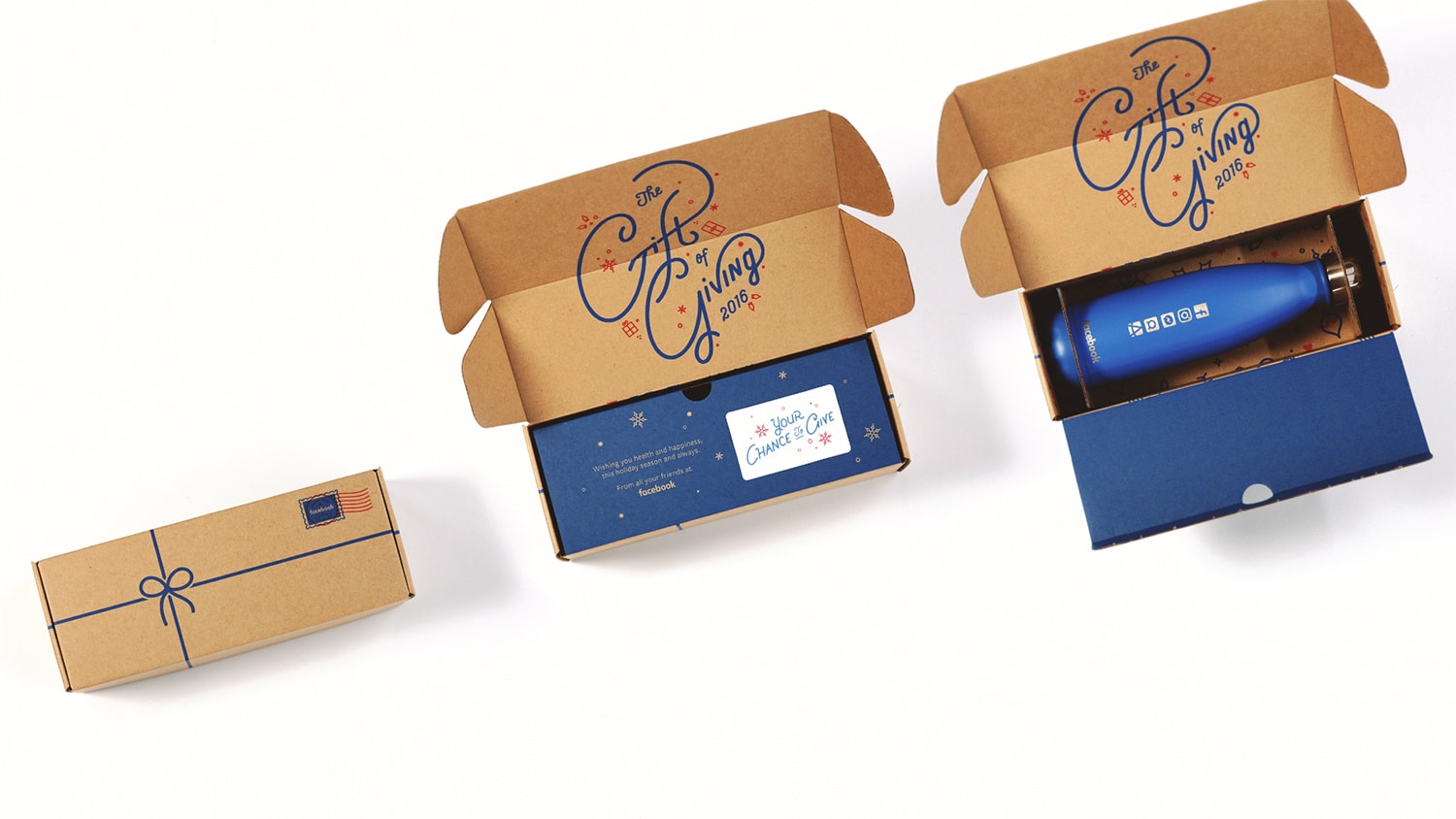
FB Holiday Gift
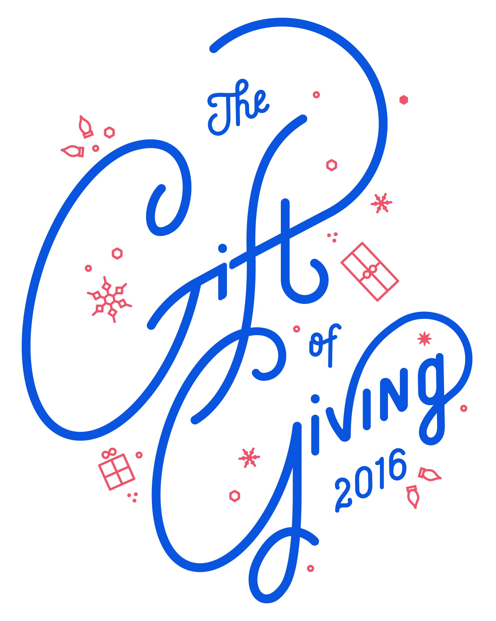
Facebook Holiday Gift
During each holiday season, Facebook surprises business partners with a gift. We helped them conceptualize and build the experience from the ground up. This included: on-brand messaging, screen print packaging, and custom lettering.
Designed @ CheshireBeane & A2E
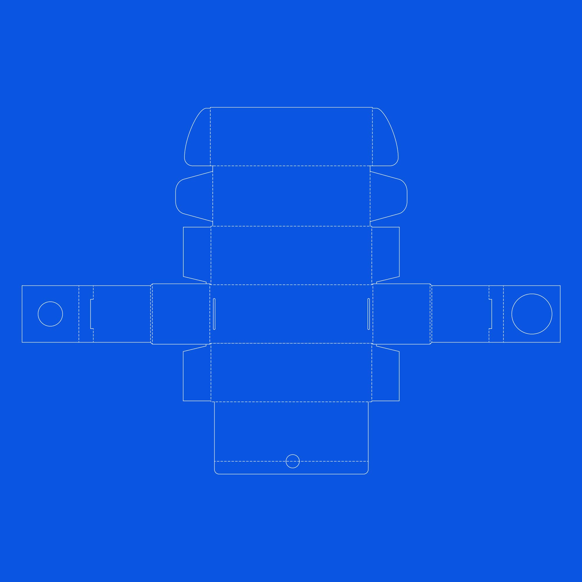
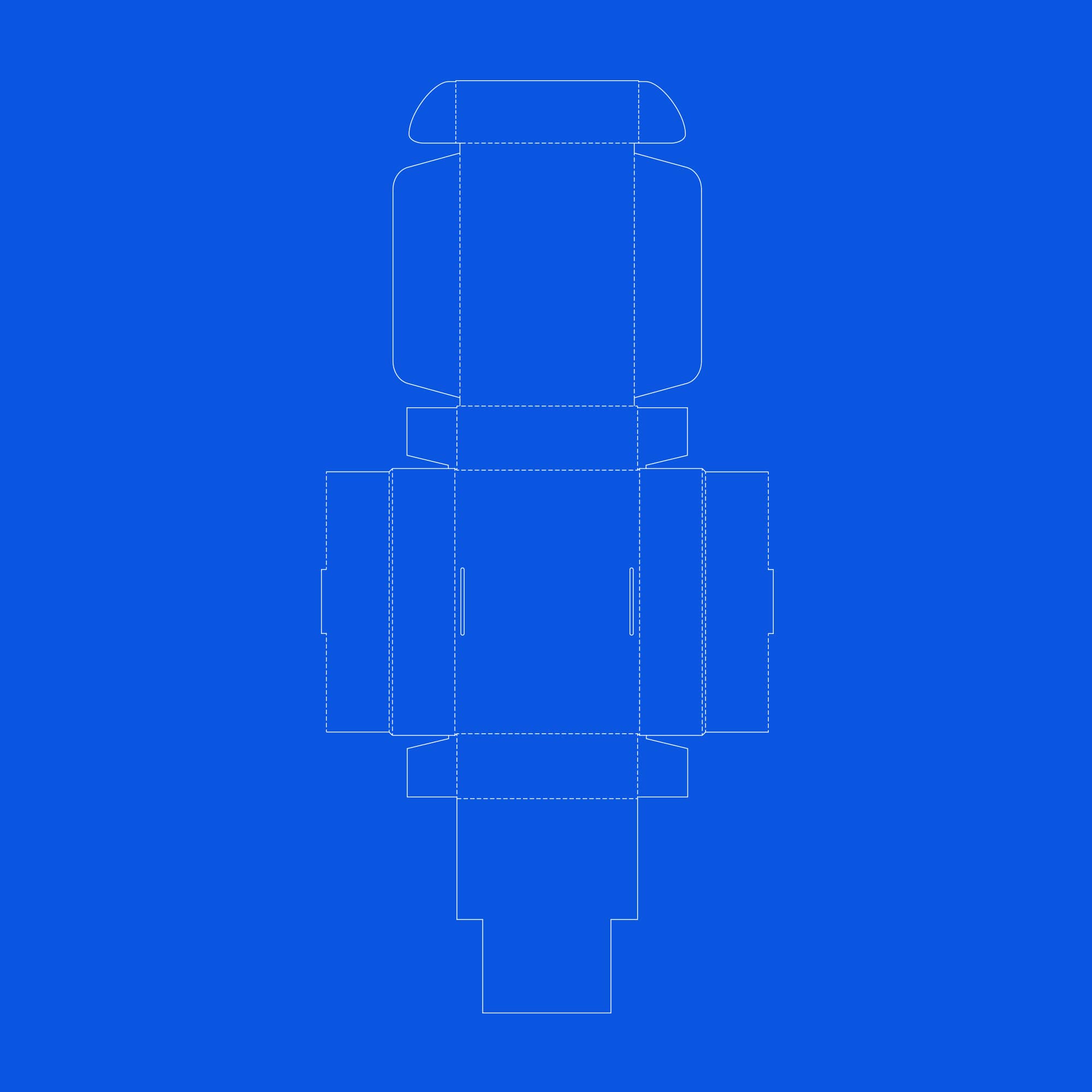
Two dielines were created. Many prototypes were made to ensure the boxes' integrity and keep its contents from shuffling around during shipping.
Ganesh
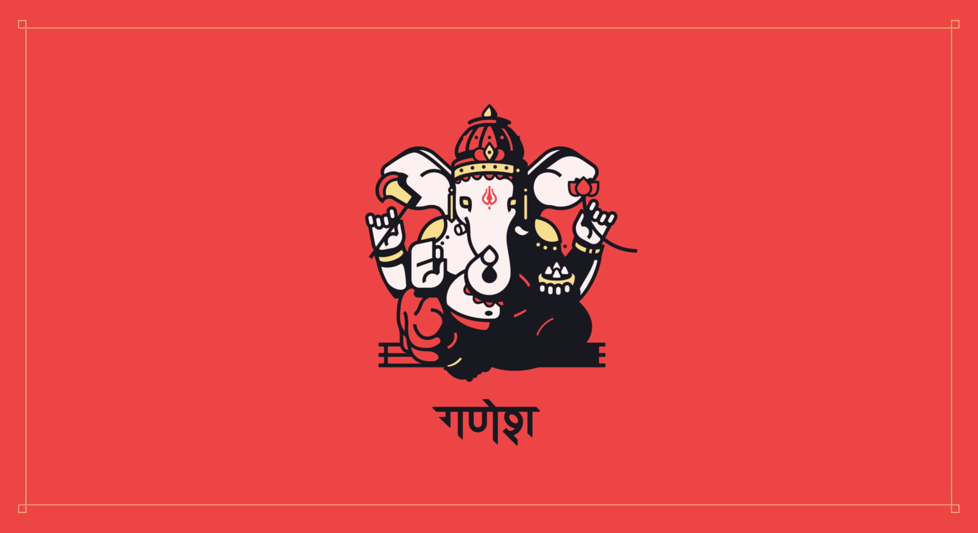
Ganesh
Ganesh's earliest name was Ekadanta (One Tusked), referring to his single whole tusk. There are a few variations on how Ganesh broke the other tusk. One variant states he lost it in a battle when struck by Parashurama’s axe. Ganesh allowed himself to be hit out of respect for Shiva, who gave Parashurama the axe. Shiva also decapitated Ganesh, giving him an elephant head in the first place…
I always found this Hindu Deity interesting an illustrated him in this graphic style.
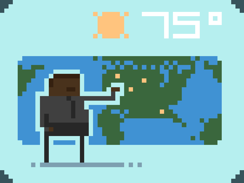
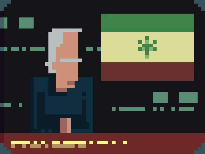
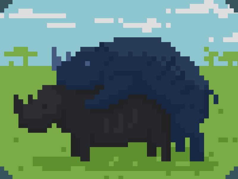
TV Programming

Programming will Resume Momentarily
As a programming study, I developed a simple game base around trying to guess the channel that had a signal. Not that thrilling to play, but learning php functions & javascript animation was worth the development budget! I went with a pixel art style to quickly animate the different tv channels. From Al Roker’s morning weather reports to the curiosities of Animal Planet’s “wilder” side, each channel represents a 90’s television classic.
Video Prod. Site
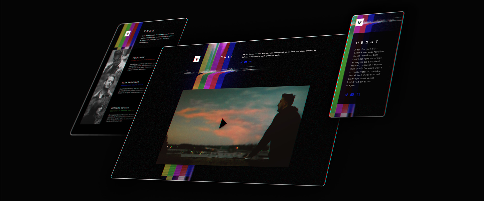
V
A website design for a small video production team, mostly showcasing a video reel and the team.
WordPress theme experience:
Responsive Design, Template Page Creation, Custom Post Types, Visual Content Editors
SCSS, JS, PHP