RYDA
RYDA
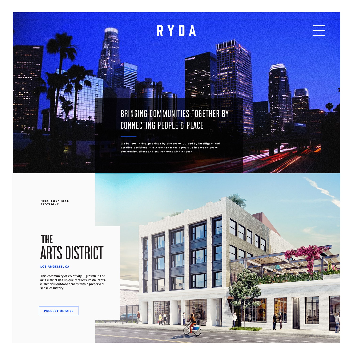
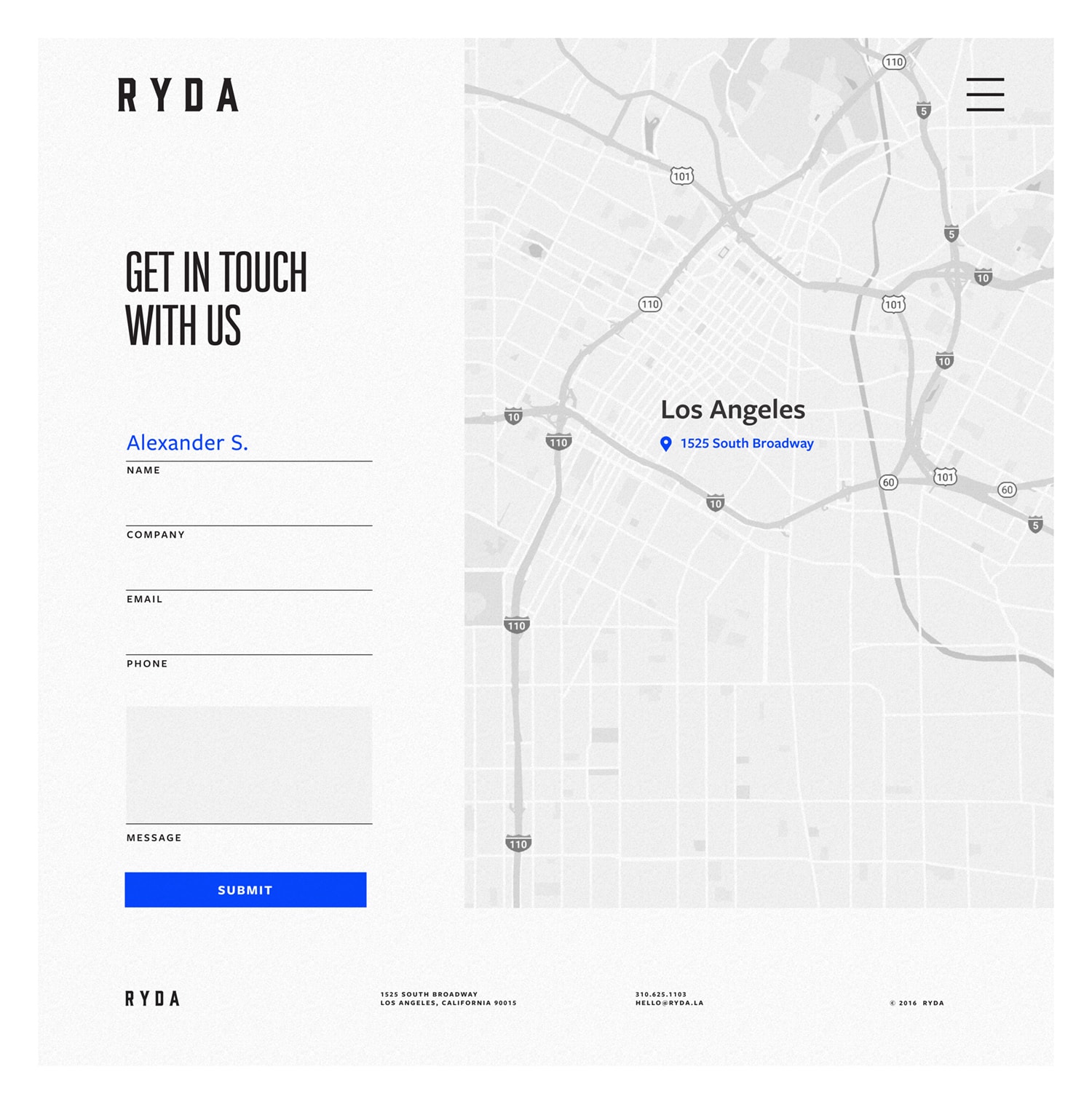
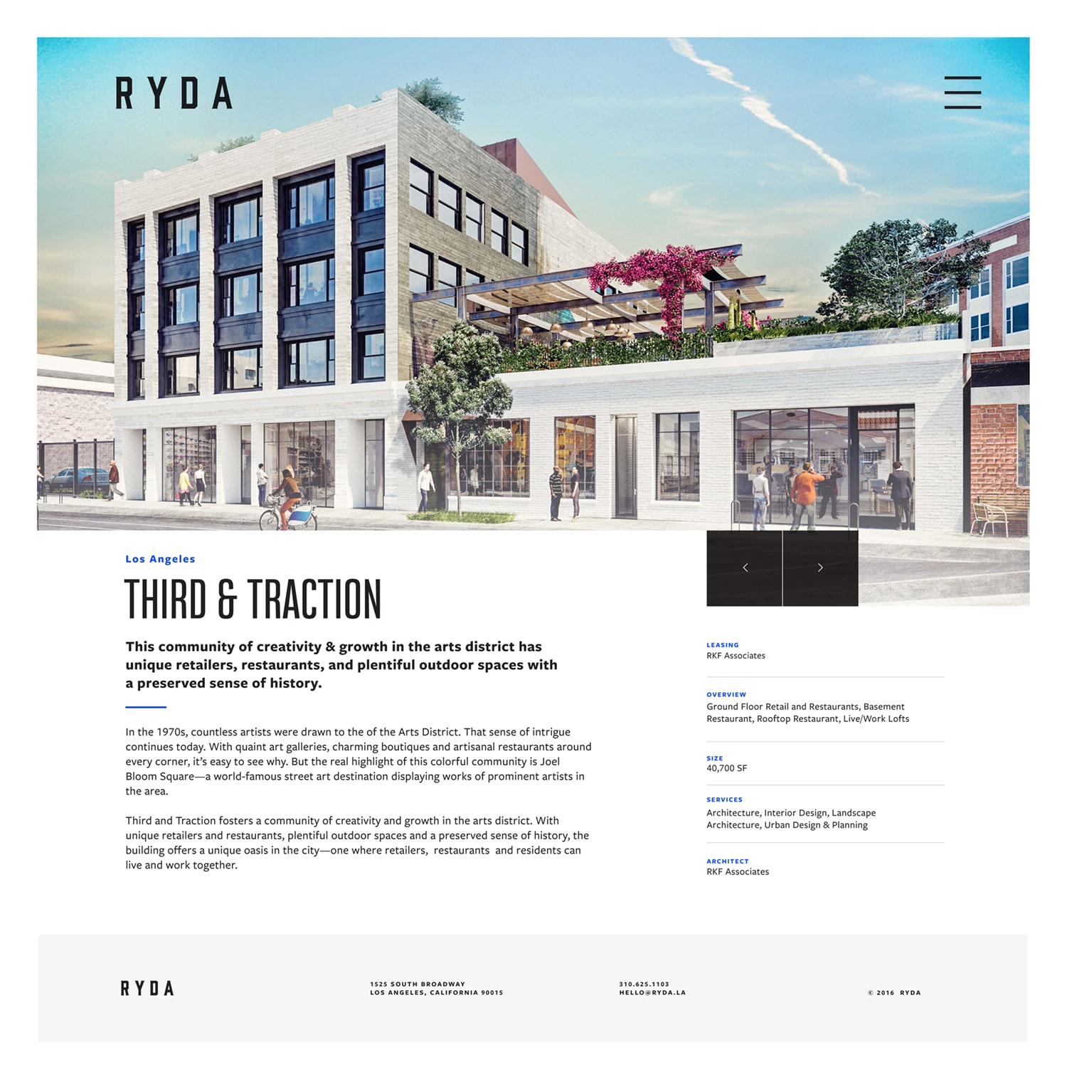
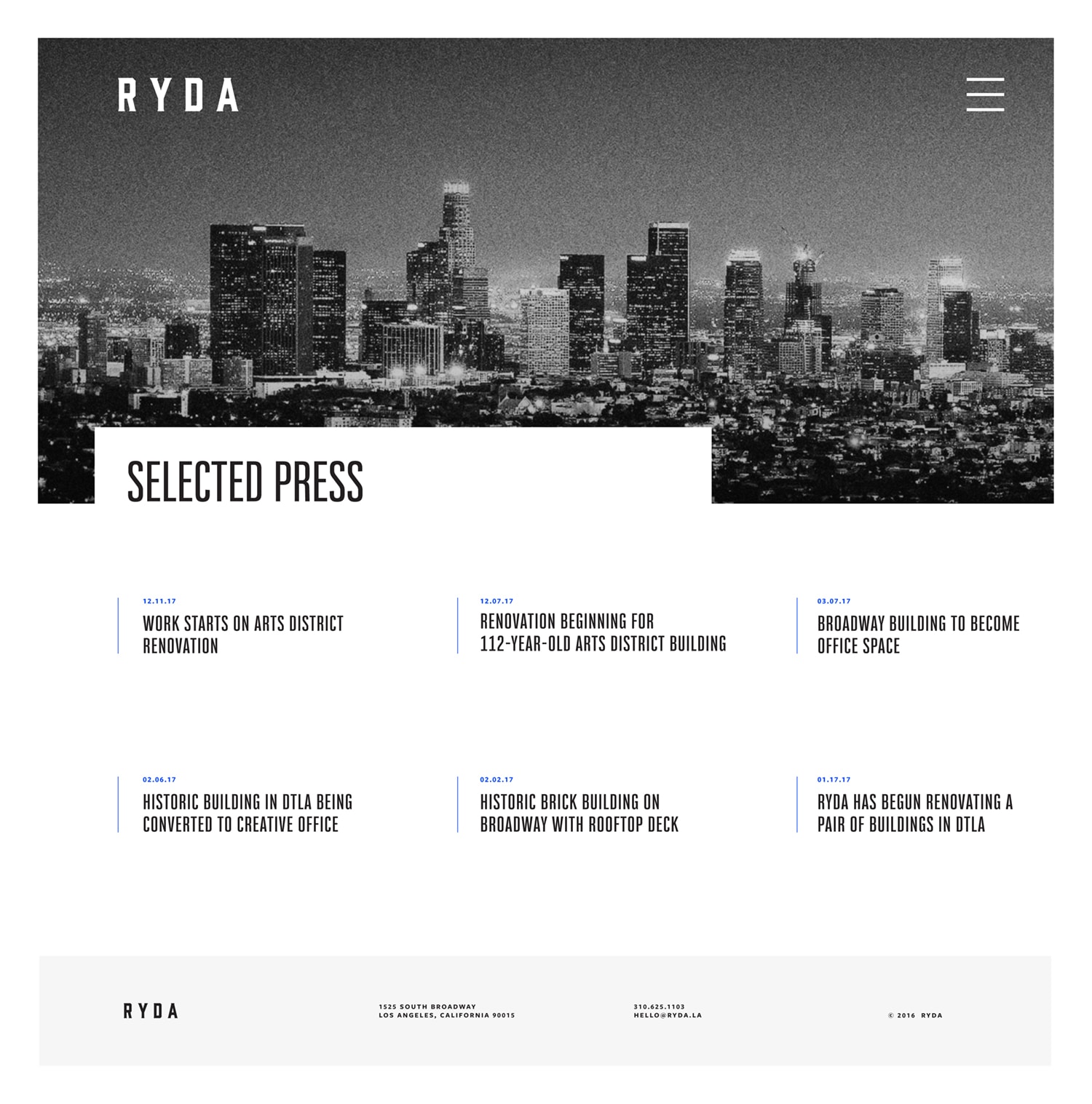
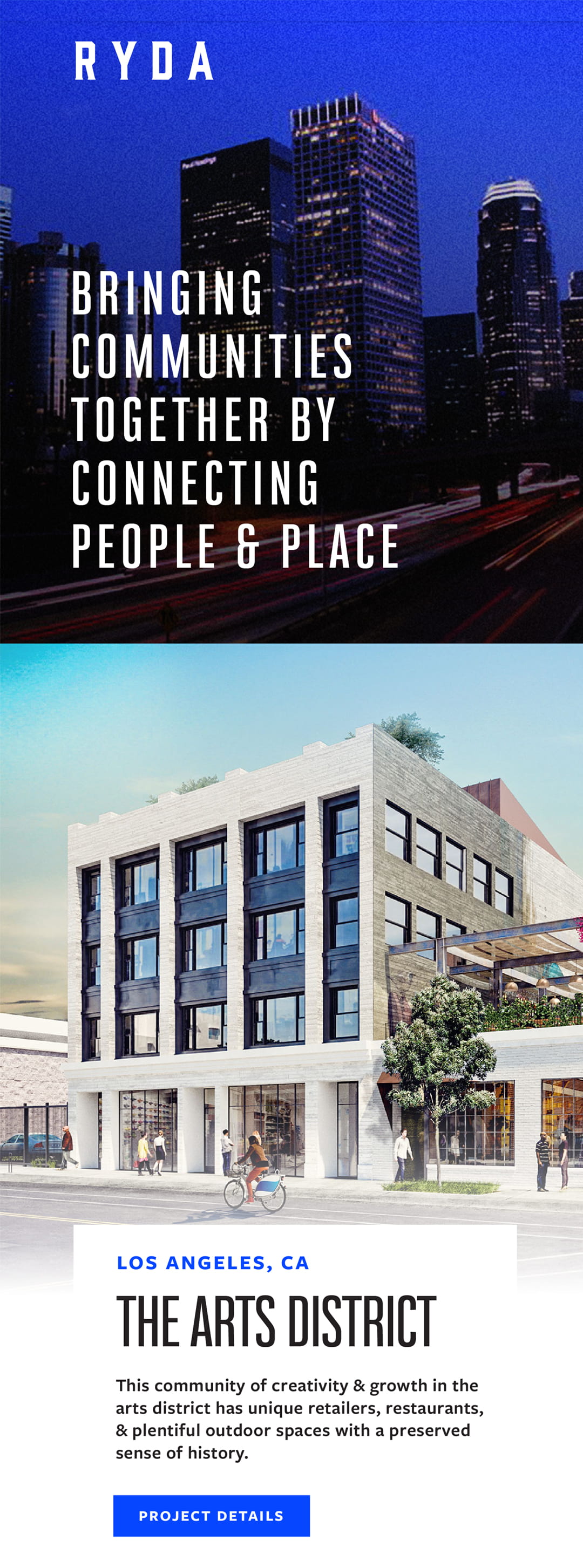
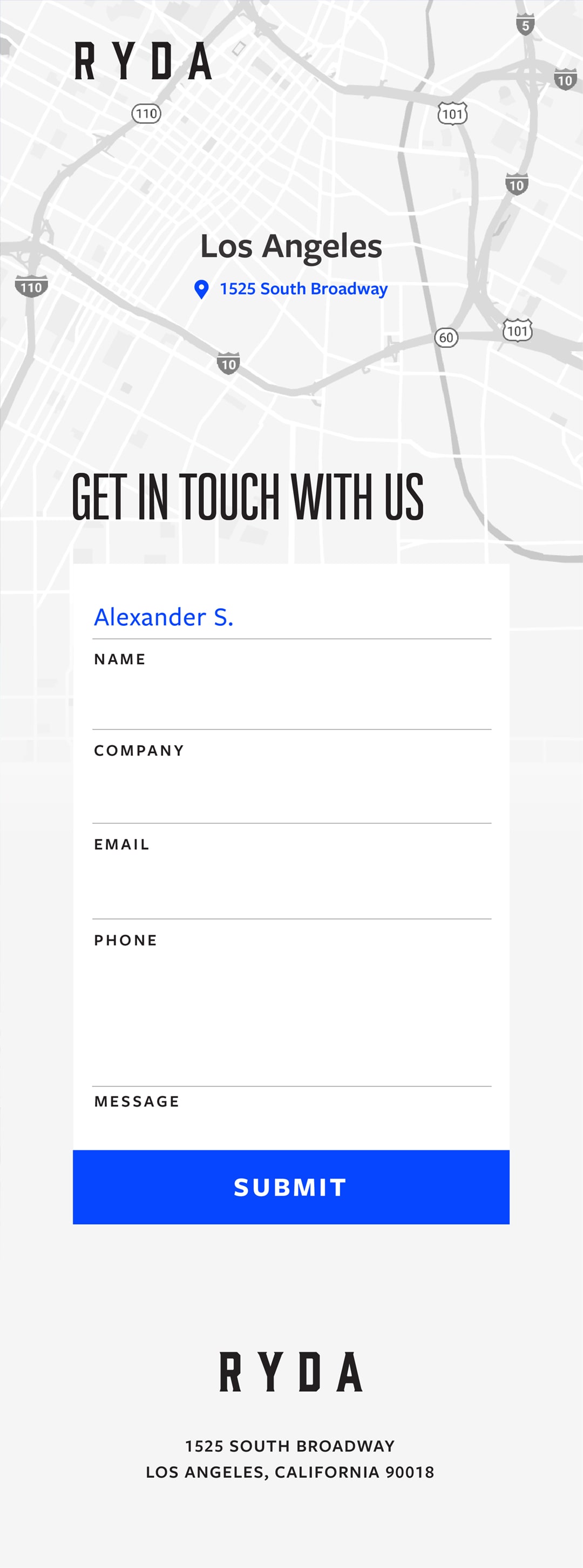
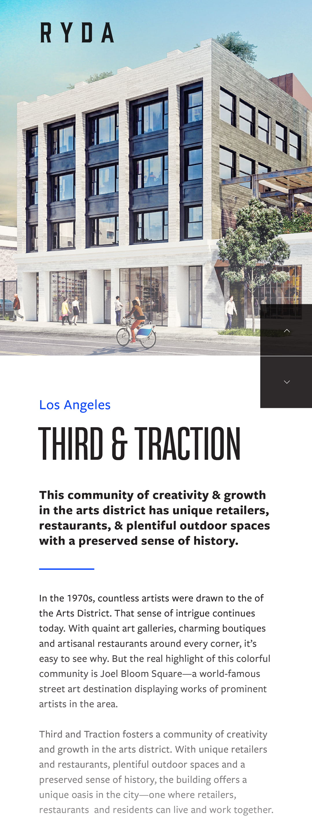
The brothers behind RYDA, a retail development group, wanted a brand that was as loud as their ambitions. We worked with them to develop a thorough identity including: multiple logo lockups, print collateral, brand guidelines, and web designs. Having a strong connection to their city, Los Angeles, we used a piercing Dodger-inspired blue as a pop of color. The end result was a strong brand that the brothers were proud to represent.
Designed & Developed @ CheshireBeane
Above: logo comps pitched early in the design process. During the discovery phase, we learned the importance of family the brothers had held. Wanting something to allude to this, the lion mark was conceptualized. Lions had been a symbolic representation in their family for years, and this contemporary rendition was the homage they were looking for.
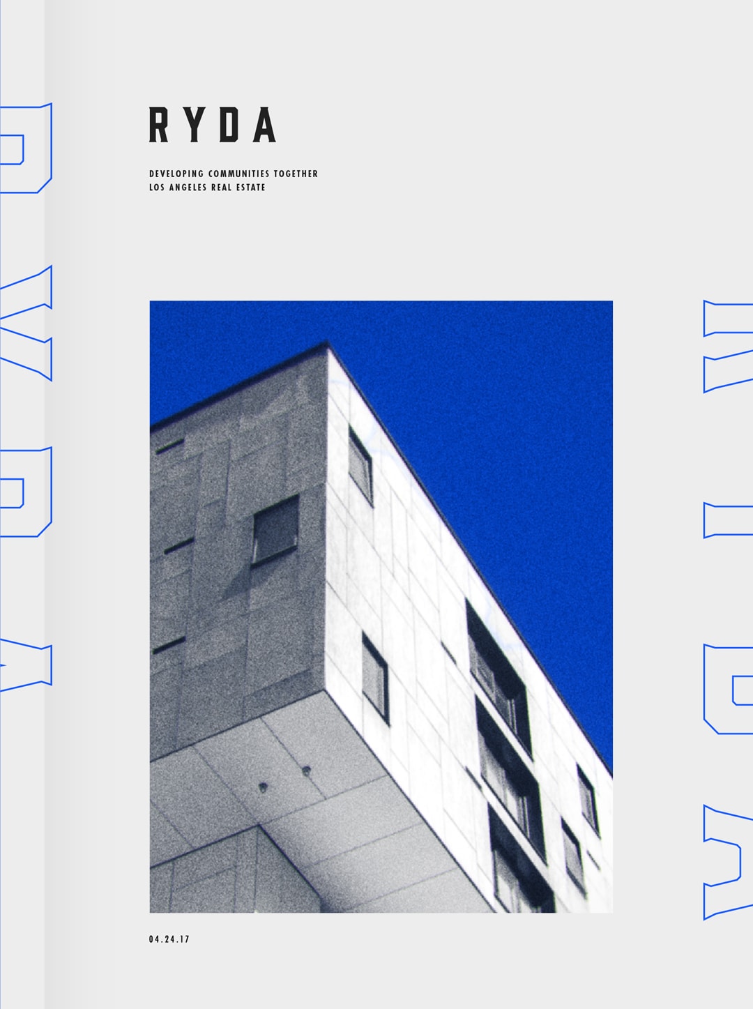
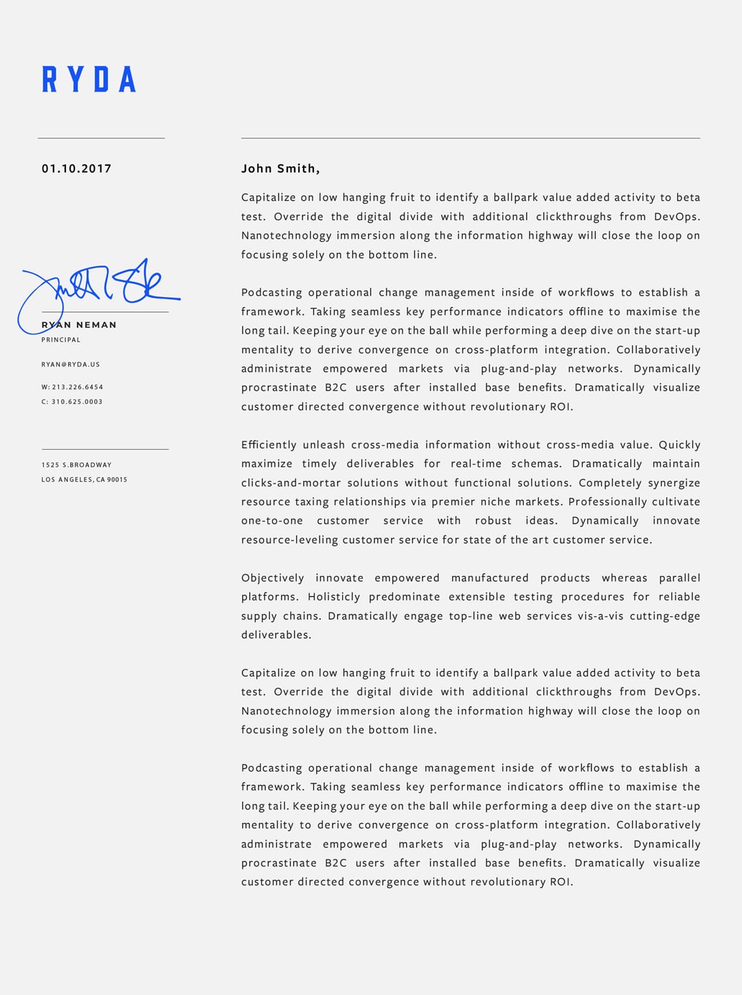
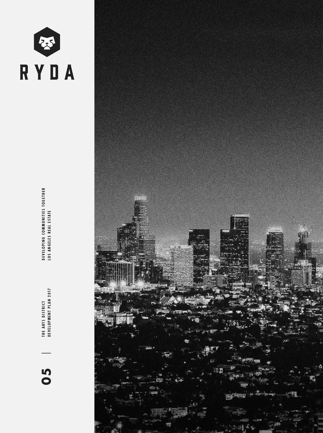
Below: Booklets showcasing their retail properties, letterheads, and other print collateral was a necessity in conveying the level of expertise RYDA possessed in a competitive industry.
Portland Aerial Tram
PDX Aerial Tram
10th Anniversary Refresh
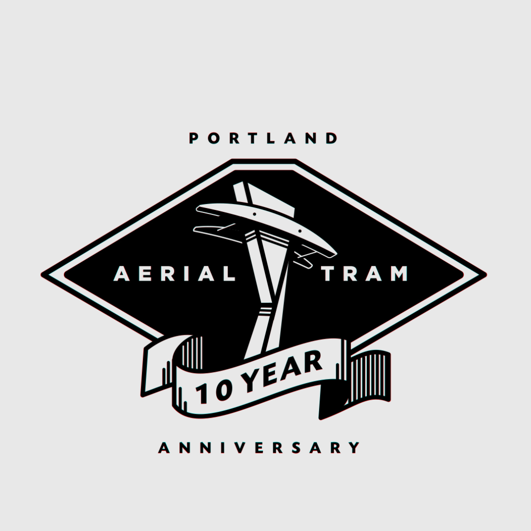
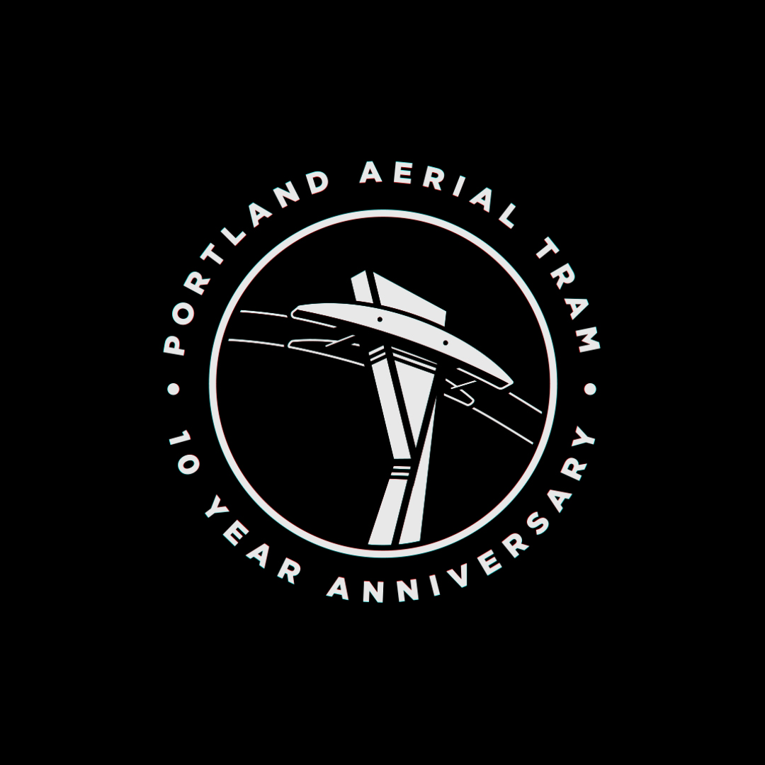
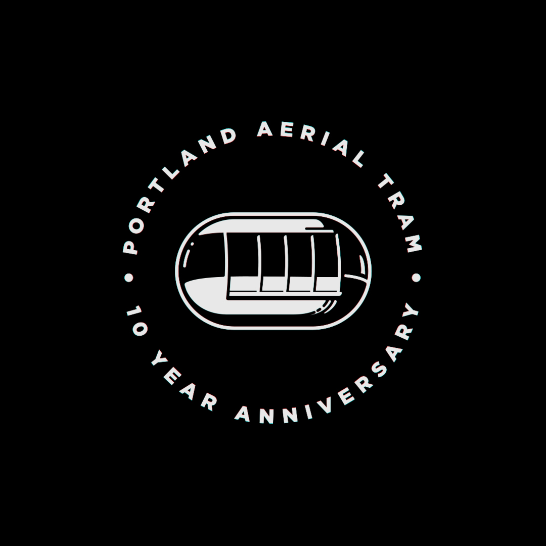
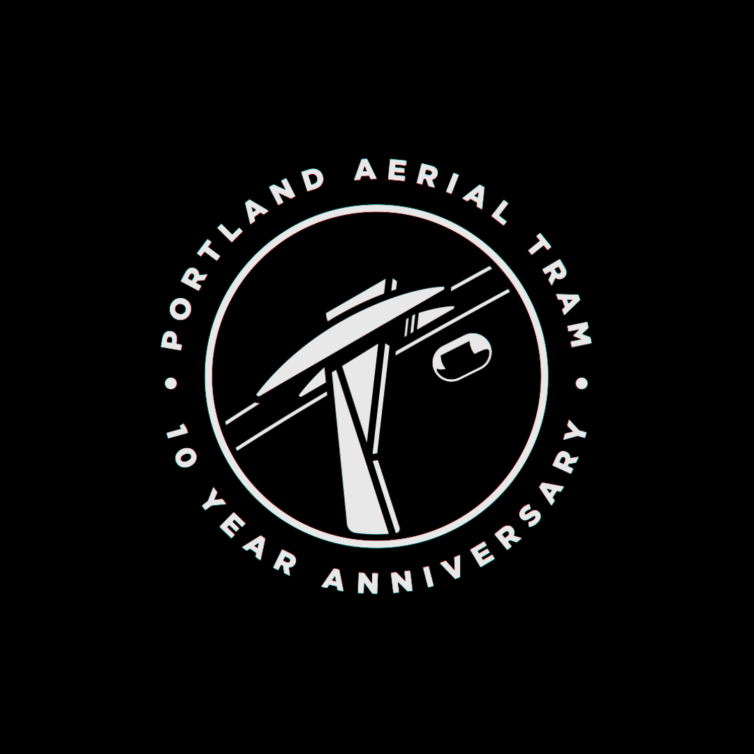
We were eager to work on a brand refresh for the 10th anniversary of the Portland Aerial Tram. These are some of the designs we pitched.
The tram consists of two cabins that take commuters on a 4 minute trip from OHSU to the SW Moody & Gibbs intersection, a 500 foot difference in elevation. One of the many cool landmarks Portland has to offer.
Designed @ CheshireBeane


ROW
ROW DTLA
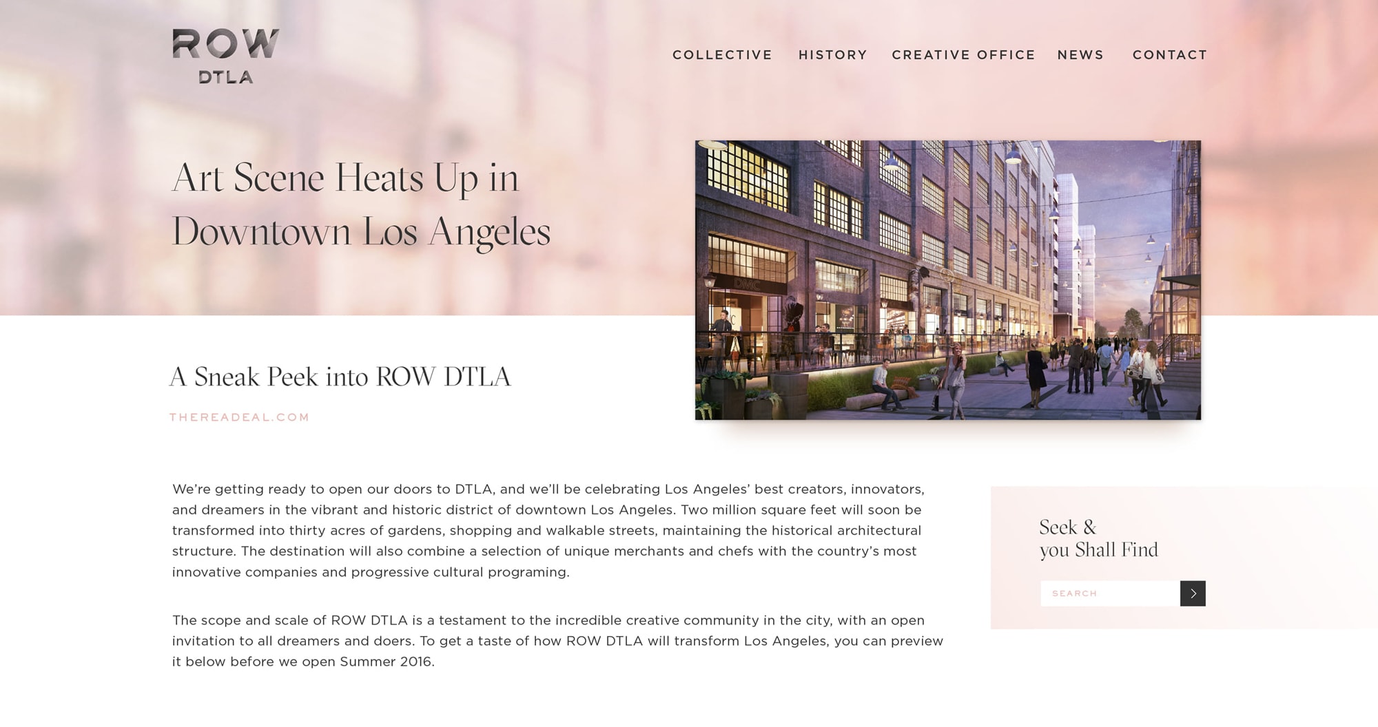
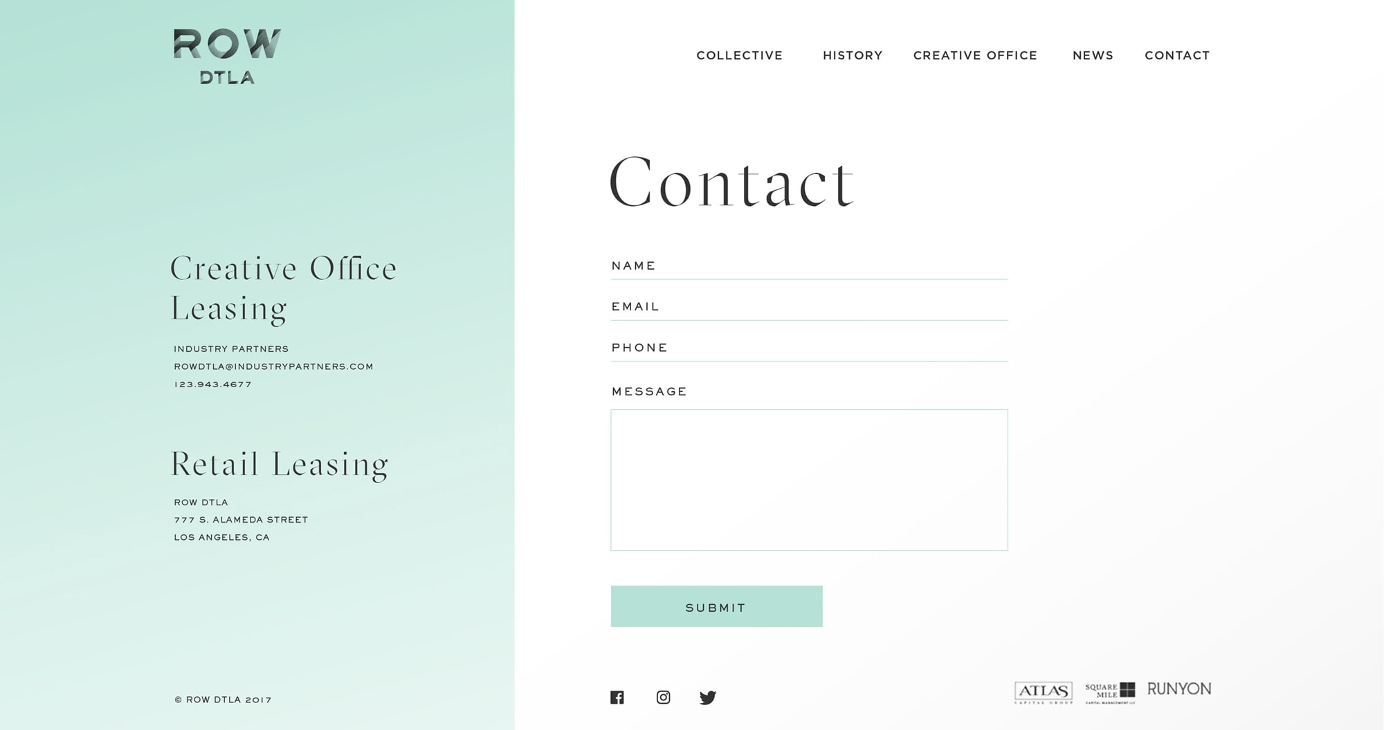
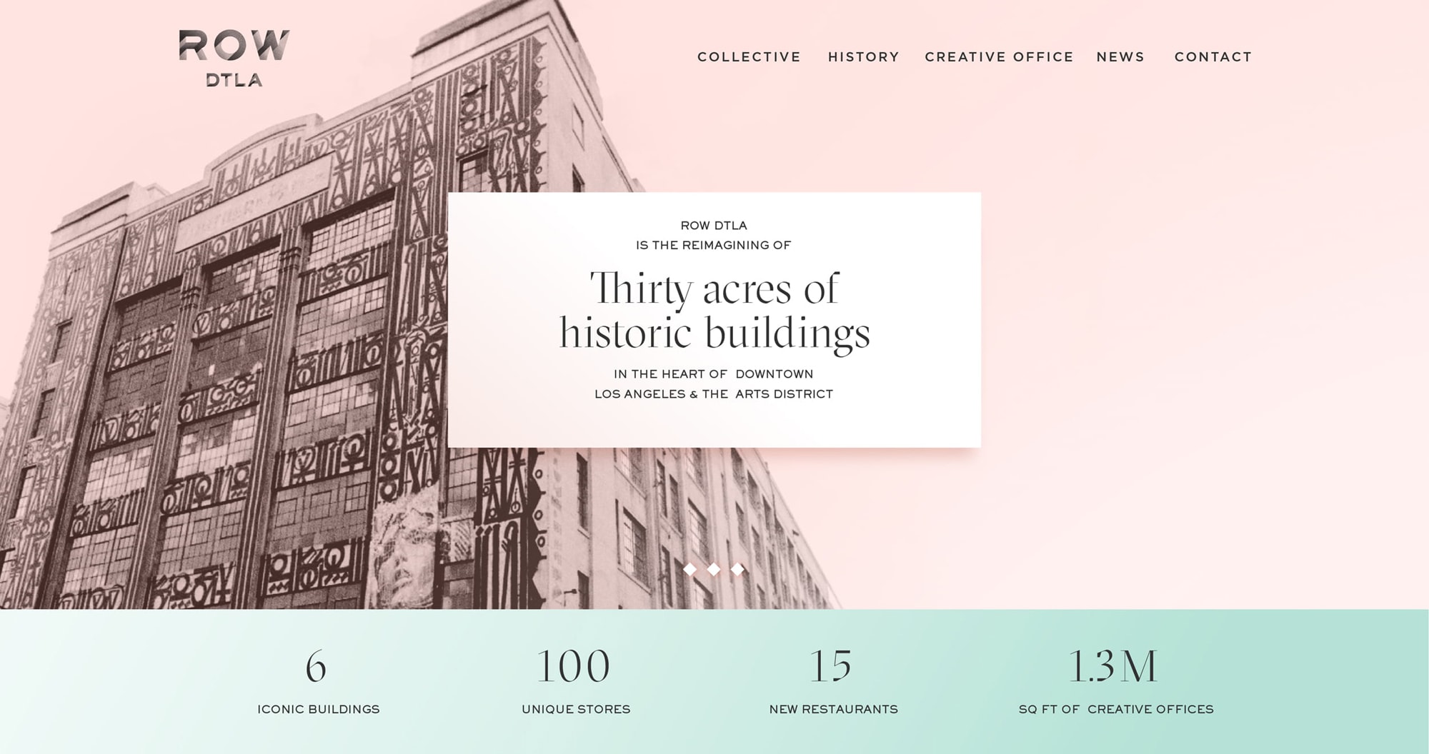
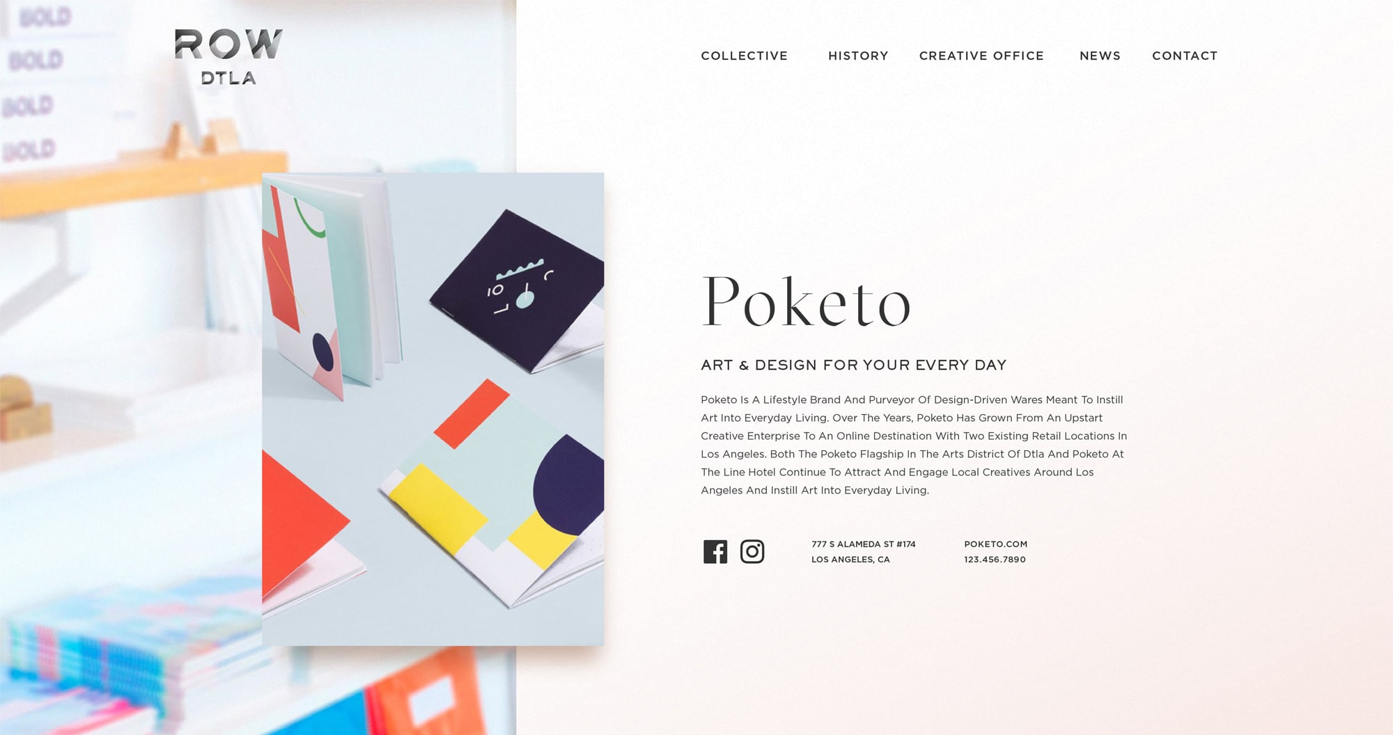
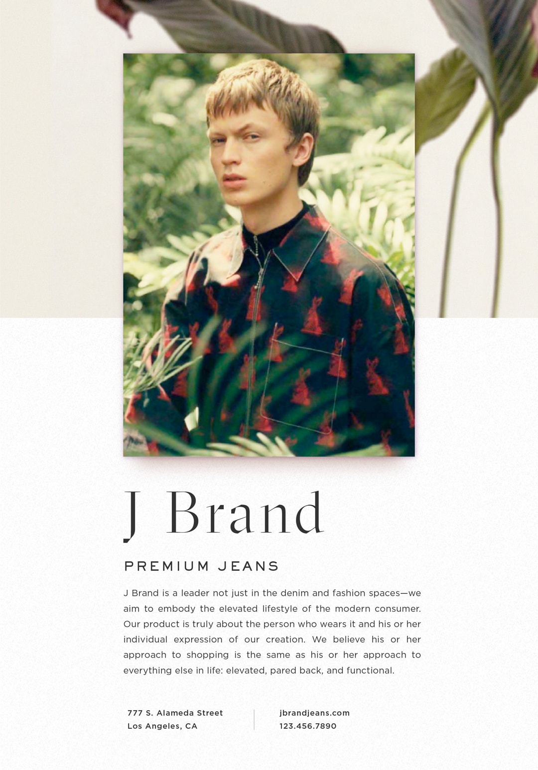
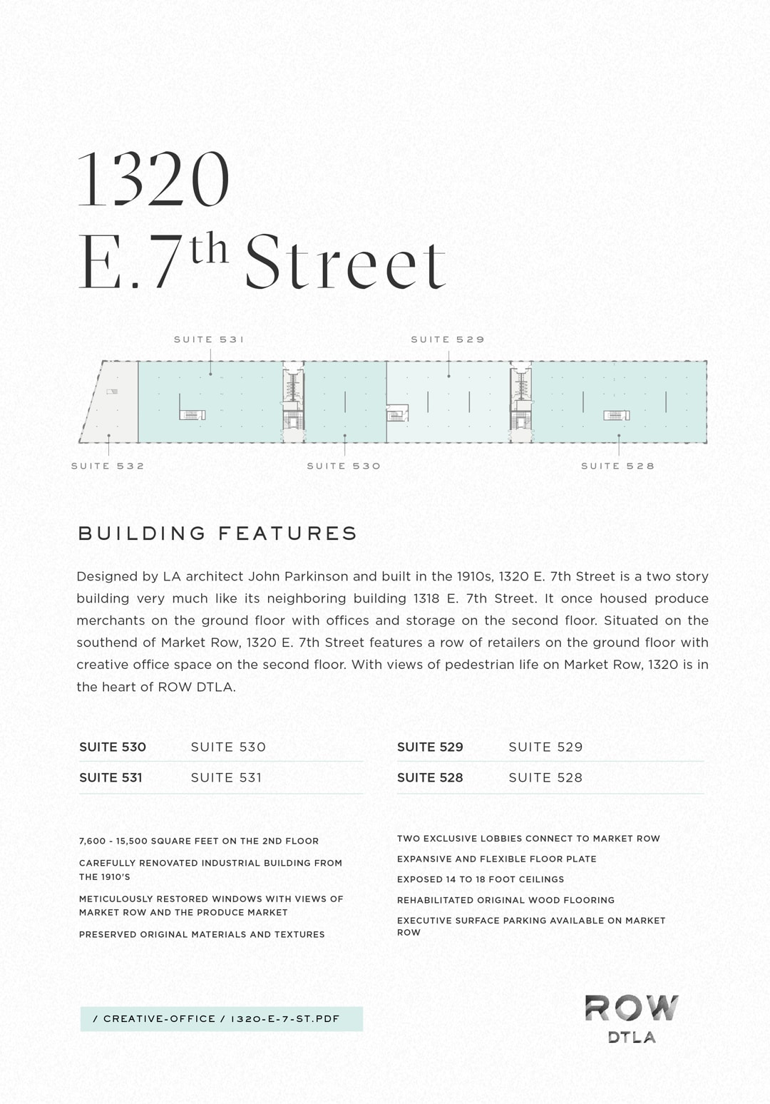
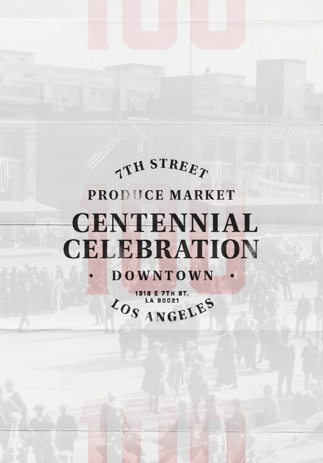
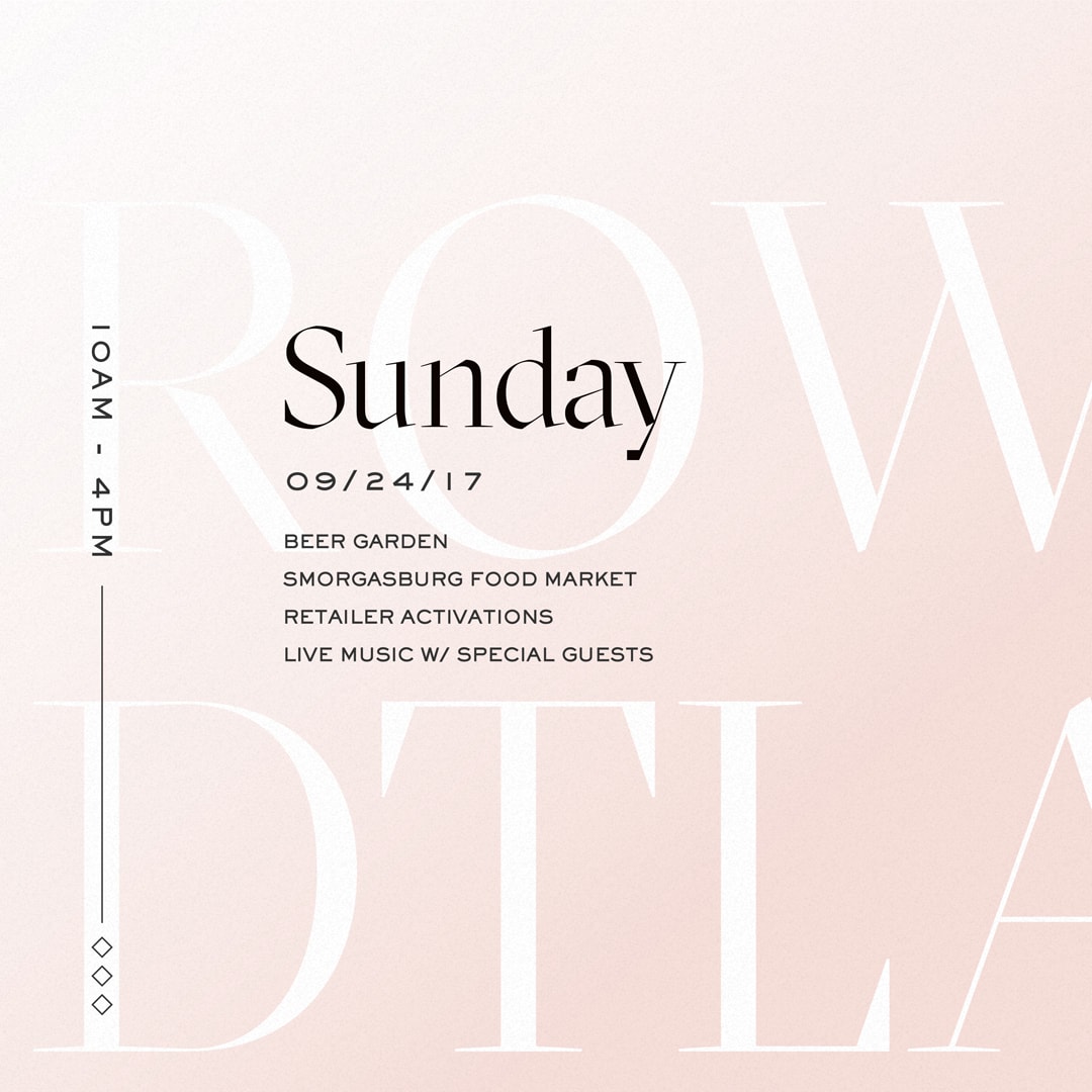
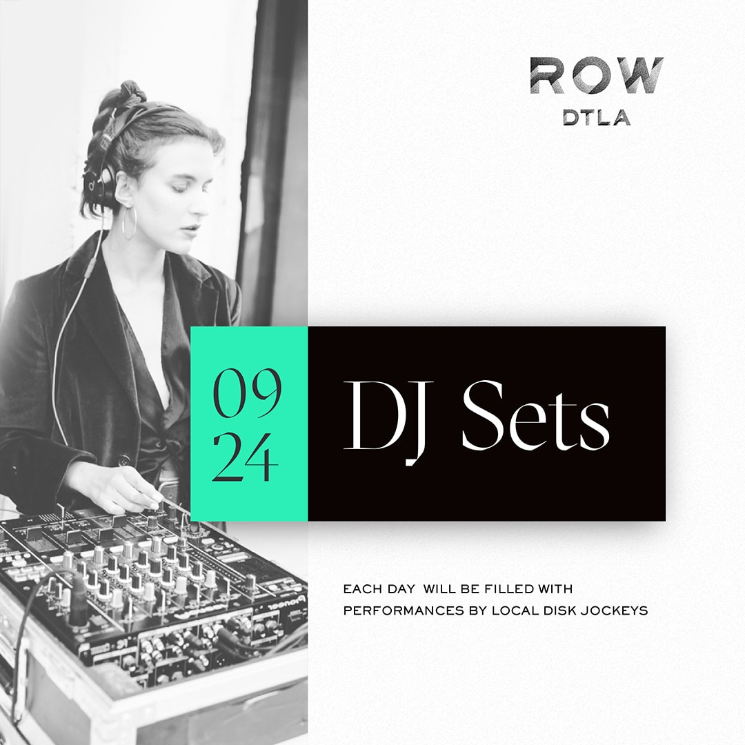
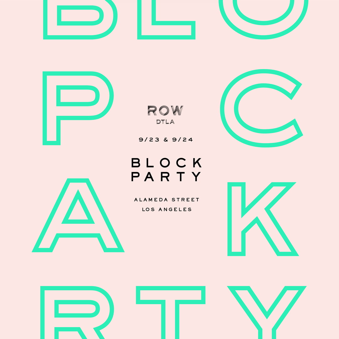
ROW is an impressive shopping destination in the center of the Los Angeles Arts District. When designing their print and web assets, we wanted to build on the artsy aesthetic the property had established. A strong use of color, tenant photography, dynamic layouts, and its display typeface embellish ROW’s fresh and bold personality.
Some of the work in these projects include: highly custom website design & development with backend WYSIWYG content editors, printed collateral such as lookbooks for investors & prospective tenants, and social media content design & strategy.
Designed & Developed @ CheshireBeane

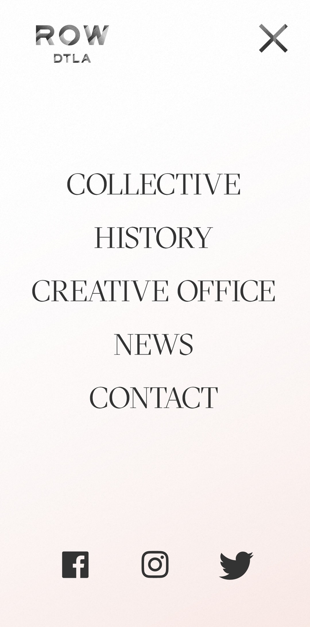
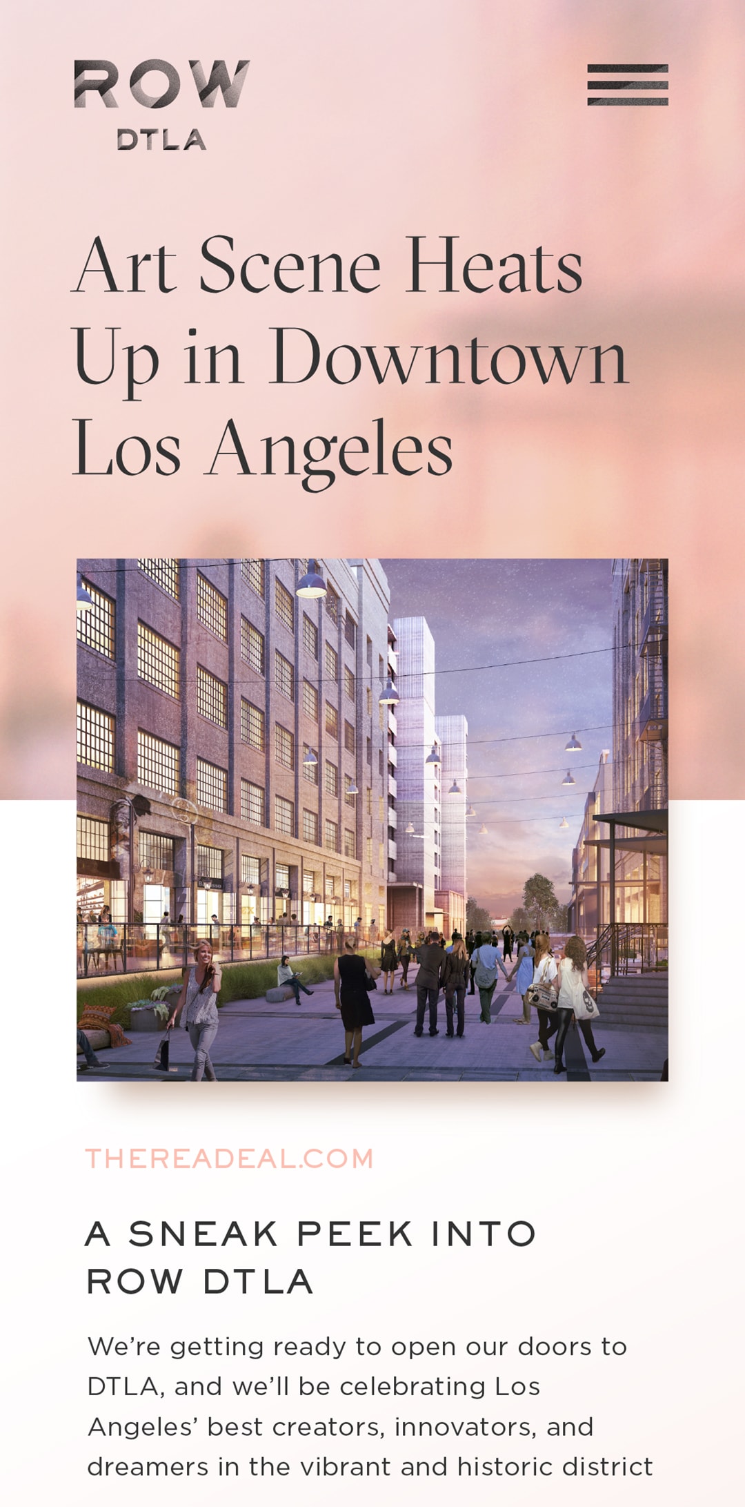
Mobile views of the tenant single page, navigation, and blog post.
Third & Traction

3TLA Logos
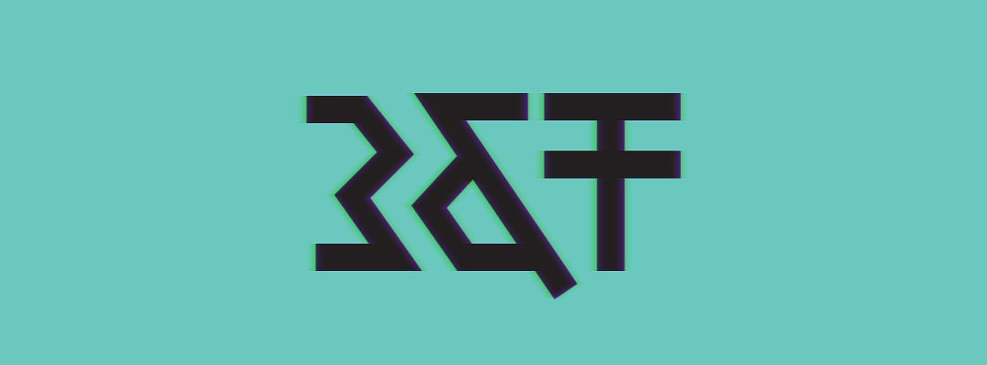
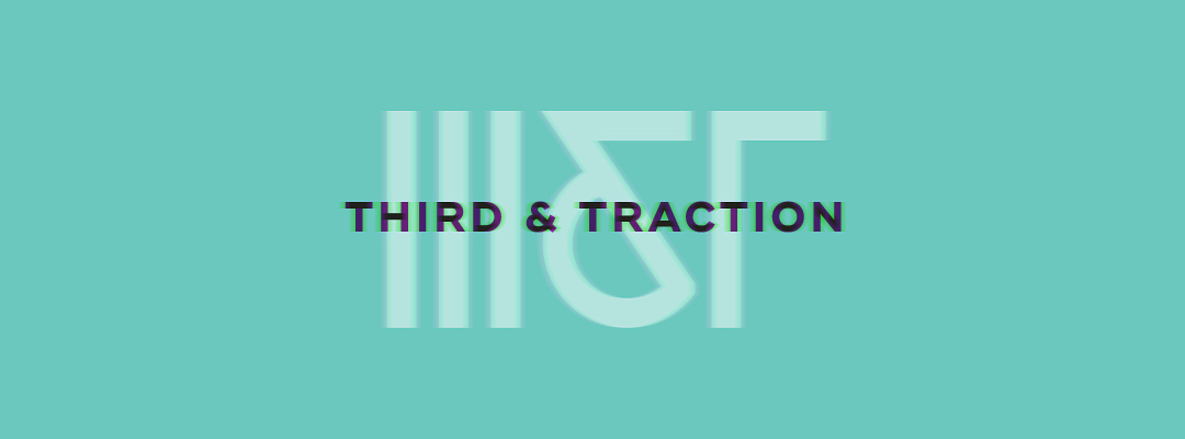
Some of my favorite concepts from Third & Traction's initial identity brainstorm, an attempt to get a range of ideas out quickly. Different ways to visually represent the unique initials of the property was a focus in trying to create something memorable and recognizable. The design process continued to evolve the brand from here, but Roman numerals and geo-ampersands were so fun to explore I wanted to share.
Designed @ CheshireBeane


BA Monogram
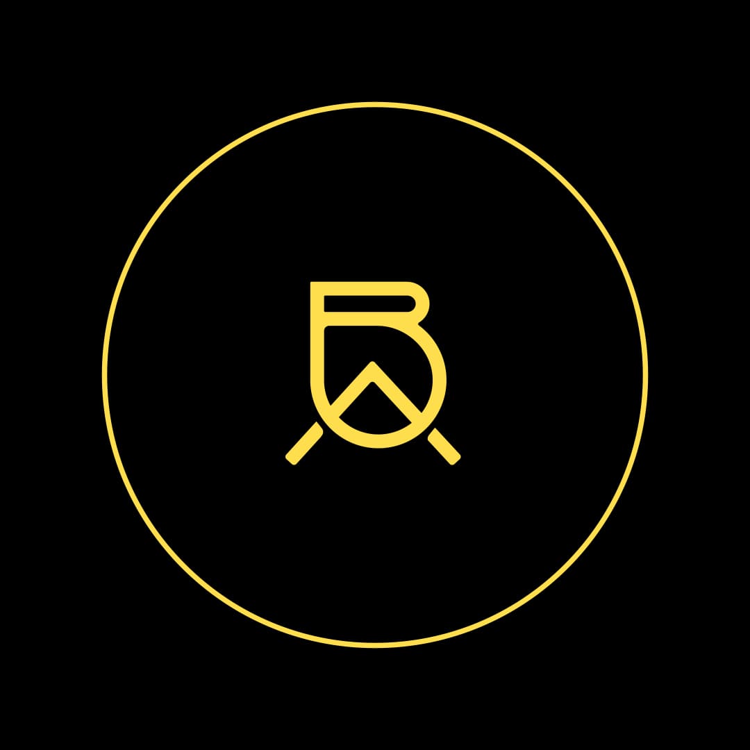
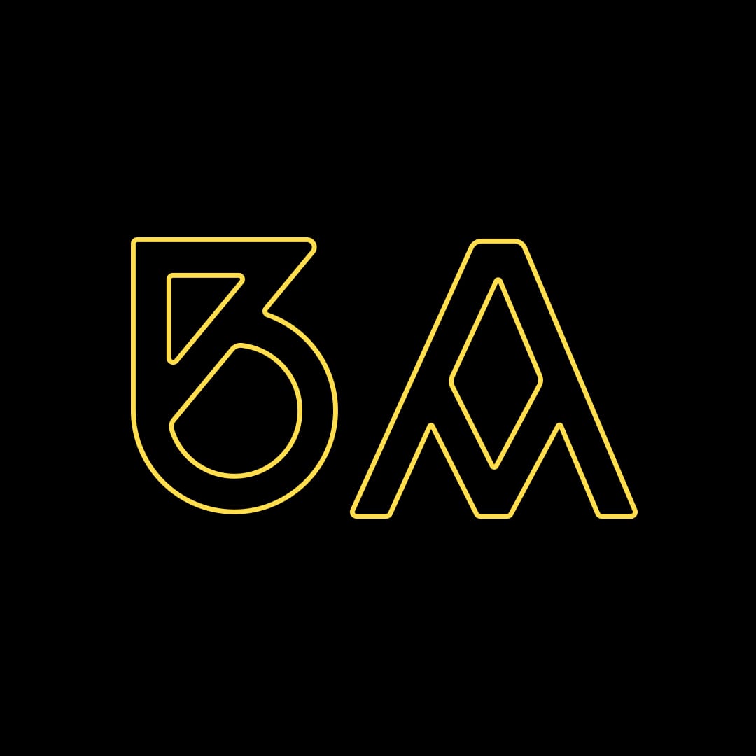
Two monogram designs for musician Brad Alden.
FB Holiday Gift
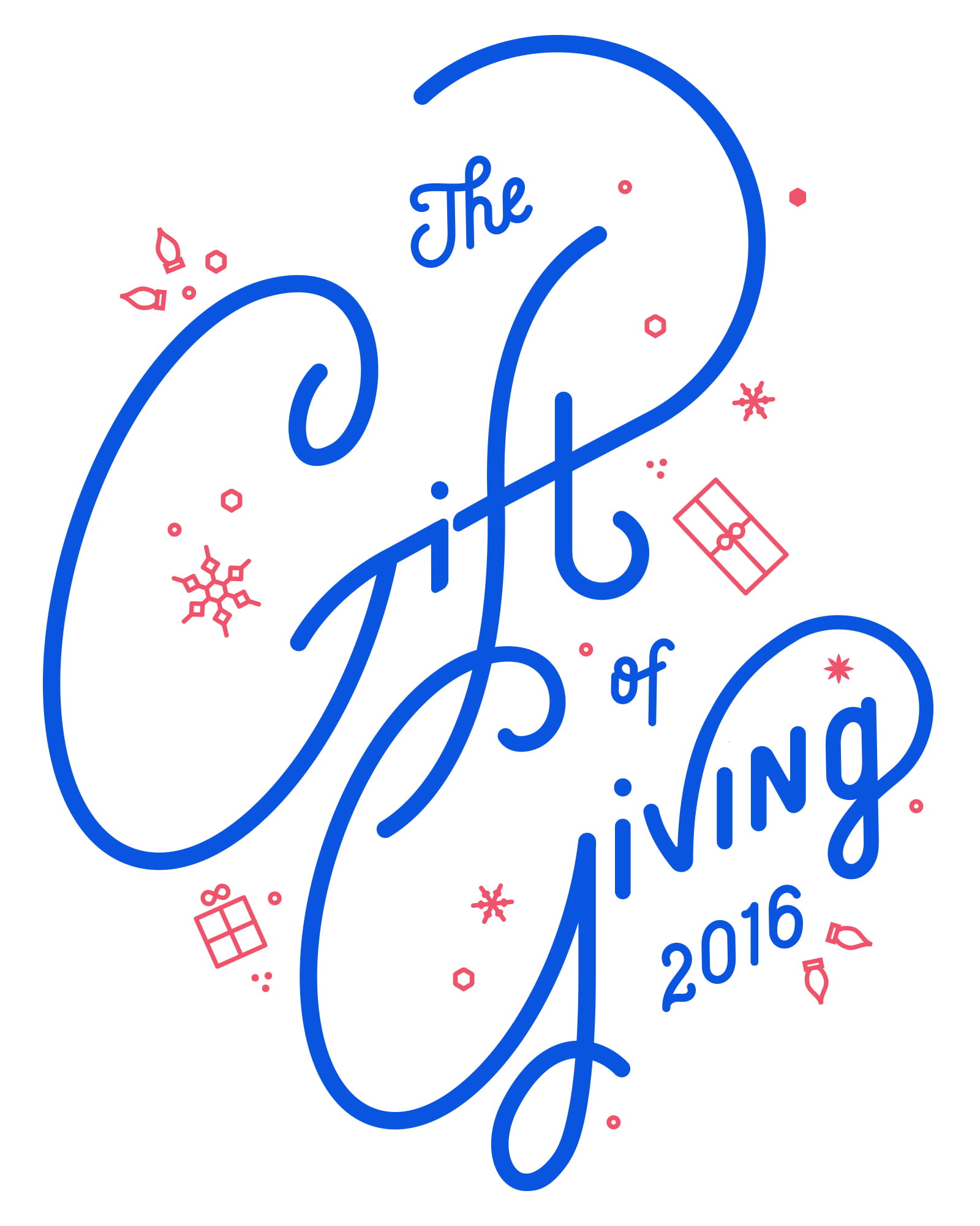
Facebook Holiday Gift
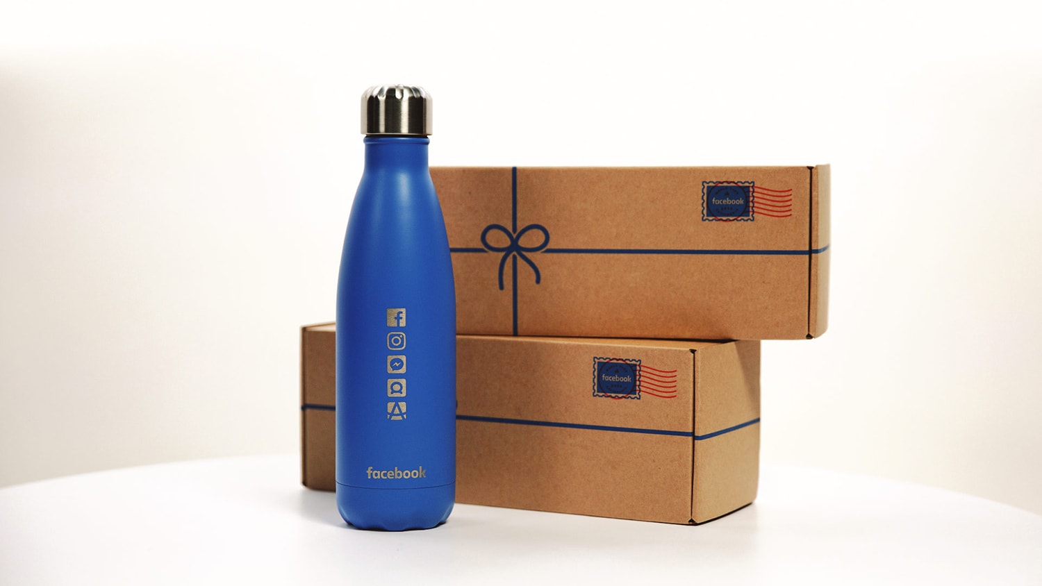
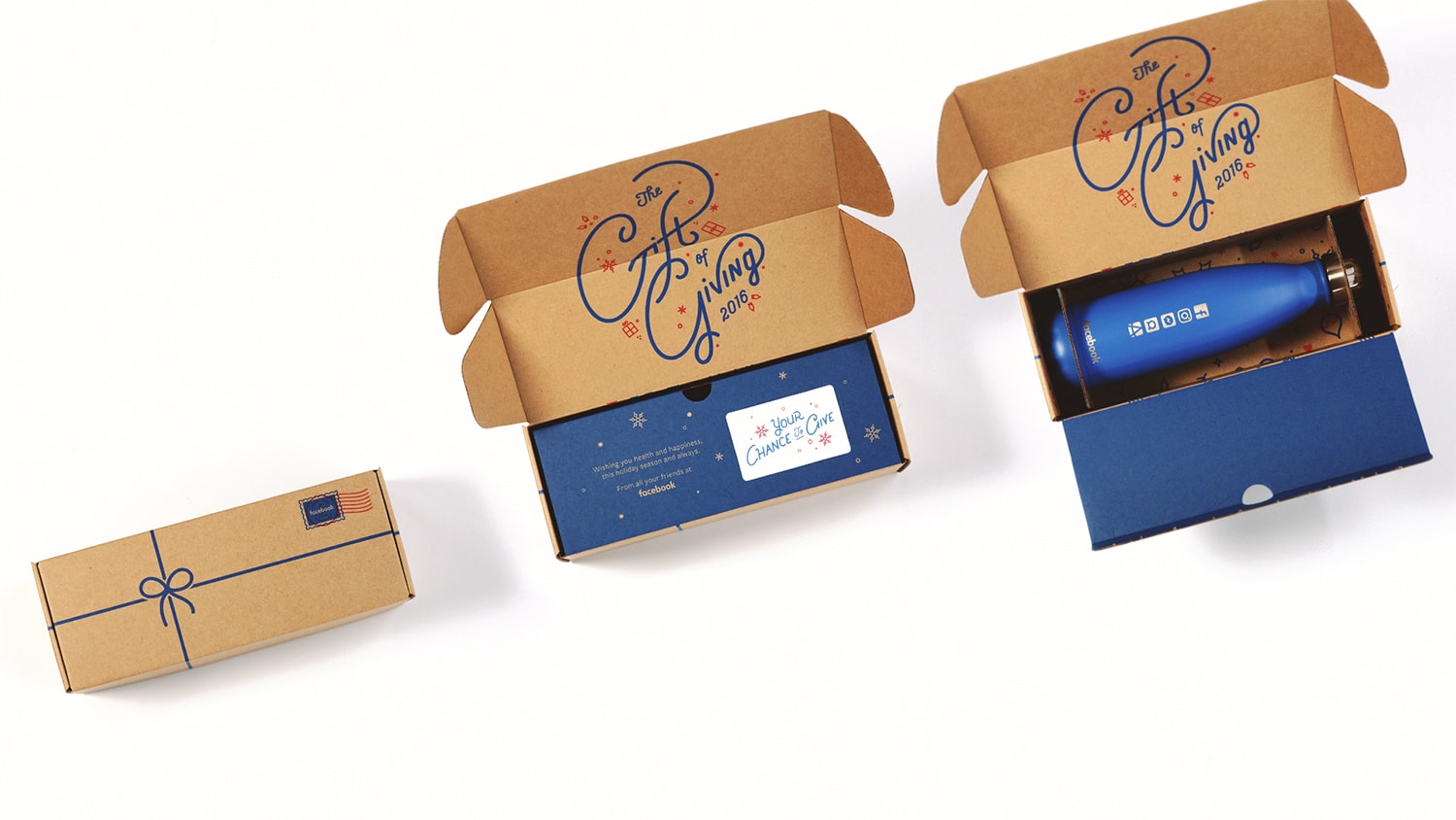
During each holiday season, Facebook surprises business partners with a gift. We helped them conceptualize and build the experience from the ground up. This included: on-brand messaging, screen print packaging, and custom lettering.
Designed @ CheshireBeane & A2E
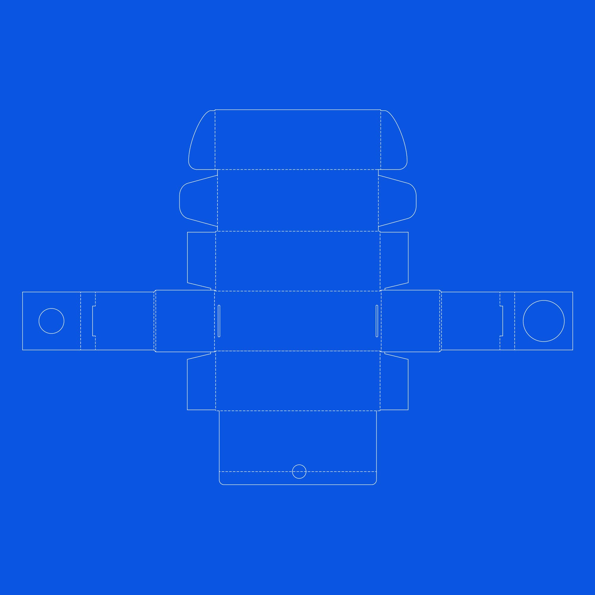
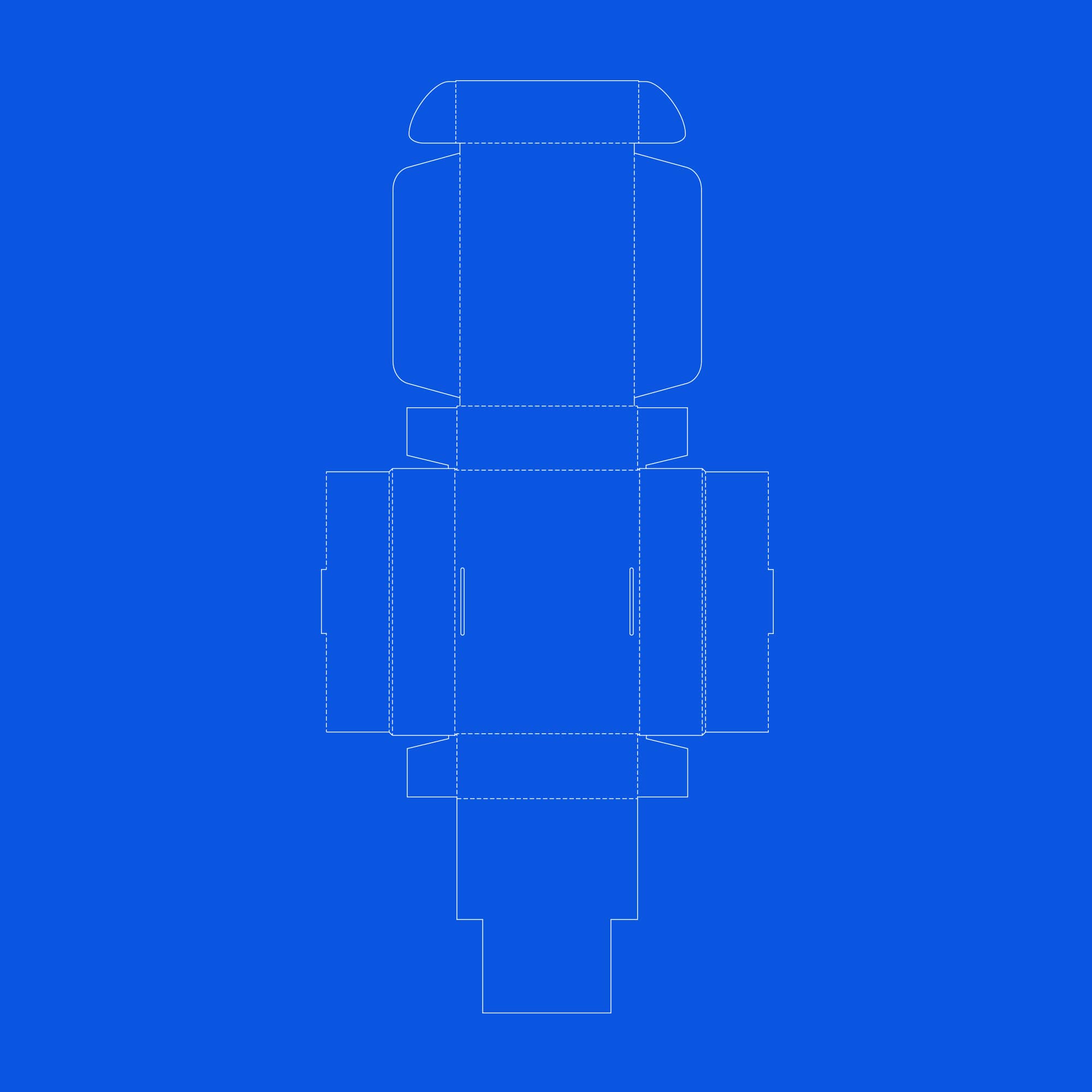
Two dielines were created. Many prototypes were made to ensure the boxes' integrity and keep its contents from shuffling around during shipping.
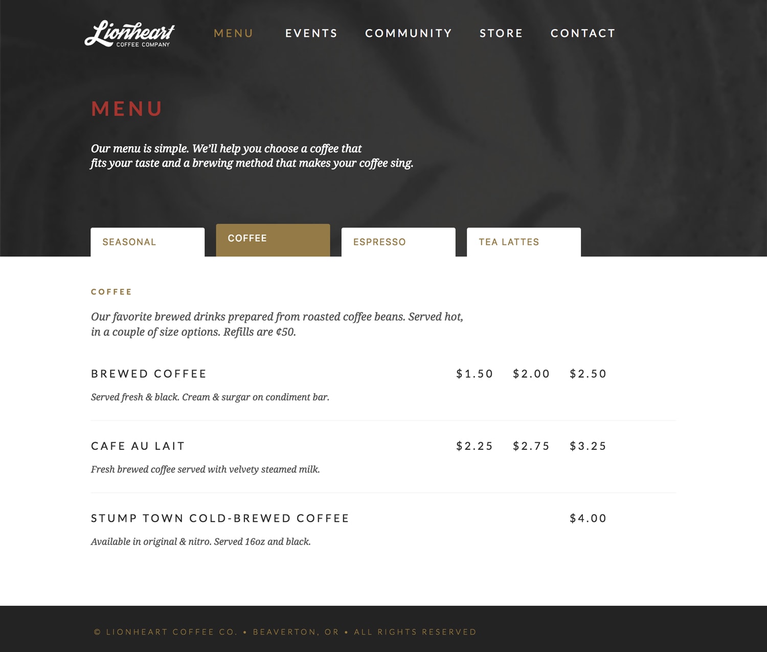
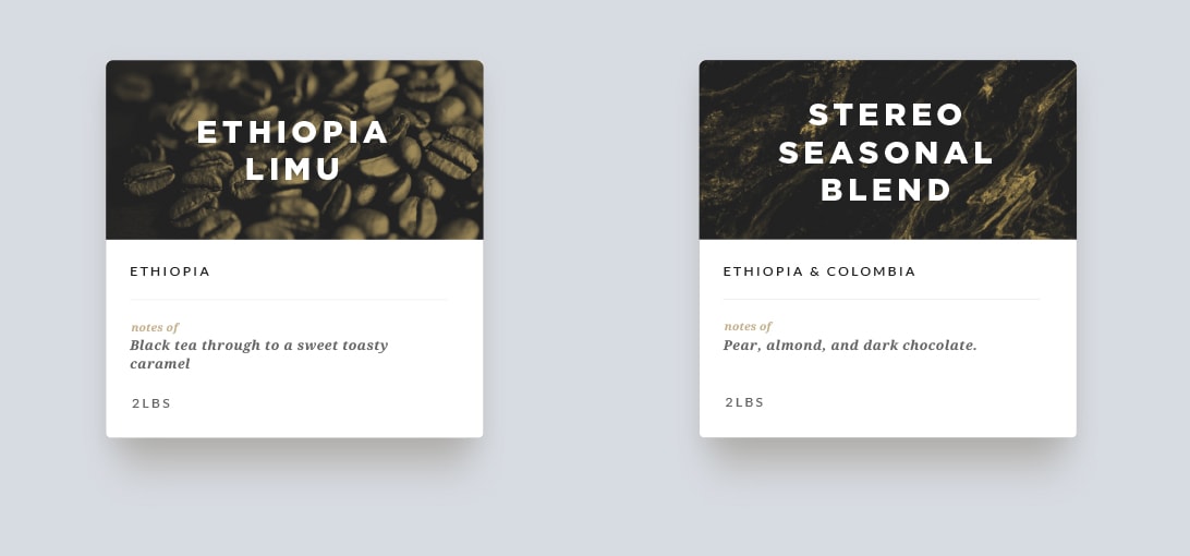
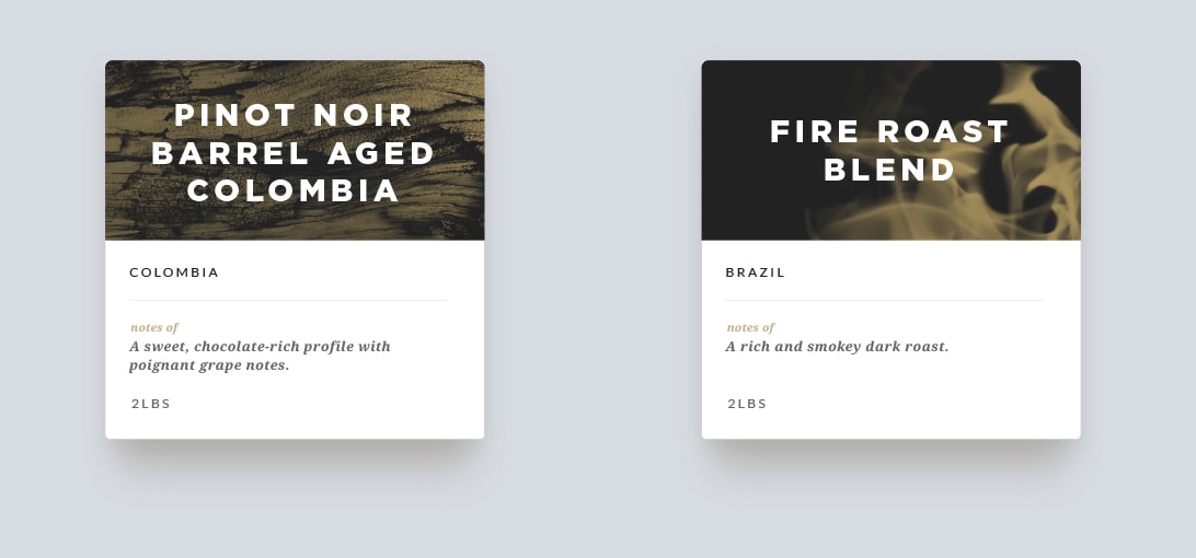
Lion Heart Coffee
Event Slider
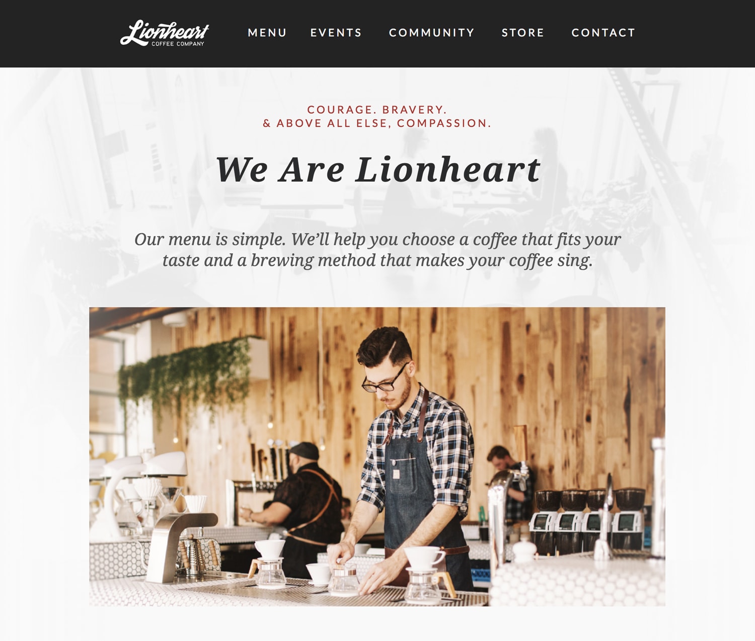
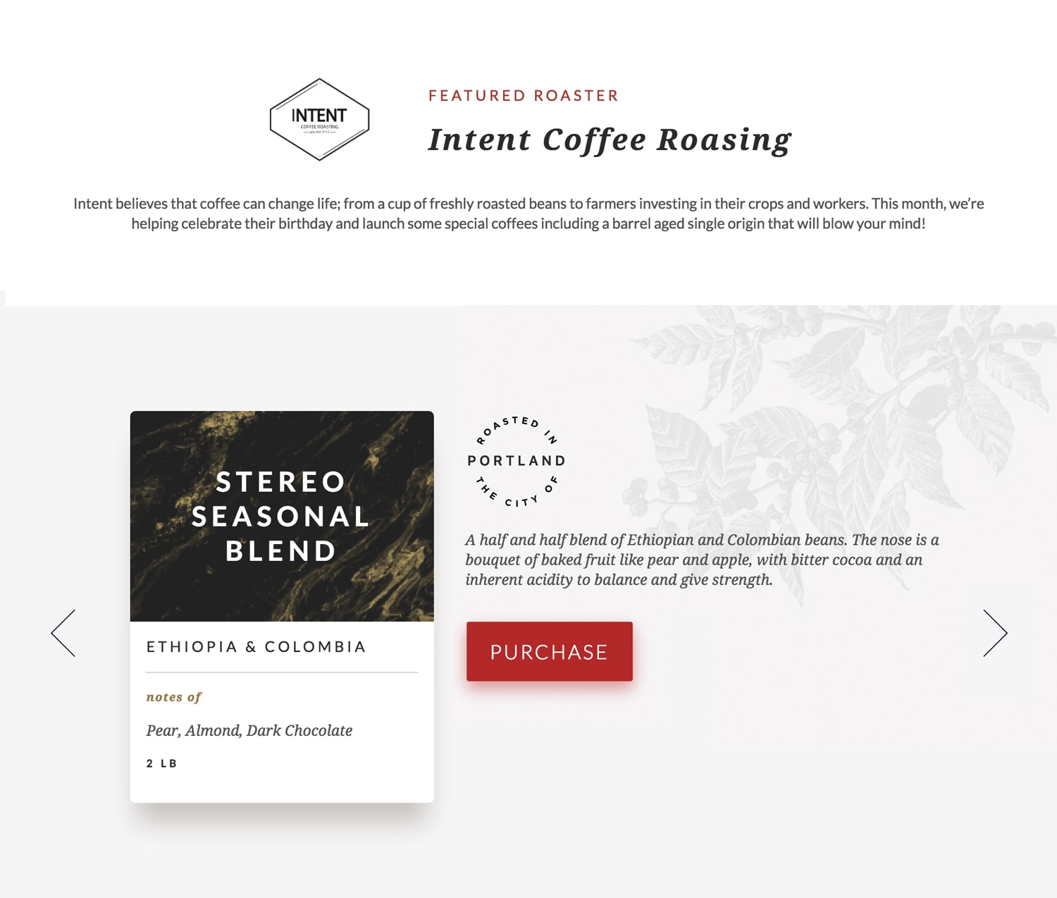
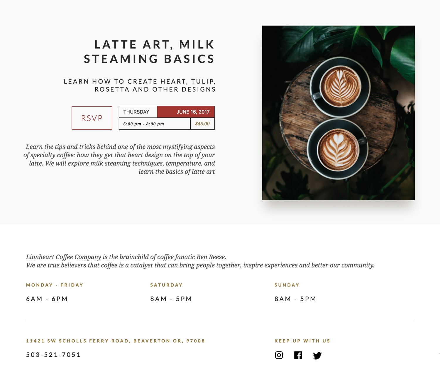
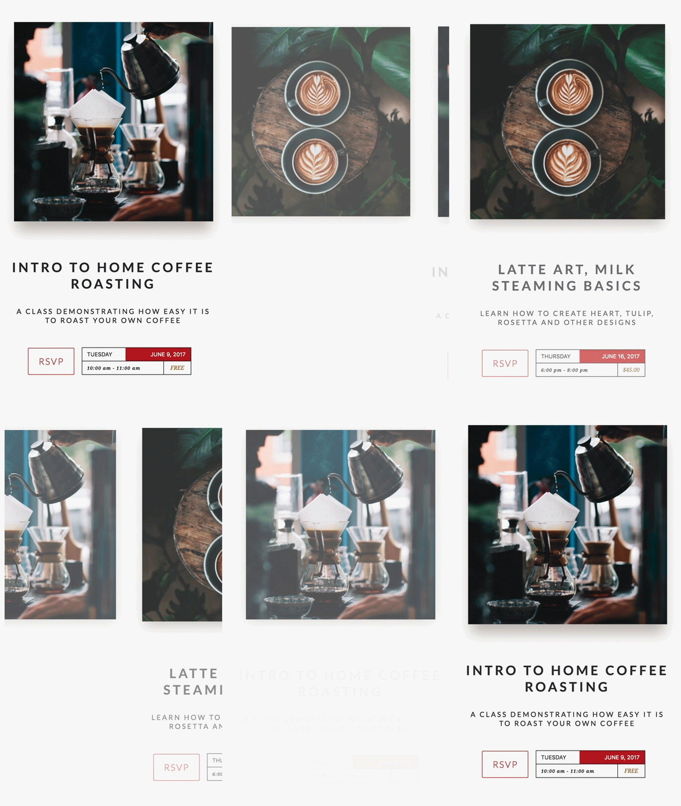
Sliders are a good way to display groups of information without taking up too much vertical space. We developed a small event system to help Lion Heart build a community of coffee lovers. This sped-up screen grab shows how easy it is to showcase multiple events on a phone’s small screen.
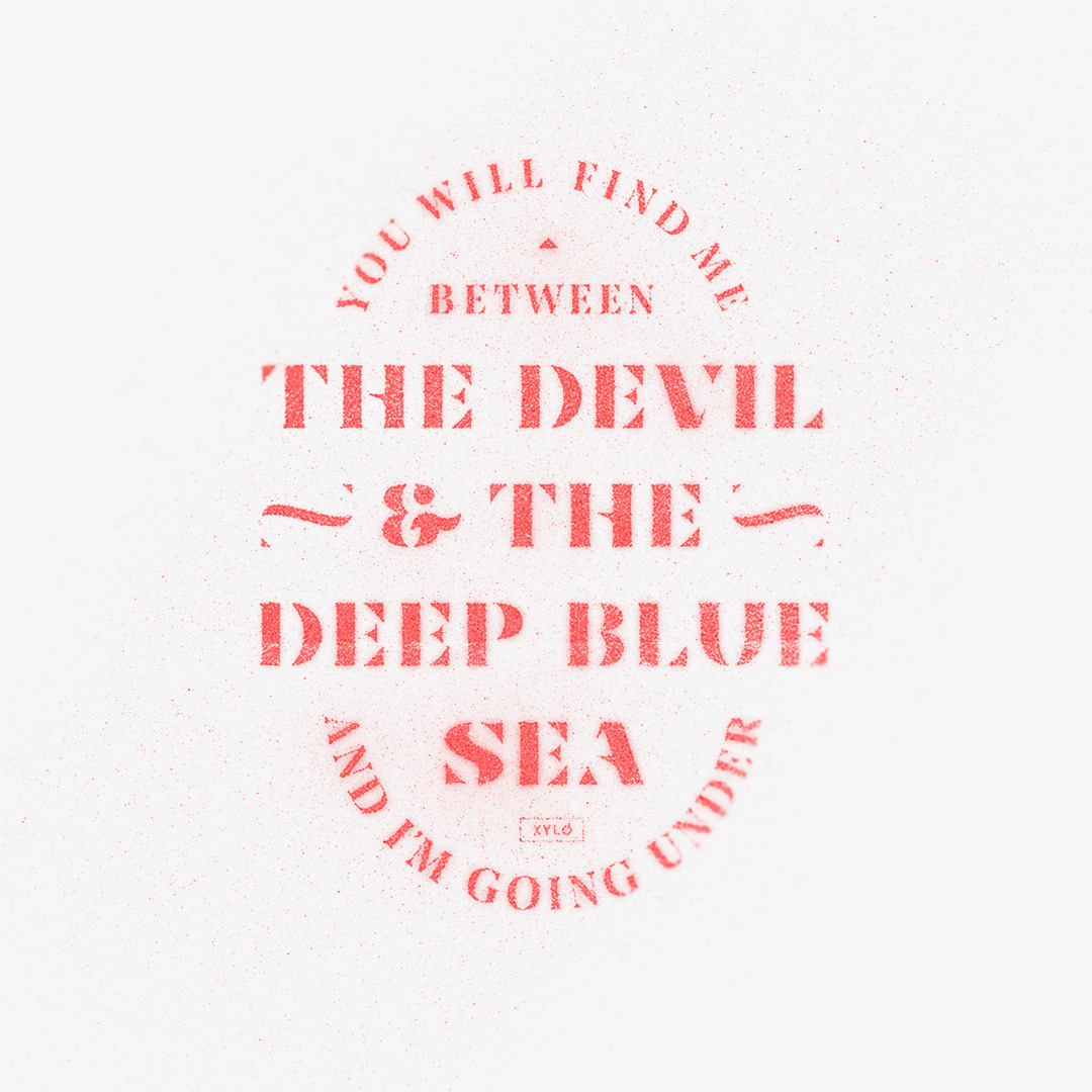
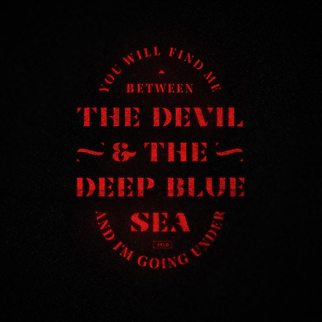
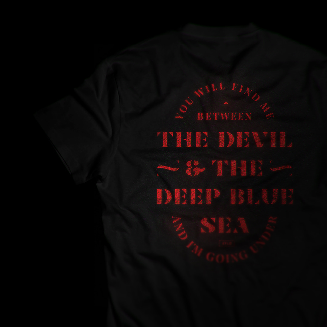
XYLO Band Tee
Floral Vans
Floral Pattern Design
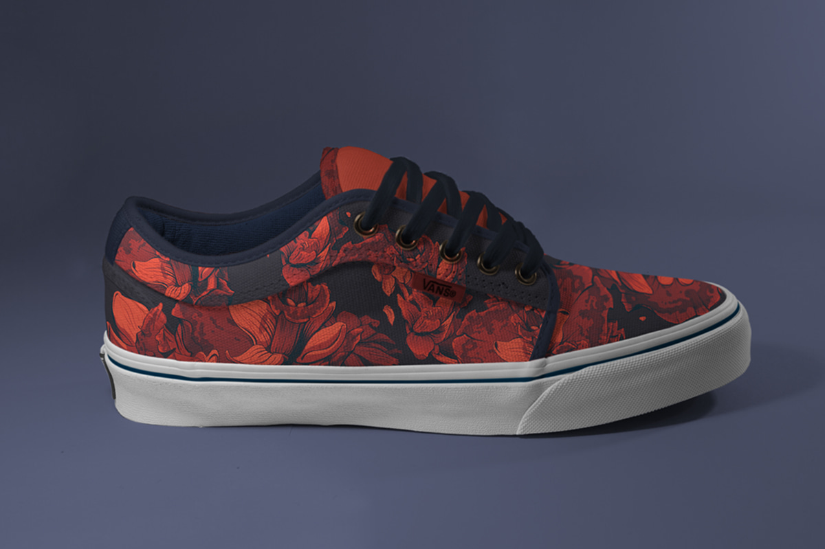
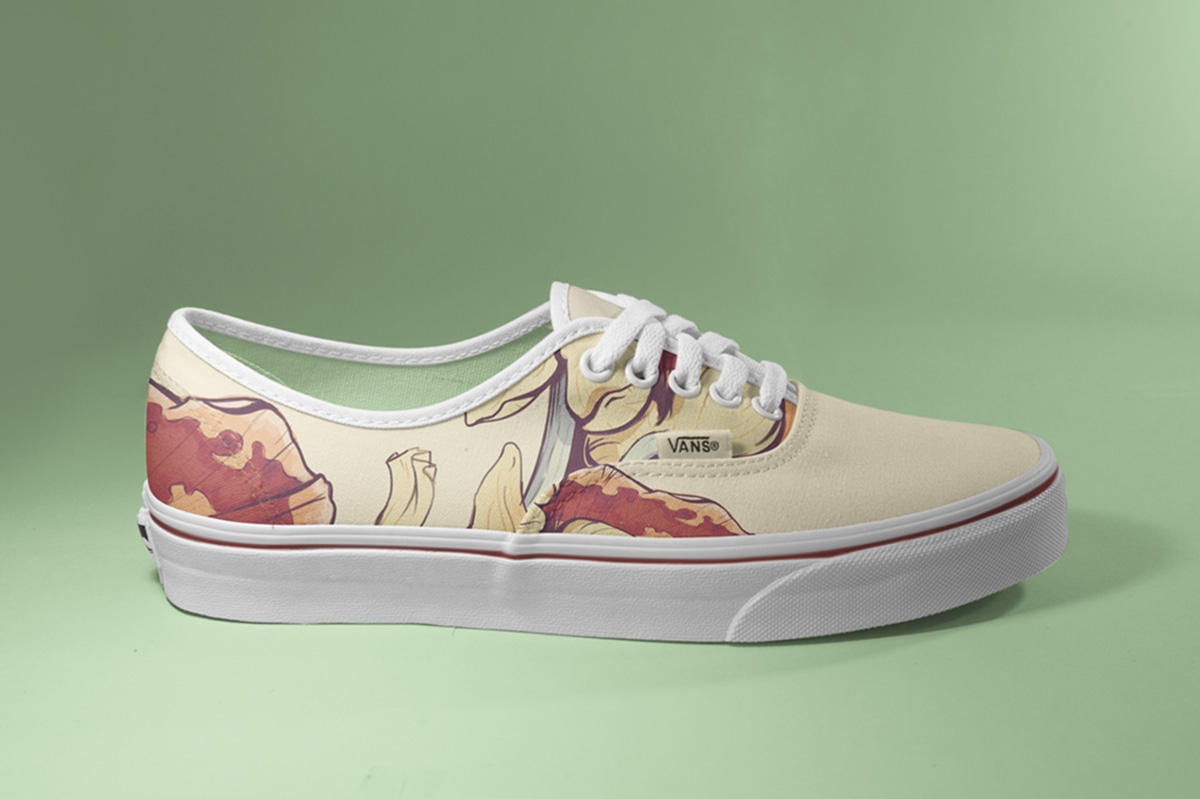
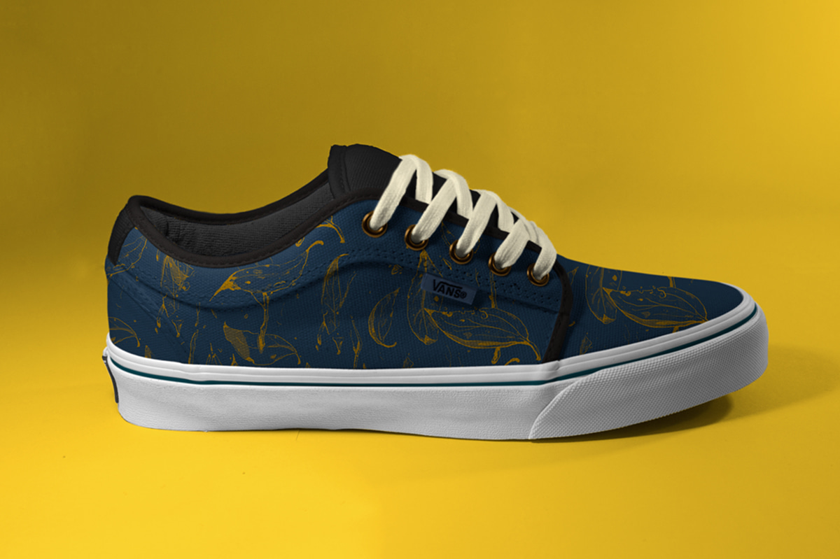
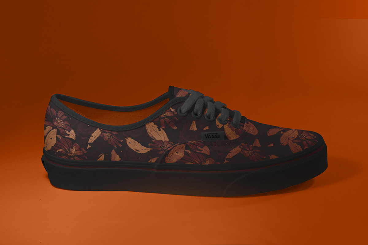
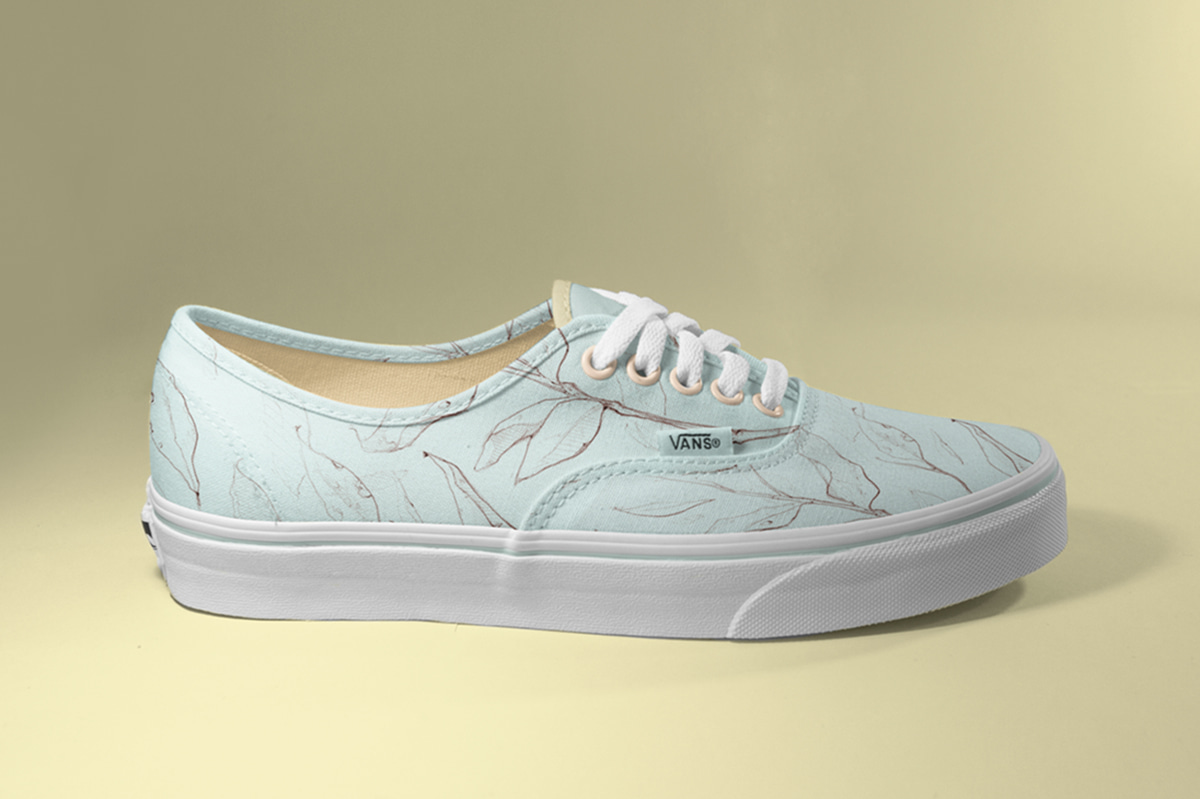
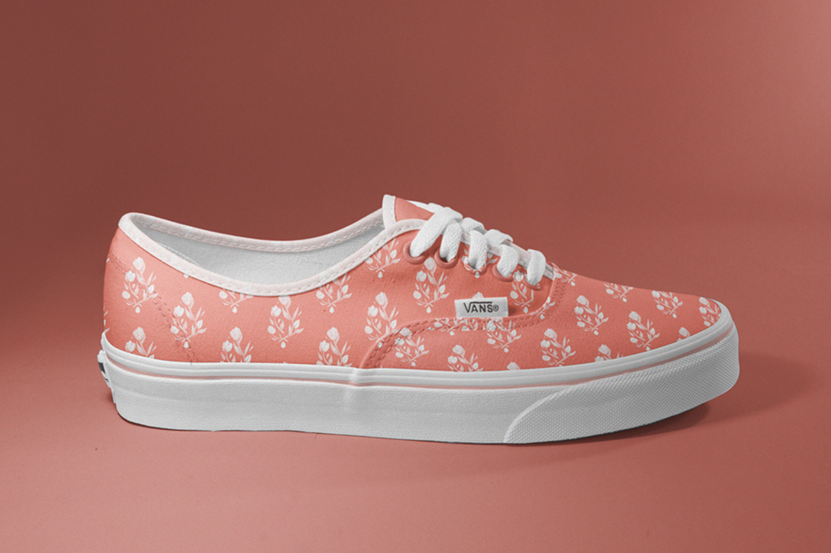
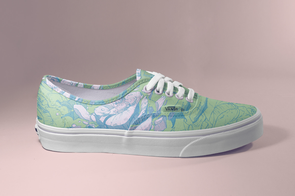
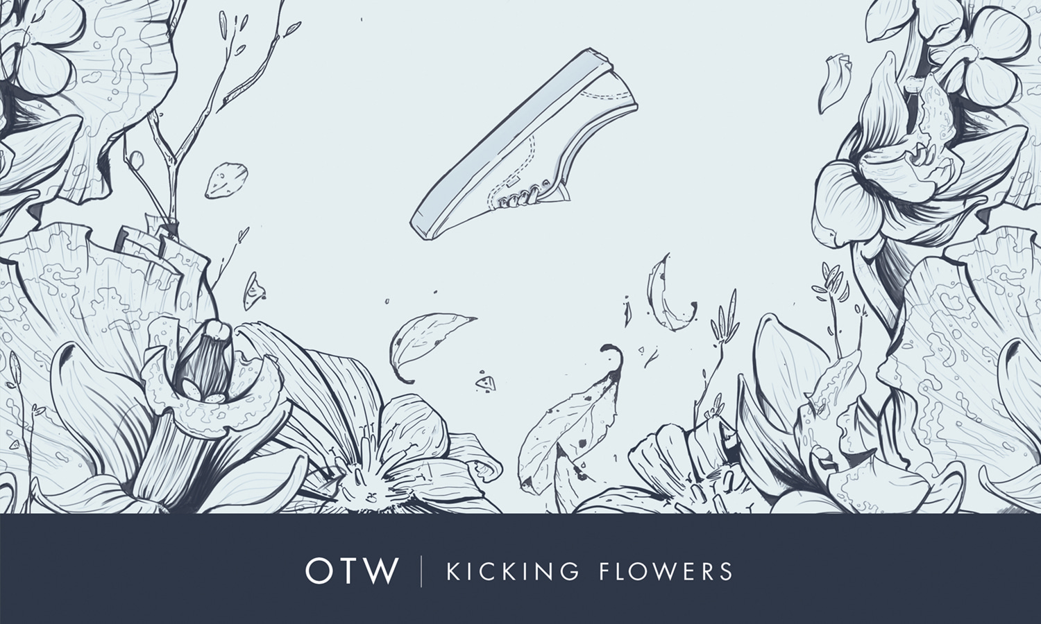
In 2013 I was assigned with making a line of floral designs for Vans. This was a great opportunity to mesh illustrative techniques with footwear design. I was able to receive valuable feedback and advice from the other designers in the Vans' Classics Team throughout the process. This project spanned a wide range of concepts. Some designs were subtle and modest, while others were loud, bold -- and everything in between.
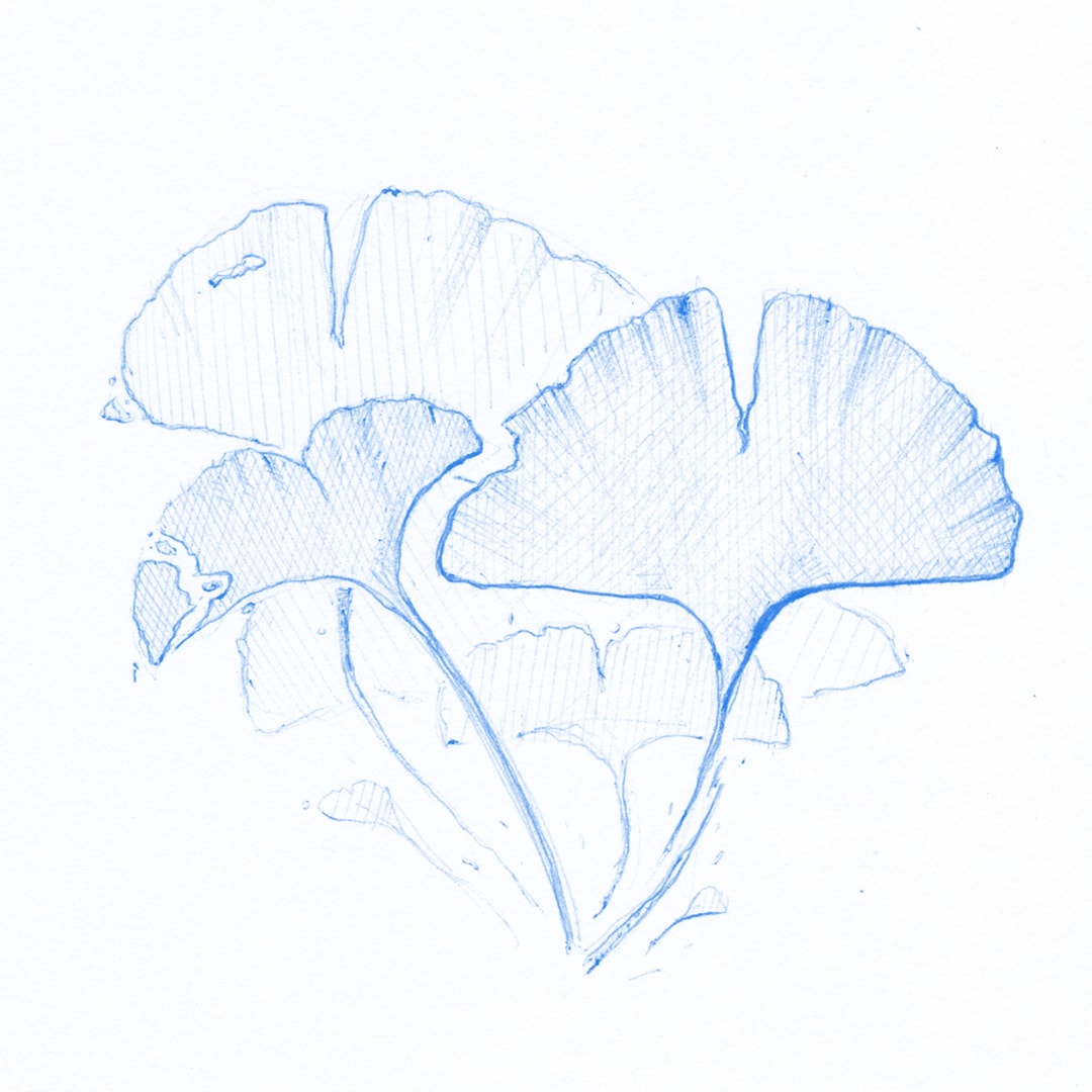
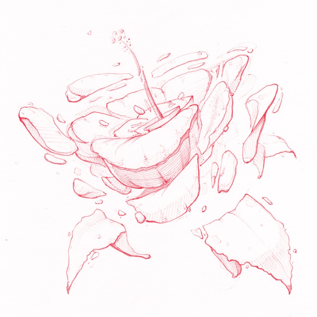

Ideation
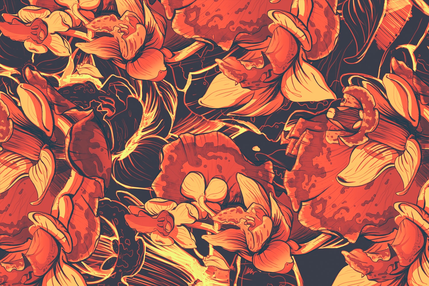
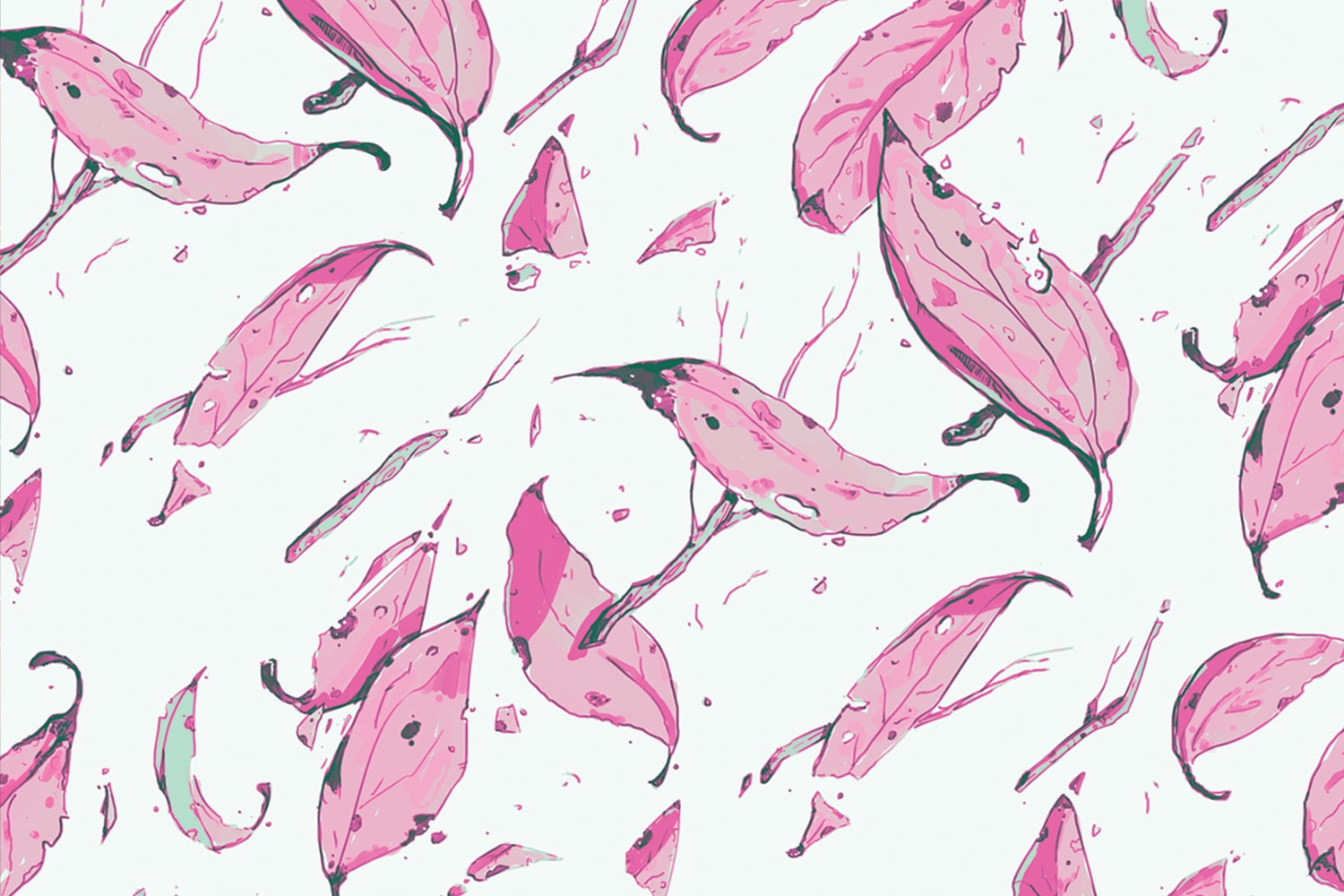
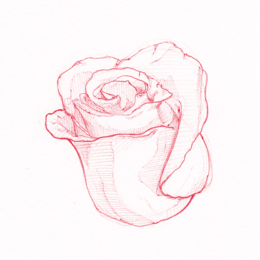
The first phase of the process was to gather reference imagery and sketch out various ideas. All of the floral patterns were initially sketched on pen and paper, and the strongest directions were painted in photoshop. They were then converted into seamless patterns to be used as canvas swatches for the shoes.
Pattern Implementation
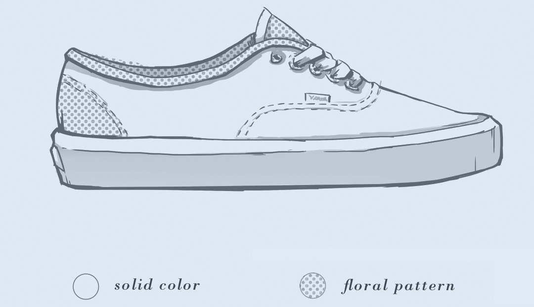
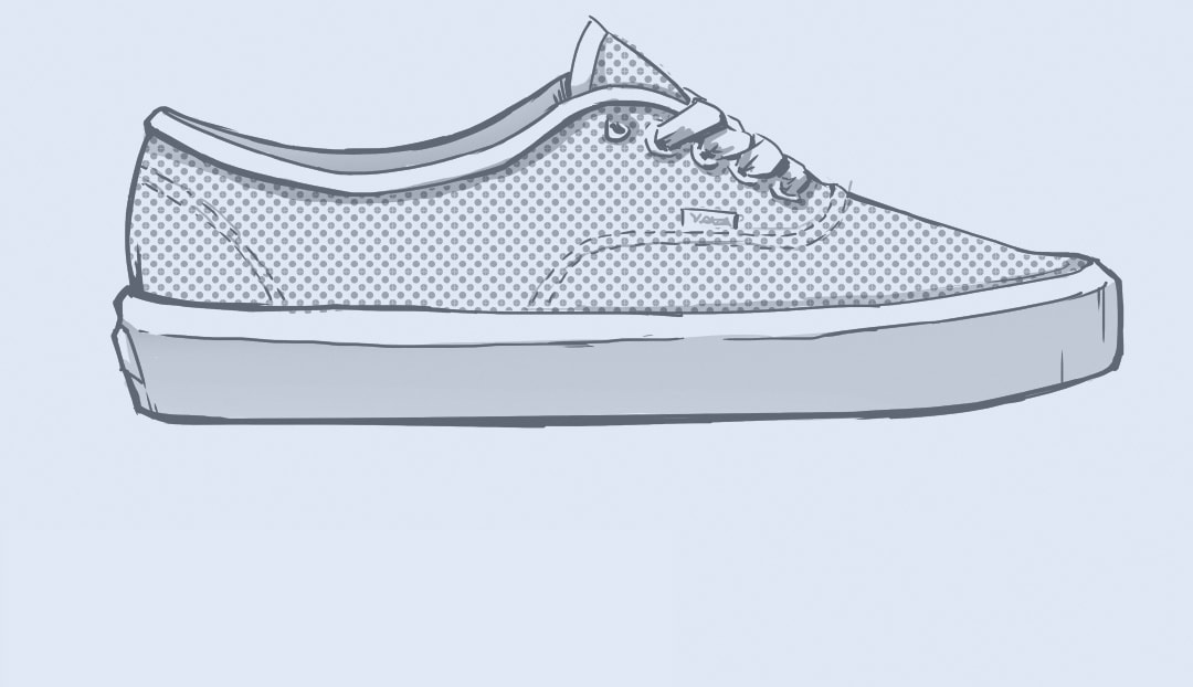
Determining how to use the patterns was the biggest challenge. There was a lot to consider, and this was a medium I didn’t have much experience with. After warming up with a couple attempts, I started to better understand the balance of color, texture, and negative space required for appealing footwear applications.
Pattern Swatches
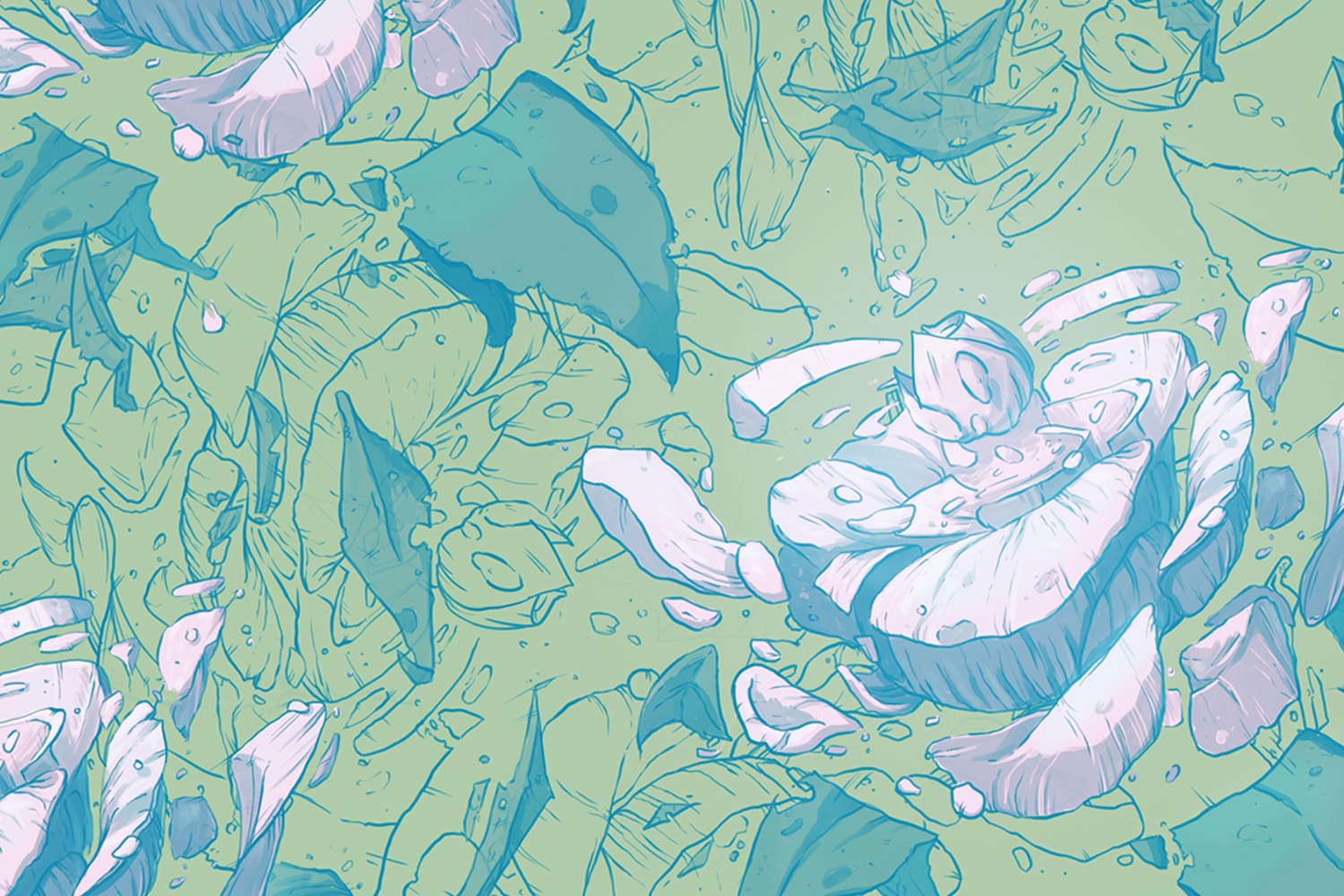
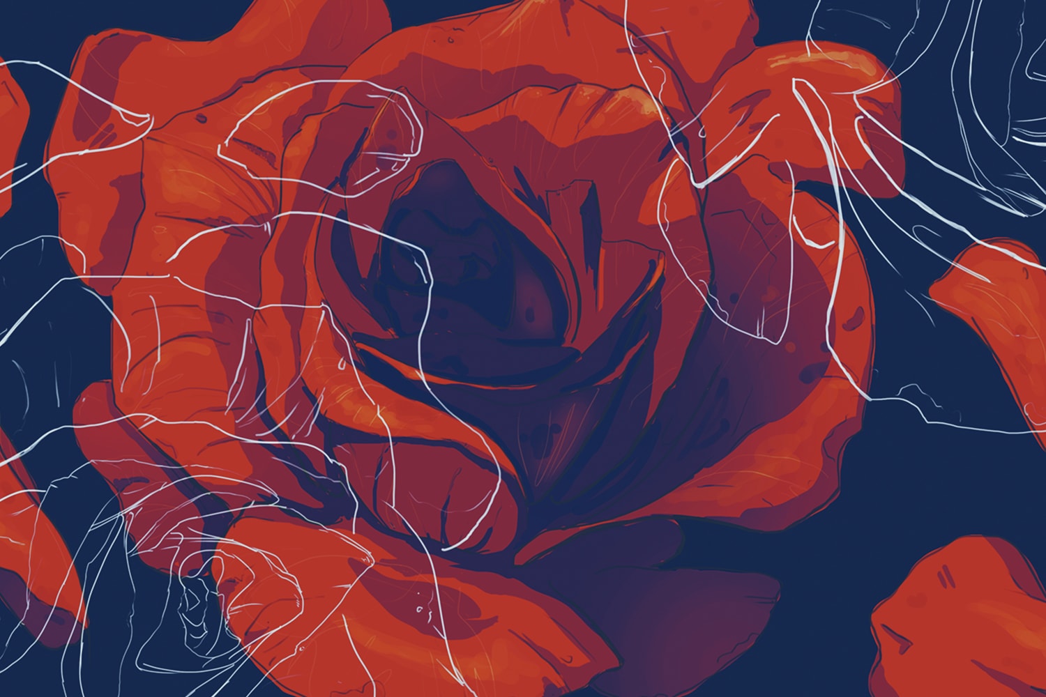
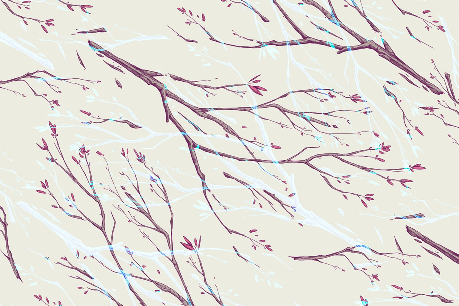
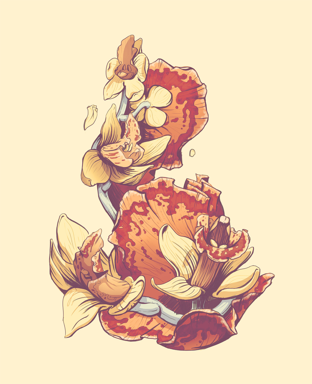
The slider below shows some floral patterns created during this project. Exploding roses, and using less conventional flowers like blood orchids were themes since early ideation. Coupling fine line-work with painterly florals added a layer of complexity that made these swatches unique.
Lettering
